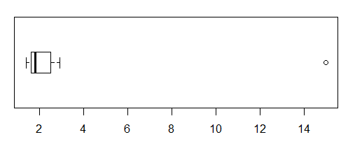
If you're talking about something like this:

$\qquad^{\text{[Data are } \tt{1.4, 1.5, 1.7, 1.8, 2.1,2.9, 15 } \text{ ]}}$
then there's probably no real need to remove anything; the display adequately indicates what it's designed to show. If the comparisons you want to make can be made there's not really a problem to solve.
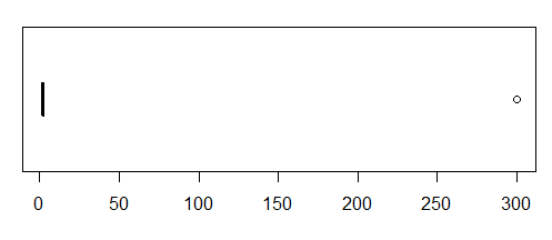
However, sometimes a really extreme value can almost completely obscure the rest of the information:

$\qquad^{\text{[Data are } \tt{1.4, 1.5, 1.7, 1.8, 2.1,2.9, 300 } \text{ ]}}$
A useful comparison between two sets of numbers which apart from the outlier all lie in a small range (but for which clear differences exist, even though they can't be seen on a plot like that) would be lost.
And in that case you might consider any of a number of alternatives - omitting the extreme value but explicitly mentioning it in the figure text, transformation, including a full scale break, or including some indication on the plot of another point outside the range of the figure, such as an arrow (and a mention on the plot of the omitted value or values).
These alternatives are discussed more fully herehere
So in short: only do something like that if it's really necessary to do so ... but whatever you do, the omission of any values must be quite clear to anyone looking at the figure.
