The central problem the OP appears to have is that they have very-heavy tailed data - and I don't think most of the present answers actually deal with that issue at all, so I am promoting my previous comment to an answer.
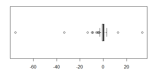
If you did want to stay with boxplots, some options are listed below. I have created some data in R which shows the basic problem:
 set.seed(seed=7513870)
 x <- rcauchy(80)
 boxplot(x,horizontal=TRUE,boxwex=.7)

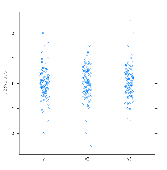
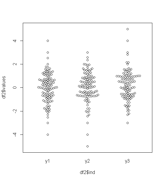
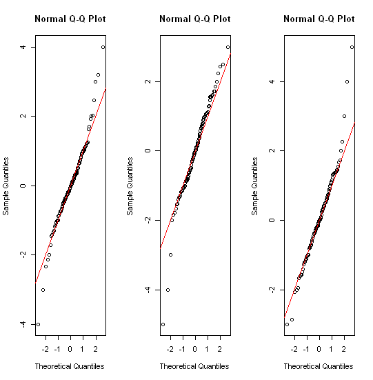
The middle half of the data is reduced to a tiny strip a couple of mm wide. The same problem afflicts most of the other suggestions - including QQ plots, strip charts, beehive/beeswarm plots, and violin plots.
Now some potential solutions:
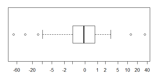
- transformation,
If logs, or inverses produce a readable boxplot, they may be a very good idea, and the original scale can still be shown on the axis.
The big problem is there's sometimes no 'intuitive' transformation. There's a smaller problem that while quantiles themselves translate with monotonic transformations well enough, the fences don't; if you just boxplot the transformed data (as I did here), the whiskers will be at different x-values than in the original plot.

Here I used a inverse-hyperbolic-sin (asinh); it's sort of log-like in the tails and similar to linear near zero, but people generally don't find it an intuitive transformation, so in general I wouldn't recommend this option unless a fairly intuitive transformation like log is obvious. Code for that:
xlab <- c(-60,-20,-10,-5,-2,-1,0,1,2,5,10,20,40)
boxplot(asinh(x),horizontal=TRUE,boxwex=.7,axes=FALSE,frame.plot=TRUE)
axis(1,at=asinh(xlab),labels=xlab)
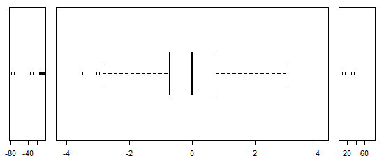
- scale breaks - take extreme outliers and compress them into narrow windows at each end with a much more compressed scale than at the center. I highly recommend a complete break across the whole scale if you do this.

opar <- par()
layout(matrix(1:3,nr=1,nc=3),heights=c(1,1,1),widths=c(1,6,1))
par(oma = c(5,4,0,0) + 0.1,mar = c(0,0,1,1) + 0.1)
stripchart(x[x< -4],pch=1,cex=1,xlim=c(-80,-5))
boxplot(x[abs(x)<4],horizontal=TRUE,ylim=c(-4,4),at=0,boxwex=.7,cex=1)
stripchart(x[x> 4],pch=1,cex=1,xlim=c(5,80))
par(opar)
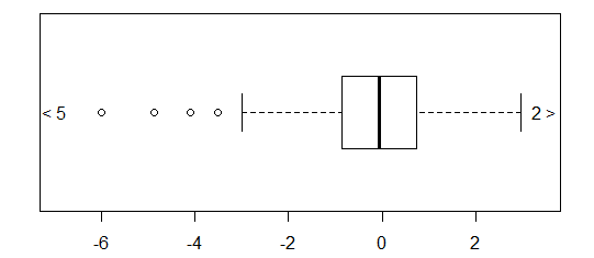
trimming of extreme outliers (which I wouldn't normally advise without indicating this very clearly, but it looks like the next plot, without the "<5" and "2>" at either end), and
what I'll call extreme-outlier "arrows" - similar to trimming, but with the count of values trimmed indicated at each end

xout <- boxplot(x,range=3,horizontal=TRUE)$out
xin <- x[!(x %in% xout)]
noutl <- sum(xout<median(x))
nouth <- sum(xout>median(x))
boxplot(xin,horizontal=TRUE,ylim=c(min(xin)*1.15,max(xin)*1.15))
text(x=max(xin)*1.17,y=1,labels=paste0(as.character(nouth)," >"))
text(x=min(xin)*1.17,y=1,labels=paste0("< ",as.character(noutl)))

