edited tags
Link
Richard Hardy
  • 69.5k
  • 13
  • 126
  • 278
I have added link for data download
Source Link

I have created couple of graphs in R

d5 <- scan('d500.txt')
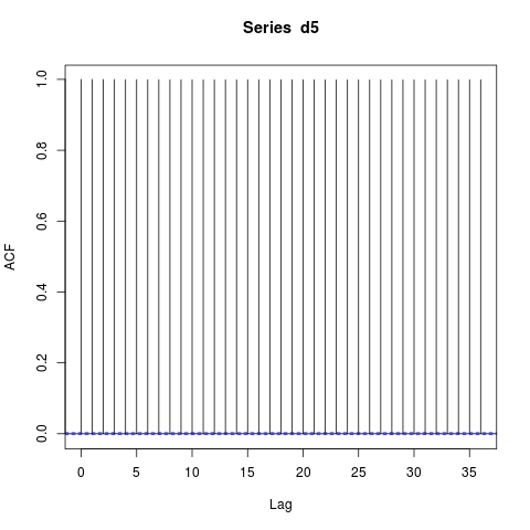
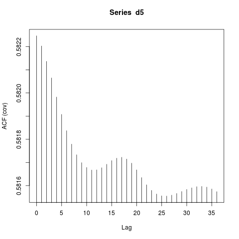
p1 <- acf(d5,lag.max = 36 ,type = c("covariance"),plot = TRUE)

enter image description here

Then the next one is correlation

p1 <- acf(d5,lag.max = 36 ,type = c("correlation"),plot = TRUE)

enter image description here

And pacf

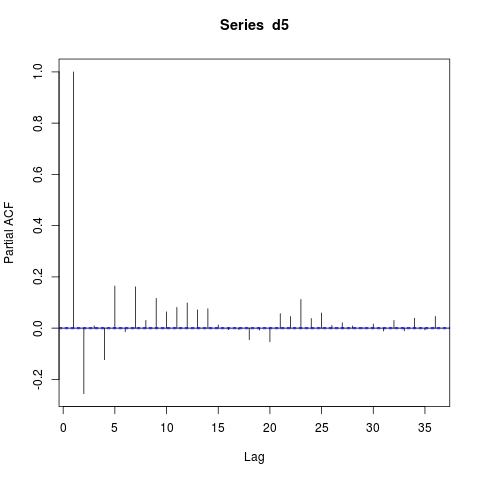
p1 <- pacf(d5,lag.max = 36 ,plot = TRUE)

enter image description here

If I take a one difference operation

d51 <- diff(d5)
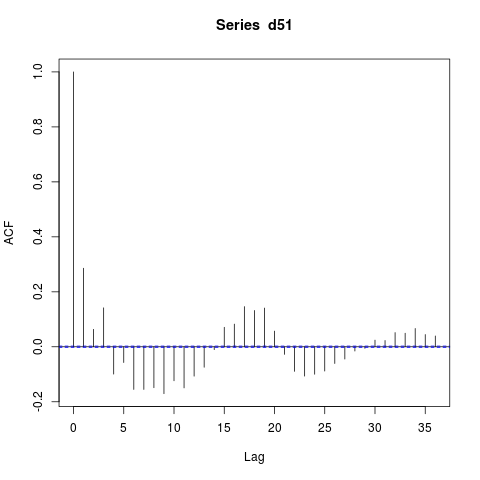
p1 <- acf(d51,lag.max = 36 ,type = c("correlation"),plot = TRUE)

enter image description here

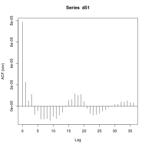
And then again acf enter image description here

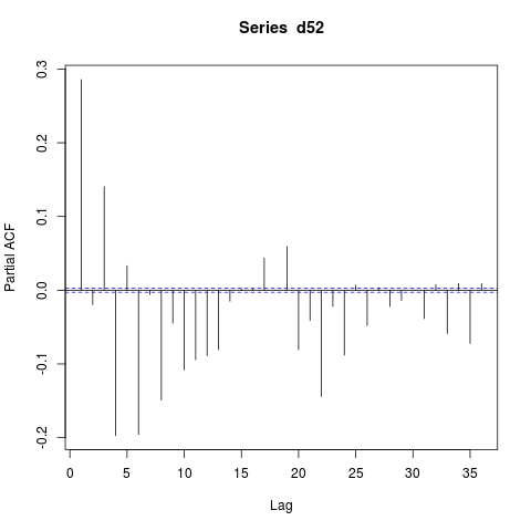
and pacf

enter image description here

How to interpret this?What does sinusoidal acf(cov) shows? Original data set is here

https://www.dropbox.com/s/8cmv02xtyvyrilp/d500.txt?dl=0

I have created couple of graphs in R

d5 <- scan('d500.txt')
p1 <- acf(d5,lag.max = 36 ,type = c("covariance"),plot = TRUE)

enter image description here

Then the next one is correlation

p1 <- acf(d5,lag.max = 36 ,type = c("correlation"),plot = TRUE)

enter image description here

And pacf

p1 <- pacf(d5,lag.max = 36 ,plot = TRUE)

enter image description here

If I take a one difference operation

d51 <- diff(d5)
p1 <- acf(d51,lag.max = 36 ,type = c("correlation"),plot = TRUE)

enter image description here

And then again acf enter image description here

and pacf

enter image description here

How to interpret this?What does sinusoidal acf(cov) shows?

I have created couple of graphs in R

d5 <- scan('d500.txt')
p1 <- acf(d5,lag.max = 36 ,type = c("covariance"),plot = TRUE)

enter image description here

Then the next one is correlation

p1 <- acf(d5,lag.max = 36 ,type = c("correlation"),plot = TRUE)

enter image description here

And pacf

p1 <- pacf(d5,lag.max = 36 ,plot = TRUE)

enter image description here

If I take a one difference operation

d51 <- diff(d5)
p1 <- acf(d51,lag.max = 36 ,type = c("correlation"),plot = TRUE)

enter image description here

And then again acf enter image description here

and pacf

enter image description here

How to interpret this?What does sinusoidal acf(cov) shows? Original data set is here
https://www.dropbox.com/s/8cmv02xtyvyrilp/d500.txt?dl=0

Source Link

How to build ARIMA model from my time series?

I have created couple of graphs in R

d5 <- scan('d500.txt')
p1 <- acf(d5,lag.max = 36 ,type = c("covariance"),plot = TRUE)

enter image description here

Then the next one is correlation

p1 <- acf(d5,lag.max = 36 ,type = c("correlation"),plot = TRUE)

enter image description here

And pacf

p1 <- pacf(d5,lag.max = 36 ,plot = TRUE)

enter image description here

If I take a one difference operation

d51 <- diff(d5)
p1 <- acf(d51,lag.max = 36 ,type = c("correlation"),plot = TRUE)

enter image description here

And then again acf enter image description here

and pacf

enter image description here

How to interpret this?What does sinusoidal acf(cov) shows?