edited tags
Link
amoeba
  • 107.3k
  • 36
  • 321
  • 347
Tweeted twitter.com/StackStats/status/826879164976349184
added 62 characters in body
Source Link
LCIII
  • 763
  • 5
  • 7

I'm seeing this image passed around a lot.

I have a gut-feeling that the information provided this way is somehow incomplete or even erroneous, but I'm not well versed enough in statistics to respond. It makes me think of this xkcd comic, that even with solid historical data, certain situations can change how things can be predicted.

What it do baby

Is this chart useful as presented useful for accurately showing what the threat level from refugees is? Is there necessary statistical context that makes this chart more or less useful?


Note: Try to keep it in layman's terms :)

I'm seeing this image passed around a lot.

I have a gut-feeling that the information provided this way is somehow incomplete or even erroneous, but I'm not well versed enough in statistics to respond. It makes me think of this xkcd comic, that even with solid historical data, certain situations can change how things can be predicted.

What it do baby

Is this chart useful as presented? Is there necessary statistical context that makes this chart more or less useful?


Note: Try to keep it in layman's terms :)
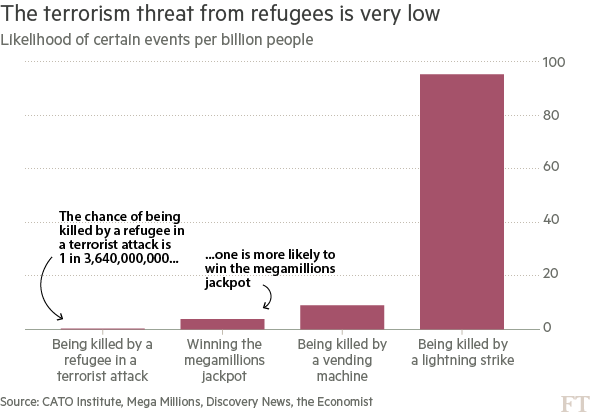
I'm seeing this image passed around a lot.

I have a gut-feeling that the information provided this way is somehow incomplete or even erroneous, but I'm not well versed enough in statistics to respond. It makes me think of this xkcd comic, that even with solid historical data, certain situations can change how things can be predicted.

What it do baby

Is this chart as presented useful for accurately showing what the threat level from refugees is? Is there necessary statistical context that makes this chart more or less useful?


Note: Try to keep it in layman's terms :)

Source Link
LCIII
  • 763
  • 5
  • 7
Loading