(I've posted this on StackOverflow--visualization--but got no response yet, so I'm trying to cross post here in the hope that more people with statistical and math knowledge can help make suggestion)
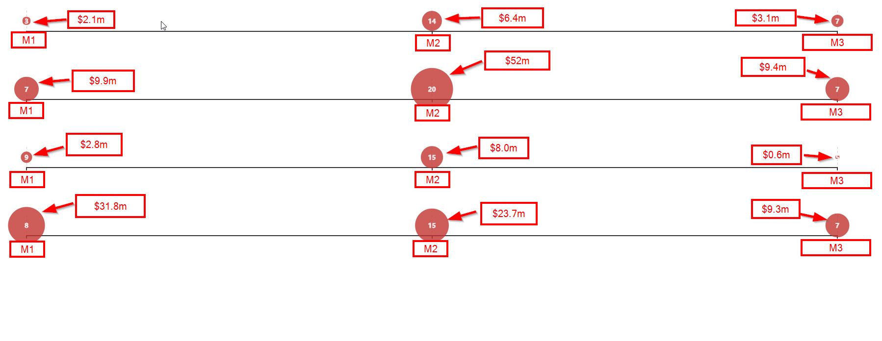
I am using a bubble chart to represent, the amount spent by members of a population on M1, M2 and M3 as follows:
Note: In the above figure, each row of axis represent individual member, and the size of the bubbles on a line represents the amount spent on M1,M2 and M3 respectively by that member. Also, please ignore the numbers showing up inside each bubble. That represents another metric not relevant to this question.
Currently, I'm using a logarithmic function (thanks to another StackOverflow post[another StackOverflow post][2] here) to scale the size of the bubbles. The function is like this:
    function scaledValue(value) {
        var minp = 0;
        var maxp = 100;

        var minv = Math.log(1000000);
        var maxv = Math.log(100000000);

        var scale = (maxv-minv) / (maxp-minp);

        return (Math.log(value)-minv) / scale + minp;
    }
Because I'm using the log scale, the size of some bubbles aren't quite proportionate to look at. For example, the bubble that represents $52m is not quite as big as it should be compared to $9.4m bubble. On the other hand, the bubbles for $3.1m vs. $9.4m look reasonable relative to each other.
One might ask, "Why are you using log scale then?!" The reason I use log scale is because the underlying spend numbers are quite spread out as follows:
min = $0
max = $272,000,000
avg = $4,000,000
stddev = $17,000,000
number of total data points = 1609
So when I used linear scale, the size of the bubbles goes out of whack (meaning some are too small to see; some are too big that they engulf the whole plot).
My question to more mathy folks here is what kind of scale will allow users to easily discern the relative size of the underlying values more accurately than logarithmic scale. Thank you in advanced for your suggestions/answers! 1: https://i.sstatic.net/e7Xjp.jpg [2]: https://stackoverflow.com/a/846249/1330974


