added 42 characters in body
Source Link
BruceET
  • 57.6k
  • 2
  • 36
  • 94

I suppose you intend that those at the upper end of the attribute scale will do better on the exam. One simple and direct way to model this is to take the attribute to be the probability $p$ of success on each of 100 T/F exam questions.

Suppose there are 20,000 potential subjects with $p \sim \mathsf{Norm}(\mu=0.5, \sigma=0.1).$ Then we pick the top 1000 of them (5%). The score of the $i$th participant is taken to be $X_i \sim \mathsf{Binom}(100, p_i),$ for $i = 1, 2, \dots, 1000.$

I have no idea whether this is a realistic model, but it might be a starting point towards clarifying what kind of model you have in mind. [If the attribute is precisely exam-taking ability, a beta distribution for $p$ might be a better choice than normal.]

set.seed(603)
p = sort(rnorm(20000, .5, .1), decr=T)[1:1000]
s = rbinom(1000, 100, p)
hist(s, prob=T)
summary(s)
   Min. 1st Qu.  Median    Mean 3rd Qu.    Max. 
  56.00   66.00   70.00   70.25   74.00   93.00 

tab = cbind(p,s)
head(tab)
             p  s  # scores of 6 highest 'attribute' subj
[1,] 0.9222469 89
[2,] 0.9020532 90
[3,] 0.8966595 93
[4,] 0.8706467 85
[5,] 0.8425157 85
[6,] 0.8409540 87

tail(tab)
                p  s   
 [995,] 0.6655590 68    # ...and of 6 lowest
 [996,] 0.6655020 67
 [997,] 0.6653522 62
 [998,] 0.6653462 74
 [999,] 0.6652848 74
[1000,] 0.6652532 61

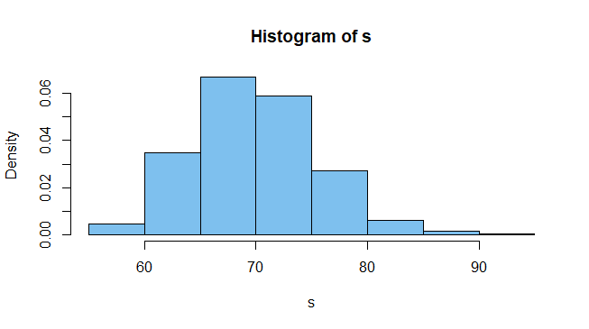
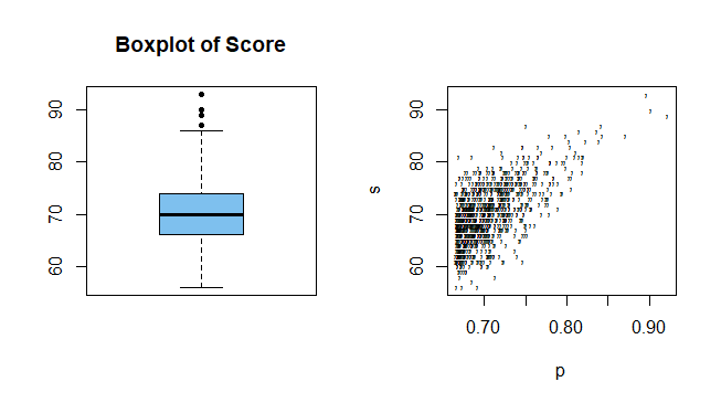
Although the mean and median scores are nearly the same (both around 70), the histogram and the boxplot of the 1000 simulated scores both show some right-skewness--as you anticipated. A Shapiro-Wilk tests rejects the null hypothesis that the scores are normal (validating @whuber's cautionary comment).

 shapiro.test(x)$p.val
 [1] 0.001612833 

enter image description here

The right-hand panel below shows a scatterplot of scores against success probabilities.

par(mfrow = c(1,2))
 boxplot(s, col="skyblue2", pch=20, main="Boxplot of Score")
 plot(p, s, pch=",")
par(mfrow = c(1,1))

enter image description here

I suppose you intend that those at the upper end of the attribute scale will do better on the exam. One simple and direct way to model this is to take the attribute to be the probability $p$ of success on exam questions.

Suppose there are 20,000 potential subjects with $p \sim \mathsf{Norm}(\mu=0.5, \sigma=0.1).$ Then we pick the top 1000 of them (5%). The score of the $i$th participant is taken to be $X_i \sim \mathsf{Binom}(100, p_i),$ for $i = 1, 2, \dots, 1000.$

I have no idea whether this is a realistic model, but it might be a starting point towards clarifying what kind of model you have in mind. [If the attribute is precisely exam-taking ability, a beta distribution for $p$ might be a better choice than normal.]

set.seed(603)
p = sort(rnorm(20000, .5, .1), decr=T)[1:1000]
s = rbinom(1000, 100, p)
hist(s, prob=T)
summary(s)
   Min. 1st Qu.  Median    Mean 3rd Qu.    Max. 
  56.00   66.00   70.00   70.25   74.00   93.00 

tab = cbind(p,s)
head(tab)
             p  s  # scores of 6 highest 'attribute' subj
[1,] 0.9222469 89
[2,] 0.9020532 90
[3,] 0.8966595 93
[4,] 0.8706467 85
[5,] 0.8425157 85
[6,] 0.8409540 87

tail(tab)
                p  s   
 [995,] 0.6655590 68    # ...and of 6 lowest
 [996,] 0.6655020 67
 [997,] 0.6653522 62
 [998,] 0.6653462 74
 [999,] 0.6652848 74
[1000,] 0.6652532 61

Although the mean and median scores are nearly the same (both around 70), the histogram and the boxplot of the 1000 simulated scores both show some right-skewness--as you anticipated. A Shapiro-Wilk tests rejects the null hypothesis that the scores are normal.

 shapiro.test(x)$p.val
 [1] 0.001612833 

enter image description here

The right-hand panel below shows a scatterplot of scores against success probabilities.

par(mfrow = c(1,2))
 boxplot(s, col="skyblue2", pch=20, main="Boxplot of Score")
 plot(p, s, pch=",")
par(mfrow = c(1,1))
enter image description here

I suppose you intend that those at the upper end of the attribute scale will do better on the exam. One simple and direct way to model this is to take the attribute to be the probability $p$ of success on each of 100 T/F exam questions.

Suppose there are 20,000 potential subjects with $p \sim \mathsf{Norm}(\mu=0.5, \sigma=0.1).$ Then we pick the top 1000 of them (5%). The score of the $i$th participant is taken to be $X_i \sim \mathsf{Binom}(100, p_i),$ for $i = 1, 2, \dots, 1000.$

I have no idea whether this is a realistic model, but it might be a starting point towards clarifying what kind of model you have in mind. [If the attribute is precisely exam-taking ability, a beta distribution for $p$ might be a better choice than normal.]

set.seed(603)
p = sort(rnorm(20000, .5, .1), decr=T)[1:1000]
s = rbinom(1000, 100, p)
hist(s, prob=T)
summary(s)
   Min. 1st Qu.  Median    Mean 3rd Qu.    Max. 
  56.00   66.00   70.00   70.25   74.00   93.00 

tab = cbind(p,s)
head(tab)
             p  s  # scores of 6 highest 'attribute' subj
[1,] 0.9222469 89
[2,] 0.9020532 90
[3,] 0.8966595 93
[4,] 0.8706467 85
[5,] 0.8425157 85
[6,] 0.8409540 87

tail(tab)
                p  s   
 [995,] 0.6655590 68    # ...and of 6 lowest
 [996,] 0.6655020 67
 [997,] 0.6653522 62
 [998,] 0.6653462 74
 [999,] 0.6652848 74
[1000,] 0.6652532 61

Although the mean and median scores are nearly the same (both around 70), the histogram and the boxplot of the 1000 simulated scores both show some right-skewness--as you anticipated. A Shapiro-Wilk tests rejects the null hypothesis that the scores are normal (validating @whuber's cautionary comment).

 shapiro.test(x)$p.val
 [1] 0.001612833 

enter image description here

The right-hand panel below shows a scatterplot of scores against success probabilities.

par(mfrow = c(1,2))
 boxplot(s, col="skyblue2", pch=20, main="Boxplot of Score")
 plot(p, s, pch=",")
par(mfrow = c(1,1))
enter image description here

added 130 characters in body
Source Link
BruceET
  • 57.6k
  • 2
  • 36
  • 94

I suppose you intend that those at the upper end of the attribute scale will do better on the exam. One simple and direct way to model this is to take the attribute to be the probability $p$ of success on exam questions.

Suppose there are 20,000 potential subjects with $p \sim \mathsf{Norm}(\mu=0.5, \sigma=0.1).$ Then we pick the top 1000 of them (5%). The score of the $i$th participant is taken to be $X_i \sim \mathsf{Binom}(100, p_i),$ for $i = 1, 2, \dots, 1000.$

I have no idea whether this is a realistic model, but it might be a starting point towards clarifying what kind of model you have in mind. [If the attribute is precisely exam-taking ability, a beta distribution for $p$ might be a better choice than normal.]

set.seed(603)
p = sort(rnorm(20000, .5, .1), decr=T)[1:1000]
s = rbinom(1000, 100, p)
hist(s, prob=T)
summary(s)
   Min. 1st Qu.  Median    Mean 3rd Qu.    Max. 
  56.00   66.00   70.00   70.25   74.00   93.00 

tab = cbind(p,s)
head(tab)
             p  s  # scores of 6 highest 'attribute' subj
[1,] 0.9222469 89
[2,] 0.9020532 90
[3,] 0.8966595 93
[4,] 0.8706467 85
[5,] 0.8425157 85
[6,] 0.8409540 87

tail(tab)
                p  s   
 [995,] 0.6655590 68    # ...and of 6 lowest
 [996,] 0.6655020 67
 [997,] 0.6653522 62
 [998,] 0.6653462 74
 [999,] 0.6652848 74
[1000,] 0.6652532 61

Although the mean and median scores are nearly the same (both around 70), the histogram and the boxplot of the 1000 simulated scores both show some right-skewness--as you anticipated. A Shapiro-Wilk tests rejects the null hypothesis that the scores are normal.

 shapiro.test(x)$p.val
 [1] 0.001612833 

enter image description here

The right-hand panel below shows a scatterplot of scores against success probabilities.

par(mfrow = c(1,2))
 boxplot(s, col="skyblue2", pch=20, main="Boxplot of Score")
 plot(p, s, pch=",")
par(mfrow = c(1,1))

enter image description here

I suppose you intend that those at the upper end of the attribute scale will do better on the exam. One simple and direct way to model this is to take the attribute to be the probability $p$ of success on exam questions.

Suppose there are 20,000 potential subjects with $p \sim \mathsf{Norm}(\mu=0.5, \sigma=0.1).$ Then we pick the top 1000 of them (5%). The score of the $i$th participant is taken to be $X_i \sim \mathsf{Binom}(100, p_i),$ for $i = 1, 2, \dots, 1000.$

I have no idea whether this is a realistic model, but it might be a starting point towards clarifying what kind of model you have in mind. [If the attribute is precisely exam-taking ability, a beta distribution for $p$ might be a better choice than normal.]

set.seed(603)
p = sort(rnorm(20000, .5, .1), decr=T)[1:1000]
s = rbinom(1000, 100, p)
hist(s, prob=T)
summary(s)
   Min. 1st Qu.  Median    Mean 3rd Qu.    Max. 
  56.00   66.00   70.00   70.25   74.00   93.00 

tab = cbind(p,s)
head(tab)
             p  s  # scores of 6 highest 'attribute' subj
[1,] 0.9222469 89
[2,] 0.9020532 90
[3,] 0.8966595 93
[4,] 0.8706467 85
[5,] 0.8425157 85
[6,] 0.8409540 87

tail(tab)
                p  s   
 [995,] 0.6655590 68    # ...and of 6 lowest
 [996,] 0.6655020 67
 [997,] 0.6653522 62
 [998,] 0.6653462 74
 [999,] 0.6652848 74
[1000,] 0.6652532 61

Although the mean and median scores are nearly the same (both around 70), the histogram and the boxplot of the 1000 simulated scores both show some right-skewness--as you anticipated.

enter image description here

The right-hand panel below shows a scatterplot of scores against success probabilities.

par(mfrow = c(1,2))
 boxplot(s, col="skyblue2", pch=20, main="Boxplot of Score")
 plot(p, s, pch=",")
par(mfrow = c(1,1))

enter image description here

I suppose you intend that those at the upper end of the attribute scale will do better on the exam. One simple and direct way to model this is to take the attribute to be the probability $p$ of success on exam questions.

Suppose there are 20,000 potential subjects with $p \sim \mathsf{Norm}(\mu=0.5, \sigma=0.1).$ Then we pick the top 1000 of them (5%). The score of the $i$th participant is taken to be $X_i \sim \mathsf{Binom}(100, p_i),$ for $i = 1, 2, \dots, 1000.$

I have no idea whether this is a realistic model, but it might be a starting point towards clarifying what kind of model you have in mind. [If the attribute is precisely exam-taking ability, a beta distribution for $p$ might be a better choice than normal.]

set.seed(603)
p = sort(rnorm(20000, .5, .1), decr=T)[1:1000]
s = rbinom(1000, 100, p)
hist(s, prob=T)
summary(s)
   Min. 1st Qu.  Median    Mean 3rd Qu.    Max. 
  56.00   66.00   70.00   70.25   74.00   93.00 

tab = cbind(p,s)
head(tab)
             p  s  # scores of 6 highest 'attribute' subj
[1,] 0.9222469 89
[2,] 0.9020532 90
[3,] 0.8966595 93
[4,] 0.8706467 85
[5,] 0.8425157 85
[6,] 0.8409540 87

tail(tab)
                p  s   
 [995,] 0.6655590 68    # ...and of 6 lowest
 [996,] 0.6655020 67
 [997,] 0.6653522 62
 [998,] 0.6653462 74
 [999,] 0.6652848 74
[1000,] 0.6652532 61

Although the mean and median scores are nearly the same (both around 70), the histogram and the boxplot of the 1000 simulated scores both show some right-skewness--as you anticipated. A Shapiro-Wilk tests rejects the null hypothesis that the scores are normal.

 shapiro.test(x)$p.val
 [1] 0.001612833 

enter image description here

The right-hand panel below shows a scatterplot of scores against success probabilities.

par(mfrow = c(1,2))
 boxplot(s, col="skyblue2", pch=20, main="Boxplot of Score")
 plot(p, s, pch=",")
par(mfrow = c(1,1))

enter image description here

added 207 characters in body
Source Link
BruceET
  • 57.6k
  • 2
  • 36
  • 94

I suppose you intend that those at the upper end of the attribute scale will do better on the exam. One simple and direct way to model this is to take the attribute to be the probability $p$ of success on exam questions.

Suppose there are 20,000 potential subjects with $p \sim \mathsf{Norm}(\mu=0.5, \sigma=0.1).$ Then we pick the top 1000 of them (5%). The score of the $i$th participant is taken to be $X_i \sim \mathsf{Binom}(100, p_i),$ for $i = 1, 2, \dots, 1000.$

I have no idea whether this is a realistic model, but it might be a starting point towards clarifying what kind of model you have in mind. [If the attribute is precisely exam-taking ability, a beta distribution for $p$ might be a better choice than normal.]

set.seed(603)
p = sort(rnorm(20000, .5, .1), decr=T)[1:1000]
s = rbinom(1000, 100, p)
hist(s, prob=T)
summary(s)
   Min. 1st Qu.  Median    Mean 3rd Qu.    Max. 
  56.00   66.00   70.00   70.25   74.00   93.00 

tab = cbind(p,s)
head(tab)
             p  s  # scores of 6 highest 'attribute' subj
[1,] 0.9222469 89
[2,] 0.9020532 90
[3,] 0.8966595 93
[4,] 0.8706467 85
[5,] 0.8425157 85
[6,] 0.8409540 87

tail(tab)
                p  s   
 [995,] 0.6655590 68    # ...and of 6 lowest
 [996,] 0.6655020 67
 [997,] 0.6653522 62
 [998,] 0.6653462 74
 [999,] 0.6652848 74
[1000,] 0.6652532 61

Although the mean and median scores are nearly the same (both around 70), the the histogramhistogram and the boxplot of the 1000 simulated scores showsboth show some right-skewness--as you anticipated.

enter image description here

Here isThe right-hand panel below shows a scatterplot of scores against success probabilities.

par(mfrow = c(1,2))
 boxplot(s, col="skyblue2", pch=20, main="Boxplot of Score")
 plot(p, s, pch=",")
par(mfrow = c(1,1))

enter image description hereenter image description here

I suppose you intend that those at the upper end of the attribute scale will do better on the exam. One simple and direct way to model this is to take the attribute to be the probability $p$ of success on exam questions.

Suppose there are 20,000 potential subjects with $p \sim \mathsf{Norm}(\mu=0.5, \sigma=0.1).$ Then we pick the top 1000 of them (5%). The score of the $i$th participant is taken to be $X_i \sim \mathsf{Binom}(100, p_i),$ for $i = 1, 2, \dots, 1000.$

I have no idea whether this is a realistic model, but it might be a starting point towards clarifying what kind of model you have in mind. [If the attribute is precisely exam-taking ability, a beta distribution for $p$ might be a better choice than normal.]

set.seed(603)
p = sort(rnorm(20000, .5, .1), decr=T)[1:1000]
s = rbinom(1000, 100, p)
hist(s, prob=T)
summary(s)
   Min. 1st Qu.  Median    Mean 3rd Qu.    Max. 
  56.00   66.00   70.00   70.25   74.00   93.00 

tab = cbind(p,s)
head(tab)
             p  s  # scores of 6 highest 'attribute' subj
[1,] 0.9222469 89
[2,] 0.9020532 90
[3,] 0.8966595 93
[4,] 0.8706467 85
[5,] 0.8425157 85
[6,] 0.8409540 87

tail(tab)
                p  s   
 [995,] 0.6655590 68    # ...and of 6 lowest
 [996,] 0.6655020 67
 [997,] 0.6653522 62
 [998,] 0.6653462 74
 [999,] 0.6652848 74
[1000,] 0.6652532 61

Although the mean and median scores are nearly the same (both around 70), the histogram of the 1000 simulated scores shows some right-skewness--as you anticipated.

enter image description here

Here is a scatterplot of scores against success probabilities.

plot(p, s, pch=",")

enter image description here

I suppose you intend that those at the upper end of the attribute scale will do better on the exam. One simple and direct way to model this is to take the attribute to be the probability $p$ of success on exam questions.

Suppose there are 20,000 potential subjects with $p \sim \mathsf{Norm}(\mu=0.5, \sigma=0.1).$ Then we pick the top 1000 of them (5%). The score of the $i$th participant is taken to be $X_i \sim \mathsf{Binom}(100, p_i),$ for $i = 1, 2, \dots, 1000.$

I have no idea whether this is a realistic model, but it might be a starting point towards clarifying what kind of model you have in mind. [If the attribute is precisely exam-taking ability, a beta distribution for $p$ might be a better choice than normal.]

set.seed(603)
p = sort(rnorm(20000, .5, .1), decr=T)[1:1000]
s = rbinom(1000, 100, p)
hist(s, prob=T)
summary(s)
   Min. 1st Qu.  Median    Mean 3rd Qu.    Max. 
  56.00   66.00   70.00   70.25   74.00   93.00 

tab = cbind(p,s)
head(tab)
             p  s  # scores of 6 highest 'attribute' subj
[1,] 0.9222469 89
[2,] 0.9020532 90
[3,] 0.8966595 93
[4,] 0.8706467 85
[5,] 0.8425157 85
[6,] 0.8409540 87

tail(tab)
                p  s   
 [995,] 0.6655590 68    # ...and of 6 lowest
 [996,] 0.6655020 67
 [997,] 0.6653522 62
 [998,] 0.6653462 74
 [999,] 0.6652848 74
[1000,] 0.6652532 61

Although the mean and median scores are nearly the same (both around 70), the histogram and the boxplot of the 1000 simulated scores both show some right-skewness--as you anticipated.

enter image description here

The right-hand panel below shows a scatterplot of scores against success probabilities.

par(mfrow = c(1,2))
 boxplot(s, col="skyblue2", pch=20, main="Boxplot of Score")
 plot(p, s, pch=",")
par(mfrow = c(1,1))

enter image description here

Source Link
BruceET
  • 57.6k
  • 2
  • 36
  • 94
Loading