# Import dataset from authoritative source:
 # https://ourworldindata.org/coronavirus-source-data
 covid <- read.csv("https://covid.ourworldindata.org/data/ecdc/full_data.csv")

 # Subsetting only data from China and Italy
 dataset <- subset(covid, location == "China" | location == "Italy")

 # Fatality ratio: is the proportion of deaths from a certain disease compared to the
 # total number of people diagnosed with the disease for a certain period of time.
 dataset$fatality <- round(dataset$total_deaths/dataset$total_cases*100, 2)

 # Outbreak duration in days
    dataset$days <- difftime(dataset$date,min(dataset$date), units="days")


  # Generating plot
    library(ggplot2)
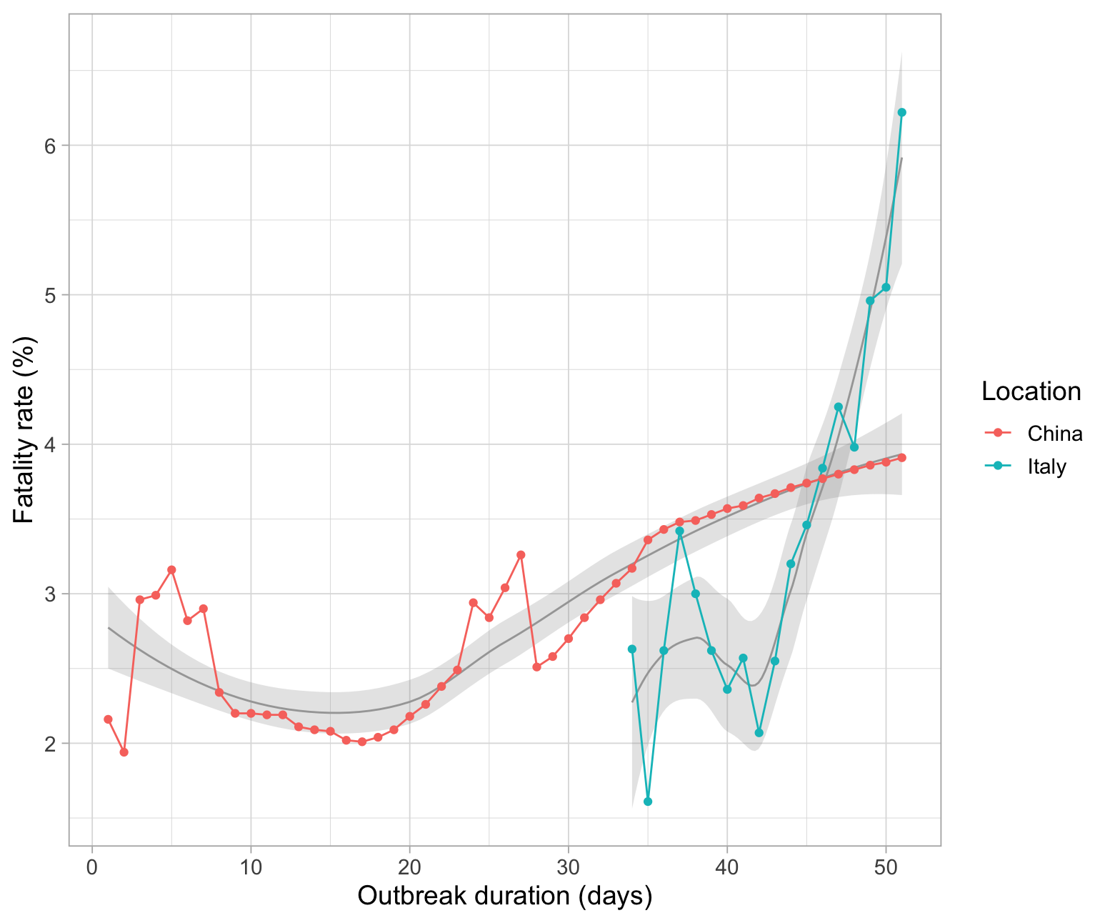
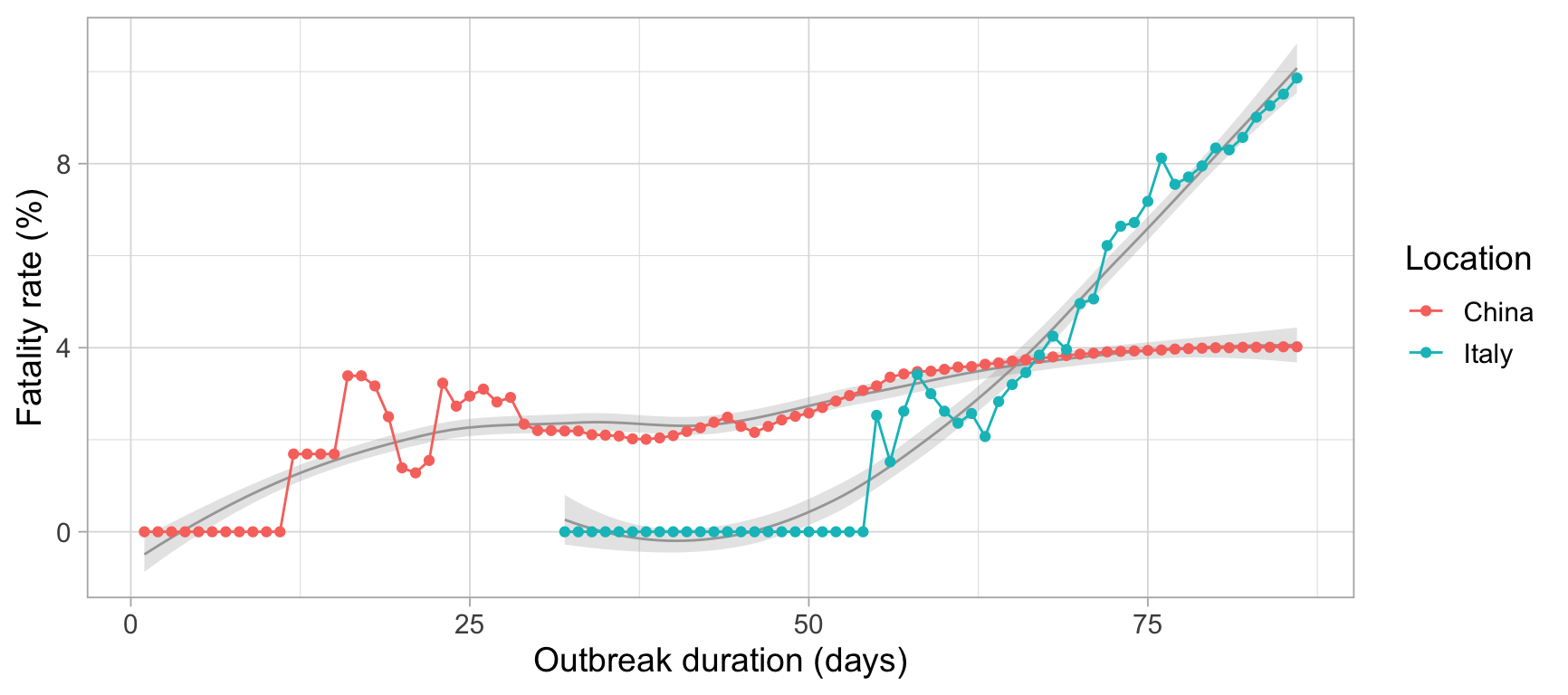
    ggplot(dataset, aes(as.numeric(date)days, fatality, color = location, group = location))+
      geom_smooth(size= .5, alpha=.25, color = "gray65")+
      geom_line()+
      geom_point()+
      labs(x="Outbreak duration (days)", y= "Fatality rate (%)", color = "Location")+
      theme_light(14)
# Generating bar plot
library(ggplot2)
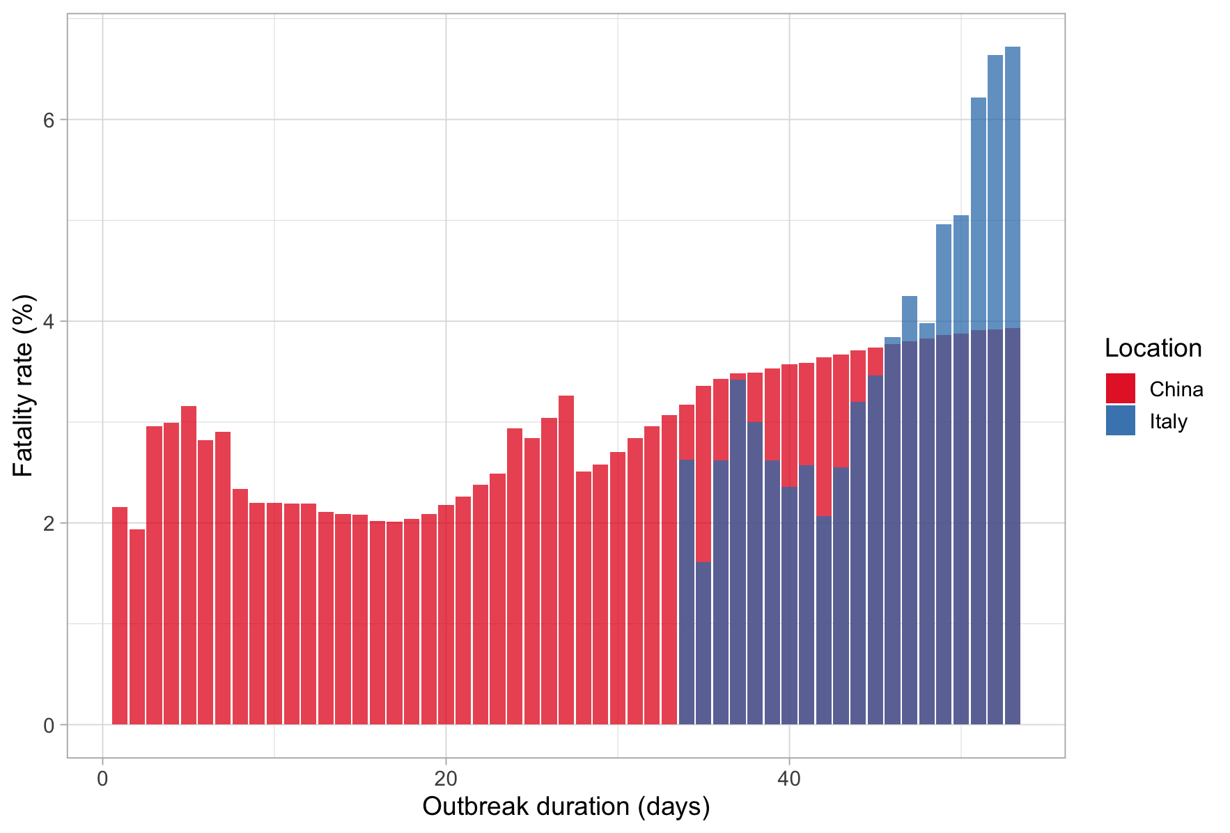
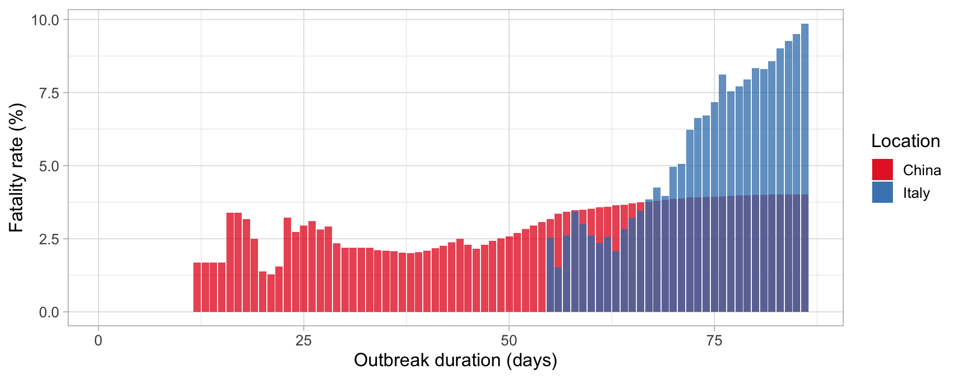
ggplot()+
  geom_bar(data=subset(dataset, location == "China"),
           aes(as.numeric(date)days, fatality, fill = "China"),
           stat = "identity", position = position_dodge(), alpha = .75)+

  geom_bar(data=subset(dataset, location == "Italy"),
           aes(as.numeric(date)days, fatality, fill = "Italy"),
           stat = "identity", position = position_dodge(), alpha = .75)+

  labs(x="Outbreak duration (days)", y= "Fatality rate (%)", fill = "Location")+
  scale_fill_brewer(palette = "Set1")+
  theme_light(14)
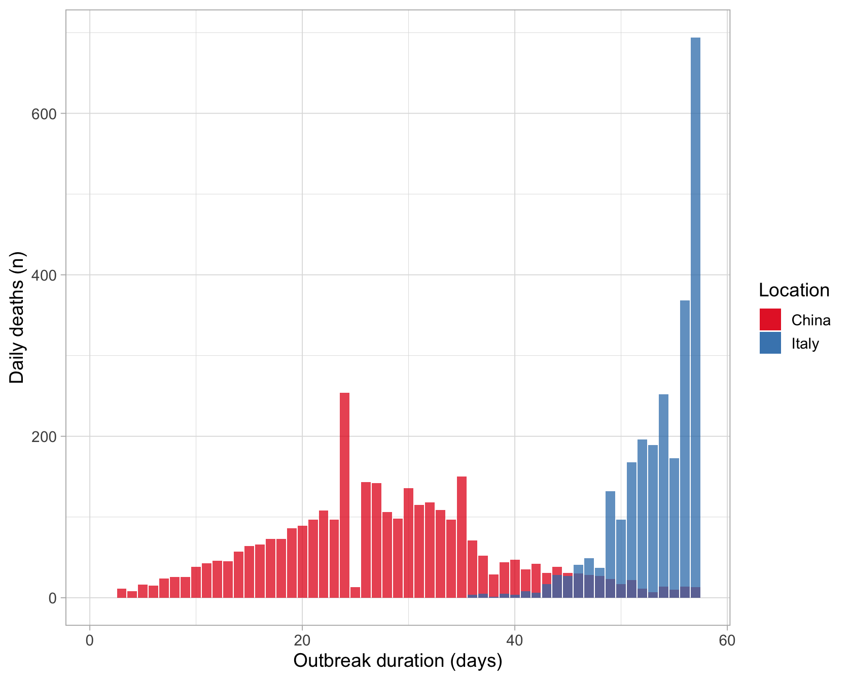
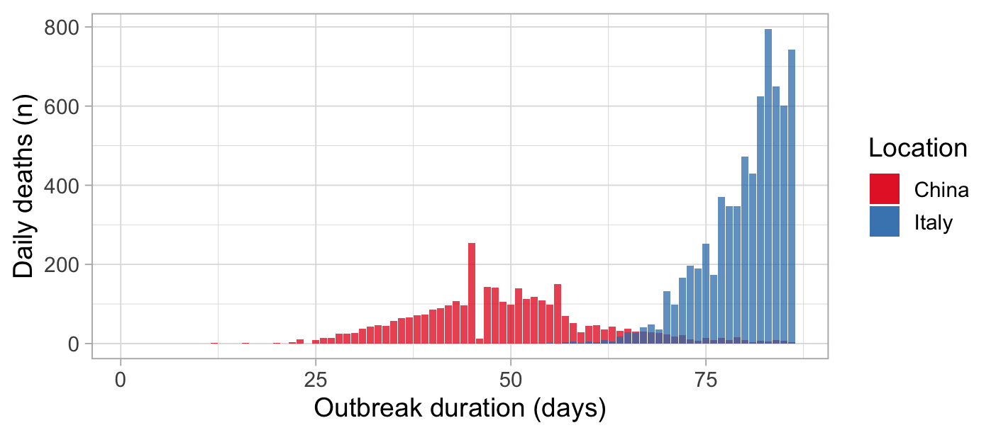
# Generating bar plot
library(ggplot2)
ggplot()+
  geom_bar(data=subset(dataset, location == "China"),
           aes(as.numeric(date)days, new_deaths, fill = "China"),
           stat = "identity", position = position_dodge(), alpha = .75)+

  geom_bar(data=subset(dataset, location == "Italy"),
           aes(as.numeric(date)days, new_deaths, fill = "Italy"),
           stat = "identity", position = position_dodge(), alpha = .75)+

  labs(x="Outbreak duration (days)", y= "Daily deaths (n)", fill = "Location")+
  scale_fill_brewer(palette = "Set1")+
  theme_light(14)

