This is a strange case of difference in fatality rate between Chinese and Italian covid-19 outbreak.
In my knowdledge, fatality rate is a ratio between deaths from a certain disease compared to the total number of subjects diagnosed with the disease.
Starting from this assumption, I attempted to analyze difference in fatality rate between Chinese/Italian outbreak. Herein, I propose a reproducible R example for exploring this variable:
# Import dataset from authoritative source:
# https://ourworldindata.org/coronavirus-source-data
covid <- read.csv("http://cowid.netlify.com/data/full_data.csv")

# Subsetting only data from China and Italy
dataset <- subset(covid, location == "China" | location == "Italy")

# Fatality ratio: is the proportion of deaths from a certain disease compared to the
# total number of people diagnosed with the disease for a certain period of time.
dataset$fatality <- round(dataset$total_deaths/dataset$total_cases*100, 2)

# Generating plot
library(ggplot2)
ggplot(dataset, aes(as.numeric(date), fatality, color = location, group = location))+
  geom_smooth(size= .5, alpha=.25, color = "gray65")+
  geom_line()+
  geom_point()+
  labs(x="Outbreak duration (days)", y= "Fatality rate (%)", color = "Location")+
  theme_light(14)
# Generating bar plot
library(ggplot2)
ggplot()+
  geom_bar(data=subset(dataset, location == "China"),
           aes(as.numeric(date), fatality, fill = "China"),
           stat = "identity", position = position_dodge(), alpha = .75)+

  geom_bar(data=subset(dataset, location == "Italy"),
           aes(as.numeric(date), fatality, fill = "Italy"),
           stat = "identity", position = position_dodge(), alpha = .75)+

  labs(x="Outbreak duration (days)", y= "Fatality rate (%)", fill = "Location")+
  scale_fill_brewer(palette = "Set1")+
  theme_light(14)
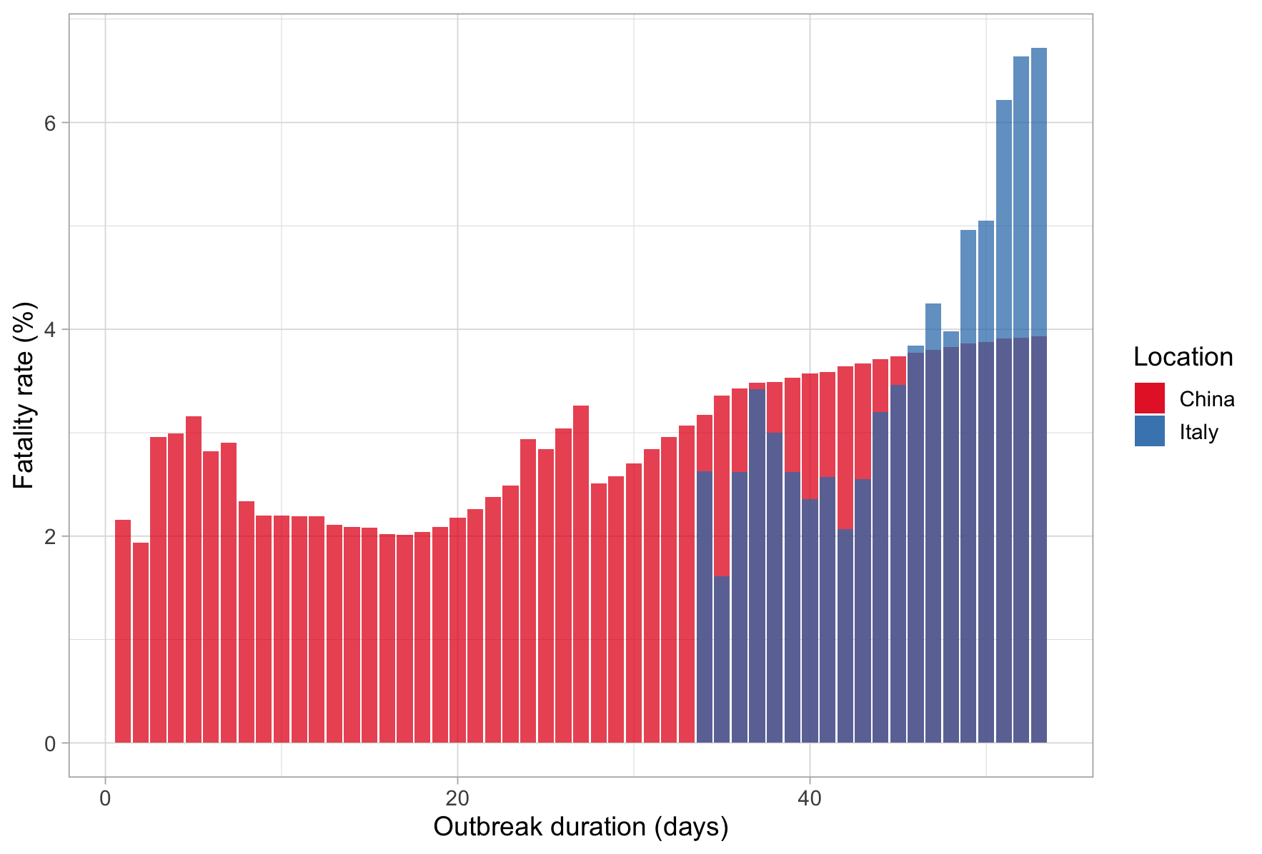
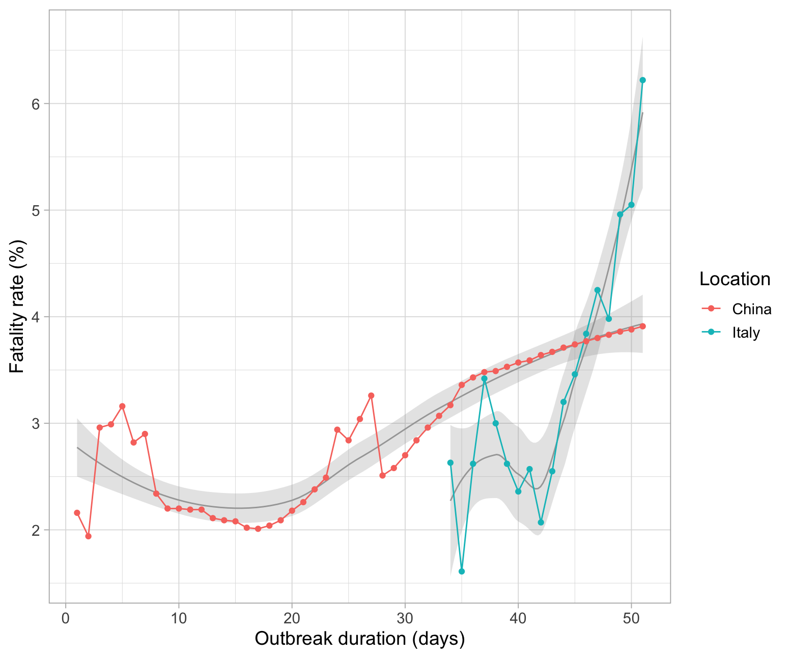
 From this basis, I'm a little bit confused about such difference in terms of fatality rate between the two analyzed countries. In fact, China has the maximum fatality rate at 4%, while Italy at more than 6%. For this reason I've two questions:
Is my computation correct?
If yes, why such a huge difference in terms of fatality rate?
EDT II
I would like to improve this question reporting a recent Science paper which can partially explain these differences. In fact, Li et al reported that for each COVID+ patient, other 5-10 are undocumented COVID+ leading to missleading fatality rate. Moreover, as reported in the comments, to date, there are no univocal diagnostic methods wordwide.
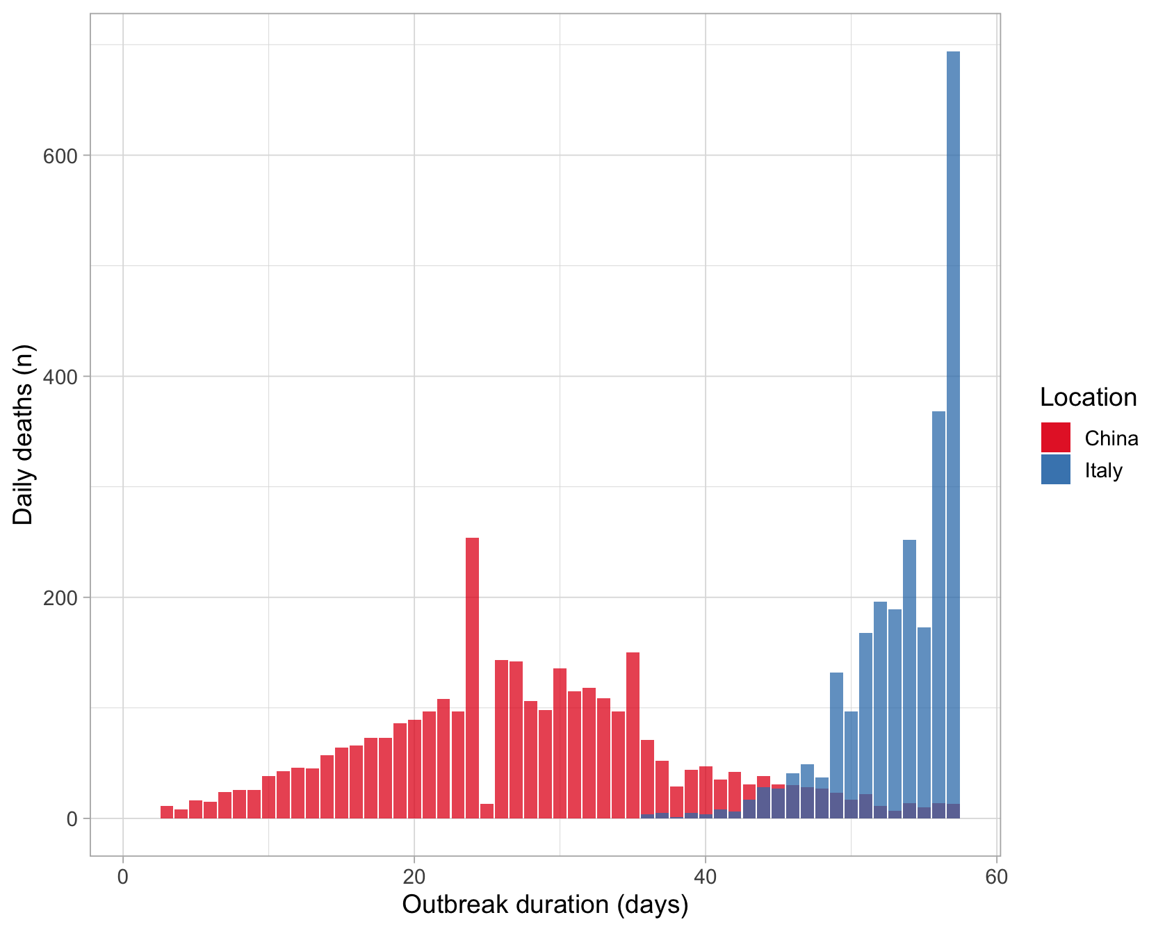
However, Italy is experiencing a huge increment in daily cumulative deaths compered to China:
# Generating bar plot
library(ggplot2)
ggplot()+
  geom_bar(data=subset(dataset, location == "China"),
           aes(as.numeric(date), new_deaths, fill = "China"),
           stat = "identity", position = position_dodge(), alpha = .75)+

  geom_bar(data=subset(dataset, location == "Italy"),
           aes(as.numeric(date), new_deaths, fill = "Italy"),
           stat = "identity", position = position_dodge(), alpha = .75)+

  labs(x="Outbreak duration (days)", y= "Daily deaths (n)", fill = "Location")+
  scale_fill_brewer(palette = "Set1")+
  theme_light(14)
Something is happening there! Hubei province is almost similar to Italy in terms of surface and population but very different in terms of population mean age since Italy is one of the oldest EU country.


