Question Protected by whuber
edited body
Source Link
CopperKettle
  • 1.2k
  • 13
  • 19

Below is a daily chart of newly-detected COVID infections in Krasnodar Krai, a region of Russia, from April 29 to May 19. The population of the region is 5.5 million people.

I read about it and wondered - does this (relatively smooth dynamics of new cases) look okay from the statistical standpoint? Or does this look suspicious? Can a curve be so level during an epidemic without any tinkering with the data by authorities of the region? In my home region, Sverdlovsk Oblast, for example, the chart is much more chaotic.

I'm an amateur atin statistics, so maybe I'm wrong and this chart is nothing out of the ordinary.

enter image description here

According to a news report from 18 May 2020, a total of 136695 tests for COVID-19 had been made in the region since the start of the epidemic period and up to that day.

As of 21 May 2020, a total of 2974 infections have been recorded in the region.

P.S. Here's a link I found to a page with better-looking statistics, and covering a longer period, specifically for Krasnodar Krai. On that page, you can hover your cursor over the chart to get specific numbers for the day. (The title uses term "daily elicited" number of cases, and the bar caption "daily confirmed" number of cases):

enter image description here

Below is a daily chart of newly-detected COVID infections in Krasnodar Krai, a region of Russia, from April 29 to May 19. The population of the region is 5.5 million people.

I read about it and wondered - does this (relatively smooth dynamics of new cases) look okay from the statistical standpoint? Or does this look suspicious? Can a curve be so level during an epidemic without any tinkering with the data by authorities of the region? In my home region, Sverdlovsk Oblast, for example, the chart is much more chaotic.

I'm an amateur at statistics, so maybe I'm wrong and this chart is nothing out of the ordinary.

enter image description here

According to a news report from 18 May 2020, a total of 136695 tests for COVID-19 had been made in the region since the start of the epidemic period and up to that day.

As of 21 May 2020, a total of 2974 infections have been recorded in the region.

P.S. Here's a link I found to a page with better-looking statistics, and covering a longer period, specifically for Krasnodar Krai. On that page, you can hover your cursor over the chart to get specific numbers for the day. (The title uses term "daily elicited" number of cases, and the bar caption "daily confirmed" number of cases):
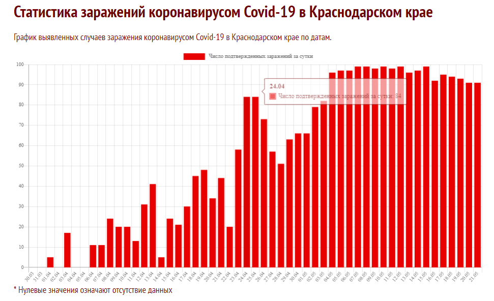
enter image description here

Below is a daily chart of newly-detected COVID infections in Krasnodar Krai, a region of Russia, from April 29 to May 19. The population of the region is 5.5 million people.

I read about it and wondered - does this (relatively smooth dynamics of new cases) look okay from the statistical standpoint? Or does this look suspicious? Can a curve be so level during an epidemic without any tinkering with the data by authorities of the region? In my home region, Sverdlovsk Oblast, for example, the chart is much more chaotic.

I'm an amateur in statistics, so maybe I'm wrong and this chart is nothing out of the ordinary.

enter image description here

According to a news report from 18 May 2020, a total of 136695 tests for COVID-19 had been made in the region since the start of the epidemic period and up to that day.

As of 21 May 2020, a total of 2974 infections have been recorded in the region.

P.S. Here's a link I found to a page with better-looking statistics, and covering a longer period, specifically for Krasnodar Krai. On that page, you can hover your cursor over the chart to get specific numbers for the day. (The title uses term "daily elicited" number of cases, and the bar caption "daily confirmed" number of cases):

enter image description here

Became Hot Network Question
Tweeted twitter.com/StackStats/status/1263530062219038720
added 111 characters in body
Source Link
ttnphns
  • 58.8k
  • 53
  • 287
  • 512

Below is a daily chart of newly-detected COVID infections in Krasnodar Krai, a region of Russia, from April 29 to May 19. The population of the region is 5.5 million people.

I read about it and wondered - does this (relatively smooth dynamics of new cases) look okay from the statistical standpoint? Or does this look suspicious? Can a curve be so level during an epidemic without any tinkering with the data by authorities of the region? In my home region, Sverdlovsk Oblast, for example, the chart is much more chaotic.

I'm an amateur at statistics, so maybe I'm wrong and this chart is nothing out of the ordinary.

enter image description here

According to a news report from 18 May 2020, a total of 136695 tests for COVID-19 had been made in the region since the start of the epidemic period and up to that day.

As of 21 May 2020, a total of 2974 infections have been recorded in the region.

P.S. Here's a link I found to a page with better-looking statistics, and covering a longer period, specifically for Krasnodar Krai. On that page, you can hover your cursor over the chart to get specific numbers for the day. (The title uses term "daily elicited" number of cases, and the bar caption "daily confirmed" number of cases):

enter image description here

Below is a daily chart of newly-detected COVID infections in Krasnodar Krai, a region of Russia, from April 29 to May 19. The population of the region is 5.5 million people.

I read about it and wondered - does this (relatively smooth dynamics of new cases) look okay from the statistical standpoint? Or does this look suspicious? Can a curve be so level during an epidemic without any tinkering with the data by authorities of the region? In my home region, Sverdlovsk Oblast, for example, the chart is much more chaotic.

I'm an amateur at statistics, so maybe I'm wrong and this chart is nothing out of the ordinary.

enter image description here

According to a news report from 18 May 2020, a total of 136695 tests for COVID-19 had been made in the region since the start of the epidemic period and up to that day.

As of 21 May 2020, a total of 2974 infections have been recorded in the region.

P.S. Here's a link I found to a page with better-looking statistics, and covering a longer period, specifically for Krasnodar Krai. On that page, you can hover your cursor over the chart to get specific numbers for the day:

enter image description here

Below is a daily chart of newly-detected COVID infections in Krasnodar Krai, a region of Russia, from April 29 to May 19. The population of the region is 5.5 million people.

I read about it and wondered - does this (relatively smooth dynamics of new cases) look okay from the statistical standpoint? Or does this look suspicious? Can a curve be so level during an epidemic without any tinkering with the data by authorities of the region? In my home region, Sverdlovsk Oblast, for example, the chart is much more chaotic.

I'm an amateur at statistics, so maybe I'm wrong and this chart is nothing out of the ordinary.

enter image description here

According to a news report from 18 May 2020, a total of 136695 tests for COVID-19 had been made in the region since the start of the epidemic period and up to that day.

As of 21 May 2020, a total of 2974 infections have been recorded in the region.

P.S. Here's a link I found to a page with better-looking statistics, and covering a longer period, specifically for Krasnodar Krai. On that page, you can hover your cursor over the chart to get specific numbers for the day. (The title uses term "daily elicited" number of cases, and the bar caption "daily confirmed" number of cases):

enter image description here

added 219 characters in body
Source Link
CopperKettle
  • 1.2k
  • 13
  • 19

Below is a daily chart of newly-detected COVID infections in Krasnodar Krai, a region of Russia, from April 29 to May 19. The population of the region is 5.5 million people.

I read about it and wondered - does this (relatively smooth dynamics of new cases) look okay from the statistical standpoint? Or does this look suspicious? Can a curve be so level during an epidemic without any tinkering with the data by authorities of the region? In my home region, Sverdlovsk Oblast, for example, the chart is much more chaotic.

I'm an amateur at statistics, so maybe I'm wrong and this chart is nothing out of the ordinary.

enter image description here

According to a news report from 18 May 2020, a total of 136695 tests for COVID-19 had been made in the region since the start of the epidemic period and up to that day.

As of 21 May 2020, a total of 2974 infections have been recorded in the region.

P.S. Here's a link I found to a page with better-looking statistics, and covering a longer period, specifically for Krasnodar Krai. On that page, you can hover your cursor over the chart to get specific numbers for the day:

enter image description here

Below is a daily chart of newly-detected COVID infections in Krasnodar Krai, a region of Russia, from April 29 to May 19. The population of the region is 5.5 million people.

I read about it and wondered - does this (relatively smooth dynamics of new cases) look okay from the statistical standpoint? Or does this look suspicious? Can a curve be so level during an epidemic without any tinkering with the data by authorities of the region? In my home region, Sverdlovsk Oblast, for example, the chart is much more chaotic.

I'm an amateur at statistics, so maybe I'm wrong and this chart is nothing out of the ordinary.

enter image description here

According to a news report from 18 May 2020, a total of 136695 tests for COVID-19 had been made in the region since the start of the epidemic period and up to that day.

As of 21 May 2020, a total of 2974 infections have been recorded in the region.

P.S. Here's a link I found to a page with better-looking statistics, and covering a longer period, specifically for Krasnodar Krai. On that page, you can hover your cursor over the chart to get specific numbers for the day:

enter image description here

added 71 characters in body; edited tags; edited tags
Source Link
ttnphns
  • 58.8k
  • 53
  • 287
  • 512
Loading
added 5 characters in body
Source Link
CopperKettle
  • 1.2k
  • 13
  • 19
Loading
added 81 characters in body
Source Link
CopperKettle
  • 1.2k
  • 13
  • 19
Loading
deleted 3 characters in body
Source Link
CopperKettle
  • 1.2k
  • 13
  • 19
Loading
added 186 characters in body
Source Link
CopperKettle
  • 1.2k
  • 13
  • 19
Loading
added 52 characters in body
Source Link
CopperKettle
  • 1.2k
  • 13
  • 19
Loading
Post Reopened by gung - Reinstate Monica
added 72 characters in body
Source Link
CopperKettle
  • 1.2k
  • 13
  • 19
Loading
Post Closed as "Opinion-based" by Tim
Source Link
CopperKettle
  • 1.2k
  • 13
  • 19
Loading