edited tags; edited title
Link
Glen_b
  • 290.5k
  • 37
  • 652
  • 1.1k

Normal Does the normal probability plot systematically underestimatesunderestimate the mean?

added 527 characters in body
Source Link
qed
  • 2.8k
  • 4
  • 26
  • 36

A normal probability plot is defined as a plot of $n$ pairs:

($[100(i-0.5)/n]$ th $z$ percentile, $i$th observation).

Theoretically the points should fall close to a straight line with slope $\sigma$ and intercept $\mu$, the population sd and mean of the observed random variable. But as shown in simulation results with R, the intercept seems always lower than $\mu$, why?

Here is the R code that I used:

    simu = function(n) {
        y = sort(rnorm(n, 40, .1))
        yperc = ((1:n)-.5)/n
        x = qnorm(yperc)
        plot(x,y)
    }
    simu(10000)

And the plot I get:
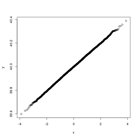
enter image description here

Also, the points in the middle always look denser than those on the two sides, why?


The link @whuber gave in the comments is really helpful. I will just write down some notes here for future reference. Imposing a linear percentage function on the orders, and under the restriction of symmetry, we have $f(i) = ai + b$, $f(n+1-i) = a(n+1-i) + b$, also $f(n+1-i) + f(i) = 1$, combining these, we get $a(n+1) + 2b = 1$, giving $a$ an arbitrary value of $1/n$, then $b$ has to be equal to $-0.5/n$.

A normal probability plot is defined as a plot of $n$ pairs:

($[100(i-0.5)/n]$ th $z$ percentile, $i$th observation).

Theoretically the points should fall close to a straight line with slope $\sigma$ and intercept $\mu$, the population sd and mean of the observed random variable. But as shown in simulation results with R, the intercept seems always lower than $\mu$, why?

Here is the R code that I used:

    simu = function(n) {
        y = sort(rnorm(n, 40, .1))
        yperc = ((1:n)-.5)/n
        x = qnorm(yperc)
        plot(x,y)
    }
    simu(10000)

And the plot I get:

enter image description here

Also, the points in the middle always look denser than those on the two sides, why?


The link @whuber gave in the comments is really helpful. I will just write down some notes here for future reference. Imposing a linear percentage function on the orders, and under the restriction of symmetry, we have $f(i) = ai + b$, $f(n+1-i) = a(n+1-i) + b$, also $f(n+1-i) + f(i) = 1$, combining these, we get $a(n+1) + 2b = 1$, giving $a$ an arbitrary value of $1/n$, then $b$ has to be equal to $-0.5/n$.

edited tags
Link
whuber
  • 333.6k
  • 63
  • 792
  • 1.3k
Source Link
qed
  • 2.8k
  • 4
  • 26
  • 36
Loading