added 664 characters in body
Source Link
BruceET
  • 57.6k
  • 2
  • 36
  • 94

In R, the procedure density gives a kernel density estimator (KDE) of data.

In order to get a suitable histogram of the very heavy tailed Cauchy distribution, it is usually necessary to disregard more than a few values in the tails of the sample.

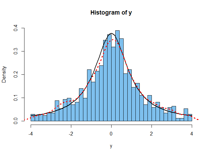
Then in order show the actual Cauchy density curve (black below), it is necessary to adjust the density by dividing by the proportion of the sample plotted in the histogram.

Also, to get a the best KDE (dotted red) you may need to use parameter adj tp adjust the default bandwidth. (I used the default.) Of course, the histogram would be 'smoother' if it had fewer bins; the KDE is made entirely without reference to the histogram.

By adjusting the proportion of the sample plotted, the bandwidth of the KDE, and the sample size, you may be able to improve on my plot below. But the agreement of the density function and the KDE in the the plot below is roughly typical for samples of size 500 to 1000.

enter image description here

R code for figure:

k = diff(pt(c(-4,4),1))
set.seed(2022)
w = rt(1000, 1)        # whole sample, size 1000
y = w[x > -4 & w < 4]  # 861 plotted points
length(y)
[1] 861

hist(y, prob=T, ylim=c(0,.4), br=50, col="skyblue2")
 curve(dt(x,1)/k, add=T, lwd=2)
 lines(density(y), col="red", lwd=2, lty="dotted")

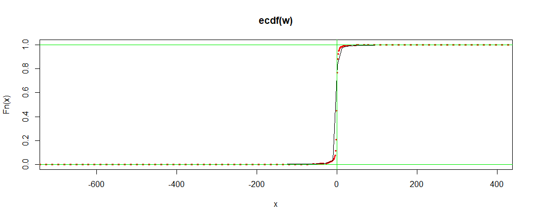
Note: For moderately large samples, the empirical CDF (ECDF) of the sample matches the density function of the population very well. The test statistic $D$ of the Kolmogorov-Smirnov goodness-of-fit test, is the maximum vertical distance between the two.

enter image description here

plot(ecdf(w), lwd=3, col="red", lty="dotted")
 curve(pt(x,1), add=T)
  abline(v=0, col="green2")
  abline(h=0:1, col="green2")

ks.test(w, pt, 1)

        One-sample Kolmogorov-Smirnov test

data:  w
D = 0.018508, p-value = 0.8832
alternative hypothesis: two-sided

In R, the procedure density gives a kernel density estimator (KDE) of data.

In order to get a suitable histogram of the very heavy tailed Cauchy distribution, it is usually necessary to disregard more than a few values in the tails of the sample.

Then in order show the actual Cauchy density curve (black below), it is necessary to adjust the density by dividing by the proportion of the sample plotted in the histogram.

Also, to get a the best KDE (dotted red) you may need to use parameter adj tp adjust the default bandwidth. (I used the default.) Of course, the histogram would be 'smoother' if it had fewer bins; the KDE is made entirely without reference to the histogram.

By adjusting the proportion of the sample plotted, the bandwidth of the KDE, and the sample size, you may be able to improve on my plot below. But the agreement of the density function and the KDE in the the plot below is roughly typical for samples of size 500 to 1000.

enter image description here

R code for figure:

k = diff(pt(c(-4,4),1))
set.seed(2022)
w = rt(1000, 1)        # whole sample, size 1000
y = w[x > -4 & w < 4]  # 861 plotted points
length(y)
[1] 861

hist(y, prob=T, ylim=c(0,.4), br=50, col="skyblue2")
 curve(dt(x,1)/k, add=T, lwd=2)
 lines(density(y), col="red", lwd=2, lty="dotted")

Note: For moderately large samples, the empirical CDF (ECDF) of the sample matches the density function of the population very well. The test statistic $D$ of the Kolmogorov-Smirnov goodness-of-fit test, is the maximum vertical distance between the two.

enter image description here

plot(ecdf(w), lwd=3, col="red", lty="dotted")
 curve(pt(x,1), add=T)
  abline(v=0, col="green2")
  abline(h=0:1, col="green2")

ks.test(w, pt, 1)

        One-sample Kolmogorov-Smirnov test

data:  w
D = 0.018508, p-value = 0.8832
alternative hypothesis: two-sided
added 5 characters in body
Source Link
BruceET
  • 57.6k
  • 2
  • 36
  • 94

In R, the procedure density gives a kernel density estimator (KDE) of data.

In order to get a suitable histogram of the very heavy tailed Cauchy distribution, it is usually necessary to omitdisregard more than a few values in the tails of the sample.

Then in order show the actual Cauchy density curve (black below), it is necessary to adjust the density by dividing by the proportion of the sample plotted in the histogram.

Also, to get a the best KDE (dotted red) you may need to use parameter adj tp adjust the default bandwidth. (I used the default.) Of course, the histogram would be 'smoother' if it had fewer bins; the KDE is made entirely without reference to the histogram.

By adjusting the proportion of the sample plotted, the bandwidth of the KDE, and the sample size, you may be able to improve on my plot below. But the agreement of the density function and the KDE in the the plot below is roughly typical for samples of size 500 to 1000.

enter image description here

R code for figure:

k = diff(pt(c(-4,4),1))
set.seed(2022)
w = rt(1000, 1)        # whole sample, size 1000
y = w[x > -4 & w < 4]  # 861 plotted points
length(y)
[1] 861

hist(y, prob=T, ylim=c(0,.4), br=50, col="skyblue2")
 curve(dt(x,1)/k, add=T, lwd=2)
 lines(density(y), col="red", lwd=2, lty="dotted")

In R, the procedure density gives a kernel density estimator (KDE) of data.

In order to get a suitable histogram of the very heavy tailed Cauchy distribution, it is usually necessary to omit more than a few values in the tails of the sample.

Then in order show the actual Cauchy density curve (black below), it is necessary to adjust the density by dividing by the proportion of the sample plotted in the histogram.

Also, to get a the best KDE (dotted red) you may need to use parameter adj tp adjust the default bandwidth. (I used the default.) Of course, the histogram would be 'smoother' if it had fewer bins; the KDE is made entirely without reference to the histogram.

By adjusting the proportion of the sample plotted, the bandwidth of the KDE, and the sample size, you may be able to improve on my plot below. But the agreement of the density function and the KDE in the the plot below is roughly typical for samples of size 500 to 1000.

enter image description here

R code for figure:

k = diff(pt(c(-4,4),1))
set.seed(2022)
w = rt(1000, 1)        # whole sample, size 1000
y = w[x > -4 & w < 4]  # 861 plotted points
length(y)
[1] 861

hist(y, prob=T, ylim=c(0,.4), br=50, col="skyblue2")
 curve(dt(x,1)/k, add=T, lwd=2)
 lines(density(y), col="red", lwd=2, lty="dotted")

In R, the procedure density gives a kernel density estimator (KDE) of data.

In order to get a suitable histogram of the very heavy tailed Cauchy distribution, it is usually necessary to disregard more than a few values in the tails of the sample.

Then in order show the actual Cauchy density curve (black below), it is necessary to adjust the density by dividing by the proportion of the sample plotted in the histogram.

Also, to get a the best KDE (dotted red) you may need to use parameter adj tp adjust the default bandwidth. (I used the default.) Of course, the histogram would be 'smoother' if it had fewer bins; the KDE is made entirely without reference to the histogram.

By adjusting the proportion of the sample plotted, the bandwidth of the KDE, and the sample size, you may be able to improve on my plot below. But the agreement of the density function and the KDE in the the plot below is roughly typical for samples of size 500 to 1000.

enter image description here

R code for figure:

k = diff(pt(c(-4,4),1))
set.seed(2022)
w = rt(1000, 1)        # whole sample, size 1000
y = w[x > -4 & w < 4]  # 861 plotted points
length(y)
[1] 861

hist(y, prob=T, ylim=c(0,.4), br=50, col="skyblue2")
 curve(dt(x,1)/k, add=T, lwd=2)
 lines(density(y), col="red", lwd=2, lty="dotted")
added 29 characters in body
Source Link
BruceET
  • 57.6k
  • 2
  • 36
  • 94

In R, the procedure density gives a kernel density estimator (KDE) of data.

In order to get a suitable histogram of the very heavy tailed Cauchy distribution, it is usually necessary to omit more than a few values in the tails of the sample.

Then in order show the actual Cauchy density curve (black below), it is necessary to adjust the density by dividing by the proportion of the sample plotted in the histogram.

Also, to get a the best KDE (dotted red) you may need to use parameter adj tp adjust the default bandwidth. (I used the default.) Of course, the histogram would be 'smoother' if it had fewer bins; the KDE is made entirely without reference to the histogram.

By adjusting the proportion of the sample plotted, the bandwidth of the KDE, and the sample size, you may be able to improve on my plot below. But the agreement of the density function and the KDE in the the plot below is roughly typical for samples of size 500 to 1000.

enter image description here

R code for figure:

k = diff(pt(c(-4,4),1))
set.seed(2022)
w = rt(1000, 1)        # whole sample, size 1000
y = w[x > -4 & w < 4]  # 861 plotted points
length(y)
[1] 861

hist(y, prob=T, ylim=c(0,.4), br=50, col="skyblue2")
 curve(dt(x,1)/k, add=T, lwd=2)
 lines(density(y), col="red", lwd=2, lty="dotted")

In R, the procedure density gives a kernel density estimator (KDE) of data.

In order to get a suitable histogram of the very heavy tailed Cauchy distribution, it is usually necessary to omit more than a few values in the tails of the sample.

Then in order show the actual Cauchy density curve (black below), it is necessary to adjust the density by dividing by the proportion of the sample plotted in the histogram.

Also, to get a the best KDE (dotted red) you may need to use parameter adj tp adjust the default bandwidth. (I used the default.)

By adjusting the proportion of the sample plotted, the bandwidth of the KDE, and the sample size, you may be able to improve on my plot below. But the agreement of the density function and the KDE in the the plot below is roughly typical for samples of size 500 to 1000.

enter image description here

R code for figure:

k = diff(pt(c(-4,4),1))
set.seed(2022)
w = rt(1000, 1)        # whole sample, size 1000
y = w[x > -4 & w < 4]  # 861 plotted points
length(y)
[1] 861

hist(y, prob=T, ylim=c(0,.4), br=50, col="skyblue2")
 curve(dt(x,1)/k, add=T, lwd=2)
 lines(density(y), col="red", lwd=2, lty="dotted")

In R, the procedure density gives a kernel density estimator (KDE) of data.

In order to get a suitable histogram of the very heavy tailed Cauchy distribution, it is usually necessary to omit more than a few values in the tails of the sample.

Then in order show the actual Cauchy density curve (black below), it is necessary to adjust the density by dividing by the proportion of the sample plotted in the histogram.

Also, to get a the best KDE (dotted red) you may need to use parameter adj tp adjust the default bandwidth. (I used the default.) Of course, the histogram would be 'smoother' if it had fewer bins; the KDE is made entirely without reference to the histogram.

By adjusting the proportion of the sample plotted, the bandwidth of the KDE, and the sample size, you may be able to improve on my plot below. But the agreement of the density function and the KDE in the the plot below is roughly typical for samples of size 500 to 1000.

enter image description here

R code for figure:

k = diff(pt(c(-4,4),1))
set.seed(2022)
w = rt(1000, 1)        # whole sample, size 1000
y = w[x > -4 & w < 4]  # 861 plotted points
length(y)
[1] 861

hist(y, prob=T, ylim=c(0,.4), br=50, col="skyblue2")
 curve(dt(x,1)/k, add=T, lwd=2)
 lines(density(y), col="red", lwd=2, lty="dotted")
added 29 characters in body
Source Link
BruceET
  • 57.6k
  • 2
  • 36
  • 94
Loading
added 148 characters in body
Source Link
BruceET
  • 57.6k
  • 2
  • 36
  • 94
Loading
Source Link
BruceET
  • 57.6k
  • 2
  • 36
  • 94
Loading