You have a hypothesis: more rain, less singing. That seems reasonable.
Your logistic regression however says something else as the main effect of rain is strongly positive: the more rain, the higher probability of singing. That's inconvenient but you cannot ignore it in your interpretation. (Instead you can run diagnostic checks that the data is coded correctly and that the model fits the data well.)
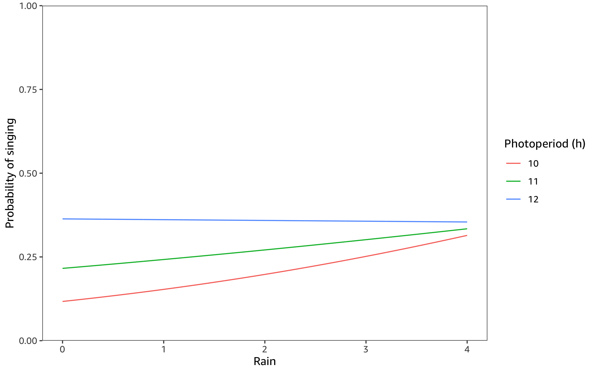
As you have yourself suggested, an effective way to describe the regression is a partial effects plot that shows the effect of rain onhow the probability of singing varies with rain, holding the other predictors to meaningful values.
I use the reported coefficients to make a partial effects plot for rain at the upper, lower and mid-point of photoperiod and no wind. The model consistently predicts higher probability of singing with more rain, though the effect decreases as photoperiod increases.
Here is the R code to make the partial effects plot.
library("tidyverse")

predict_singing <- function(dat) {
  dat %>%
    mutate(
      log_odds =
        -9.32
        + 0.73 * Photoperiod + 1.91 * Rain - 0.28 * Wind
          - 0.16 * Photoperiod * Rain
          + 0.02 * Photoperiod * Wind,
      probability = plogis(log_odds)
    )
}

n <- 1000

newdata <- crossing(
  # Photoperiod ranges from 10h in winter to 12h in summer
  Photoperiod = c(10, 11, 12),
  # Rain is measured on a 5 point scale from 0 to 4
  Rain = seq(0, 4, length.out = n),
  # No wind
  Wind = 0
)

newdata %>%
  predict_singing() %>%
  ggplot(
    aes(Rain, probability, color = as.factor(Photoperiod))
  ) +
  geom_line() +
  scale_y_continuous(
    limits = c(0, 1),
    expand = c(0, 0)
  ) +
  scale_color_discrete(
    name = "Photoperiod (h)"
  ) +
  labs(
    y = "Probability of singing"
  )
```

