1
$\begingroup$

I'm having difficulty wrapping my head around my results from a logistic regression model I ran.

In a nutshell, I'm trying to determine if singing behavior in a songbird is influenced by environmental factors.

My model is as follows: Singing (yes or no) = B0 + B1 x Photoperiod + B2 x Rain + B3 x Wind + B4 x Photoperiod x Rain + B5 x Photoperiod x Wind + error

Here's the output of the logistic regression:

enter image description here

I know I cannot interpret B2 and B3 like in a standard regression (i.e., one without interaction terms). But instead have to interpret them as the relationship of rain and wind with singing (respectively) when photoperiod is 0.

So my question is - what does that mean? The interaction effect plot of B4 shows a negative relationship of rain with singing probability (shown as detection on the y-axis) but the plot of just B2 (sorry it's so poorly done) when photoperiod = 0 shows a positive relationship of rain with singing probability.

That seems contradictory to me. Are B2 and B3 even relevant to discuss? After all, photoperiod cannot ever be zero at these study sites (it ranges from ~10h in winter to ~12h in summer). So, under real-life circumstances, rain should have a negative influence on singing behavior, correct?

Thanks in advance for any assistance y'all can provide!!

$\endgroup$
3
  • 2
    $\begingroup$ Welcome to Cross Validated! How would you do it in a linear regression? $\endgroup$
    – Dave
    Commented Apr 1, 2022 at 19:24
  • 1
    $\begingroup$ Math is helpful but partial effect plots are better. That's what the interaction plot is. However, yours doesn't look right as the effect of rain seems linear on the probability scale but actually it is linear on the log odds scale. (That's what the math tells us.) $\endgroup$
    – dipetkov
    Commented Apr 1, 2022 at 20:32
  • $\begingroup$ It's often advised not to interpret the results of main effects in an interaction for this reason. Your main effect is telling you something out of the bounds of your data, but necessary for understanding the actual probability of singing across the range of studied photoperiod (and the other variable) values, rather than the change in probability. Your data is telling you that, at the shortest photoperiod(s) in your study, rain was associated (maybe not significantly) with an increase in singing, but that, as photoperiod increased, increasing rain was associated with a decrease in singing. $\endgroup$
    – Picapica
    Commented Apr 2, 2022 at 11:40

1 Answer 1

3
$\begingroup$

You have a hypothesis: more rain, less singing. That seems reasonable.

Your logistic regression however says something else as the main effect of rain is strongly positive: the more rain, the higher probability of singing. That's inconvenient but you cannot ignore it in your interpretation. (Instead you can run diagnostic checks that the data is coded correctly and that the model fits the data well.)

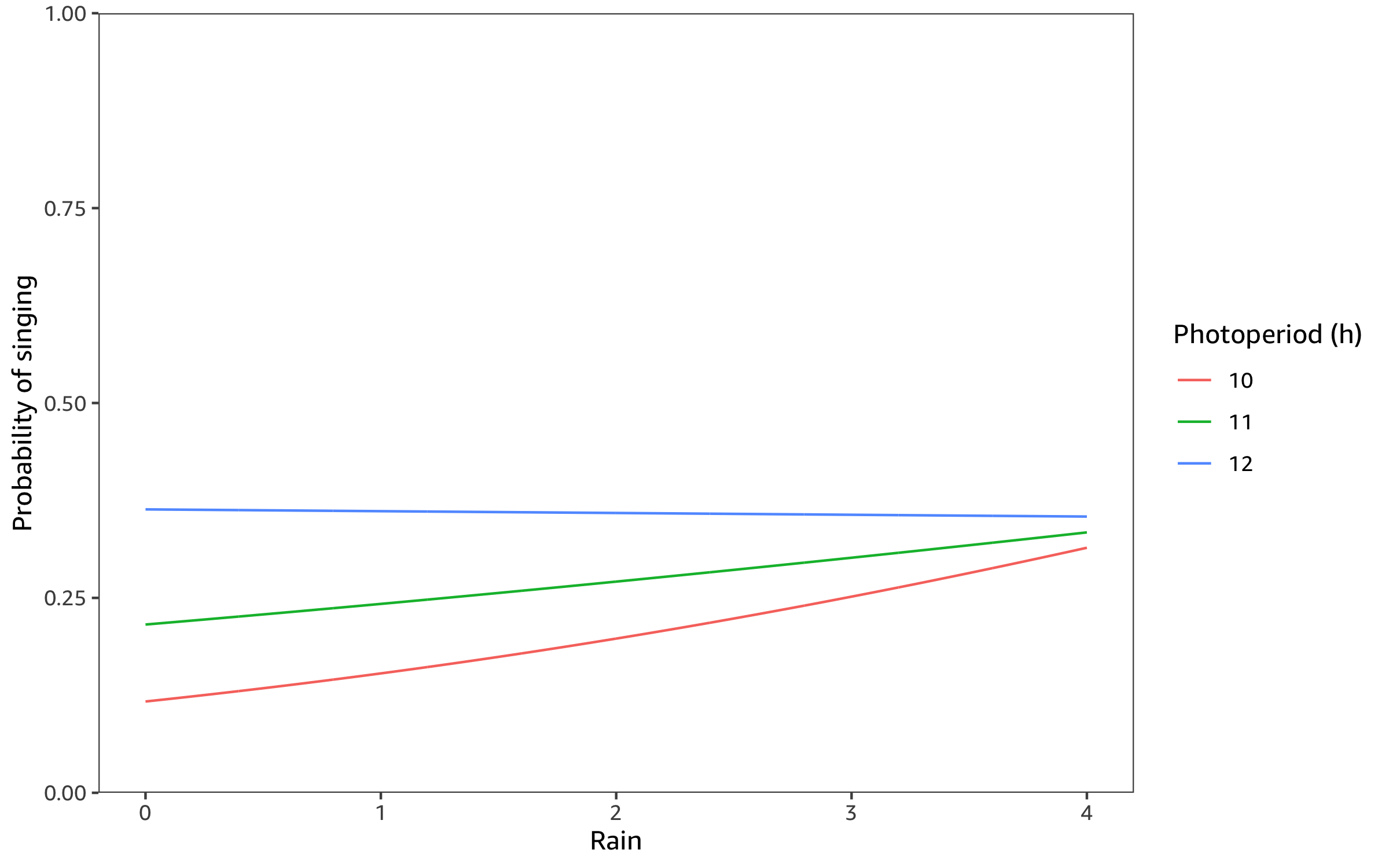
As you have yourself suggested, an effective way to describe the regression is a partial effects plot that shows how the probability of singing varies with rain, holding the other predictors to meaningful values.

I use the reported coefficients to make a partial effects plot for rain at the upper, lower and mid-point of photoperiod and no wind. The model consistently predicts higher probability of singing with more rain, though the effect decreases as photoperiod increases.

enter image description here

Here is the R code to make the partial effects plot.

library("tidyverse")

predict_singing <- function(dat) {
  dat %>%
    mutate(
      log_odds =
        -9.32
        + 0.73 * Photoperiod + 1.91 * Rain - 0.28 * Wind
          - 0.16 * Photoperiod * Rain
          + 0.02 * Photoperiod * Wind,
      probability = plogis(log_odds)
    )
}

n <- 1000

newdata <- crossing(
  # Photoperiod ranges from 10h in winter to 12h in summer
  Photoperiod = c(10, 11, 12),
  # Rain is measured on a 5 point scale from 0 to 4
  Rain = seq(0, 4, length.out = n),
  # No wind
  Wind = 0
)

newdata %>%
  predict_singing() %>%
  ggplot(
    aes(Rain, probability, color = as.factor(Photoperiod))
  ) +
  geom_line() +
  scale_y_continuous(
    limits = c(0, 1),
    expand = c(0, 0)
  ) +
  scale_color_discrete(
    name = "Photoperiod (h)"
  ) +
  labs(
    y = "Probability of singing"
  )
```
$\endgroup$
1

Not the answer you're looking for? Browse other questions tagged or ask your own question.