A tangent suggestion since this thread has come to the top... Ordering groups alphabetically is rarely meaningful for plotting. If a better ordering doesn't exists, as it may be the case for names of salesman, you can hierarchically cluster the salesmen and use the ladderized dendrogram to bring similar salesman close to each other in the plot panels. (It sounds quite messy and complex but it's not that bad and I had good results with gene expression data).
It works nicely when you have more than a few groups so for the sake of example I'm going to duplicate the OP's dataset to have 12 salesmen:
library(data.table)
library(ggplot2)
library(dendextend)

set.seed(1234)

df1<-read.csv(header=TRUE,text=
    "dates,product,salesman,sales
    2015-05-01,Product1,Salesman1,100
    2015-05-01,Product1,Salesman2,300
    2015-05-01,Product1,Salesman3,400
    2015-05-01,Product1,Salesman4,120
    2015-05-01,Product1,Salesman5,290
    2015-05-01,Product1,Salesman6,210
    2015-05-01,Product2,Salesman1,500
    2015-05-01,Product2,Salesman2,90
    2015-05-01,Product2,Salesman3,100
    2015-05-01,Product2,Salesman4,50
    2015-05-01,Product2,Salesman5,320
    2015-05-01,Product2,Salesman6,120
    2015-05-09,Product1,Salesman1,10
    2015-05-09,Product1,Salesman2,200
    2015-05-09,Product1,Salesman3,400
    2015-05-09,Product2,Salesman1,200
    2015-05-09,Product2,Salesman2,40
    2015-05-09,Product2,Salesman3,10
    2015-05-09,Product2,Salesman4,120
    2015-05-09,Product2,Salesman5,20
    2015-05-09,Product2,Salesman6,500
    2015-05-20,Product1,Salesman1,100
    2015-05-20,Product1,Salesman2,300
    2015-05-20,Product1,Salesman3,400
    2015-05-20,Product2,Salesman1,200
    2015-05-20,Product2,Salesman2,180
    2015-05-20,Product2,Salesman3,20
    2015-05-20,Product2,Salesman4,20
    2015-05-20,Product2,Salesman5,40
    2015-05-20,Product2,Salesman6,40")
df1<-as.data.table(df1)
levels(df1$dates) <- c('2015-05-01', '2015-05-09', '2015-05-20')
df2 <- copy(df1)
df2[, salesman := sprintf('A%s', salesman)]
df2[, sales := rpois(n=length(sales), sales * 1.2)]
df1 <- rbind(df1, df2)
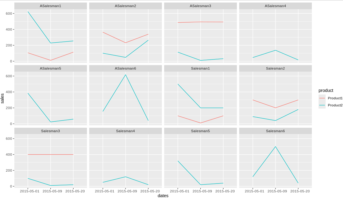
Alphabetical ordering makes it difficult to notice for example that "A Salesman 4" is similar to "Salesman 4":
gg <- ggplot(data=df1, aes(x=dates, y=sales, group=product, colour=product)) +
    geom_line() +
    facet_wrap(~salesman, ncol=4)

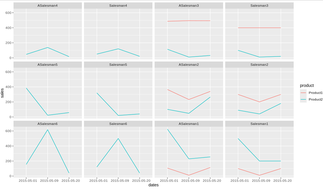
However, after clustering and reordering some similarities become clear:
mat <- dcast(salesman ~ dates, value.var='sales', data=df1[product == 'Product2'])
mat <- scale(as.matrix(mat, rownames='salesman'))
hc <- ladderize(as.dendrogram(hclust(dist(mat))))
df1[, salesman2 := factor(salesman, labels(hc))]

gg <- ggplot(data=df1, aes(x=dates, y=sales, group=product, colour=product)) +
    geom_line() +
    facet_wrap(~salesman2, ncol=4)
"A Salesman4" is next to "Salesman4" and "3" is closer to "5" (since I clustered on Product2)
