I have a data set that looks like the following:
dates, product, salesman, sales
2015-05-01, Product1, Salesman1, 100
2015-05-01, Product1, Salesman2, 300
2015-05-01, Product1, Salesman3, 400
2015-05-01, Product1, Salesman4, 120
2015-05-01, Product1, Salesman5, 290
2015-05-01, Product1, Salesman6, 210
2015-05-01, Product2, Salesman1, 500
2015-05-01, Product2, Salesman2, 90
2015-05-01, Product2, Salesman3, 100
2015-05-01, Product2, Salesman4, 50
2015-05-01, Product2, Salesman5, 320
2015-05-01, Product2, Salesman6, 120
2015-05-09, Product1, Salesman1, 10
2015-05-09, Product1, Salesman2, 200
2015-05-09, Product1, Salesman3, 400
2015-05-09, Product2, Salesman1, 200
2015-05-09, Product2, Salesman2, 40
2015-05-09, Product2, Salesman3, 10
2015-05-09, Product2, Salesman4, 120
2015-05-09, Product2, Salesman5, 20
2015-05-09, Product2, Salesman6, 500
2015-05-20, Product1, Salesman1, 100
2015-05-20, Product1, Salesman2, 300
2015-05-20, Product1, Salesman3, 400
2015-05-20, Product2, Salesman1, 200
2015-05-20, Product2, Salesman2, 180
2015-05-20, Product2, Salesman3, 20
2015-05-20, Product2, Salesman4, 20
2015-05-20, Product2, Salesman5, 40
2015-05-20, Product2, Salesman6, 40
And I need to visualise this effectively. Currently, I am using the following visualisation (visualisation code along with data generation)
df1 <- read.csv(header = TRUE, text =
    "dates, product, salesman, sales
    2015-05-01, Product1, Salesman1, 100
    2015-05-01, Product1, Salesman2, 300
    2015-05-01, Product1, Salesman3, 400
    2015-05-01, Product1, Salesman4, 120
    2015-05-01, Product1, Salesman5, 290
    2015-05-01, Product1, Salesman6, 210
    2015-05-01, Product2, Salesman1, 500
    2015-05-01, Product2, Salesman2, 90
    2015-05-01, Product2, Salesman3, 100
    2015-05-01, Product2, Salesman4, 50
    2015-05-01, Product2, Salesman5, 320
    2015-05-01, Product2, Salesman6, 120
    2015-05-09, Product1, Salesman1, 10
    2015-05-09, Product1, Salesman2, 200
    2015-05-09, Product1, Salesman3, 400
    2015-05-09, Product2, Salesman1, 200
    2015-05-09, Product2, Salesman2, 40
    2015-05-09, Product2, Salesman3, 10
    2015-05-09, Product2, Salesman4, 120
    2015-05-09, Product2, Salesman5, 20
    2015-05-09, Product2, Salesman6, 500
    2015-05-20, Product1, Salesman1, 100
    2015-05-20, Product1, Salesman2, 300
    2015-05-20, Product1, Salesman3, 400
    2015-05-20, Product2, Salesman1, 200
    2015-05-20, Product2, Salesman2, 180
    2015-05-20, Product2, Salesman3, 20
    2015-05-20, Product2, Salesman4, 20
    2015-05-20, Product2, Salesman5, 40
    2015-05-20, Product2, Salesman6, 40")


levels(df1$dates) <- c('2015-05-01', '2015-05-09', '2015-05-20', '2015-05-01')

library(ggplot2)
library(magrittr)


df1 %>% ggplot(aes(x = dates, y = salesman)) + geom_tile(aes(fill = sales), colour = 'white') + scale_fill_gradient(low = 'white', high = 'steelblue') + theme_bw() + theme
(panel.grid = element_blank(), panel.border = element_blank()) + facet_grid(product ~ ., scales = 'free')
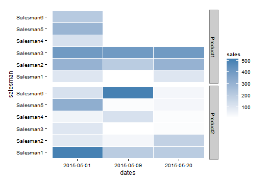
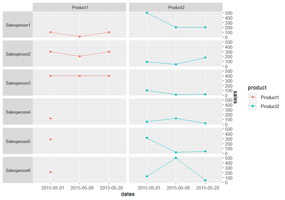
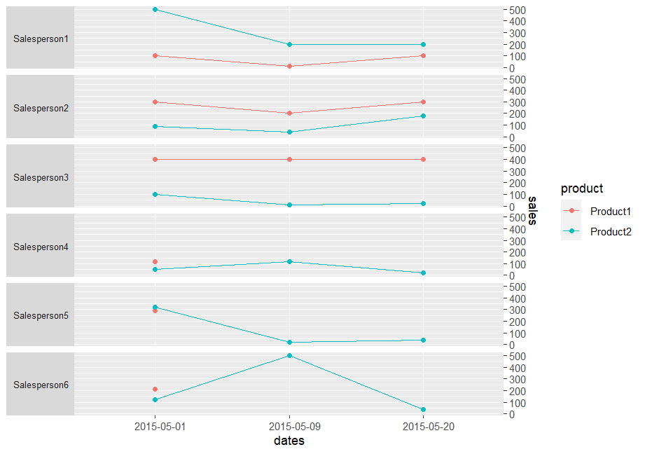
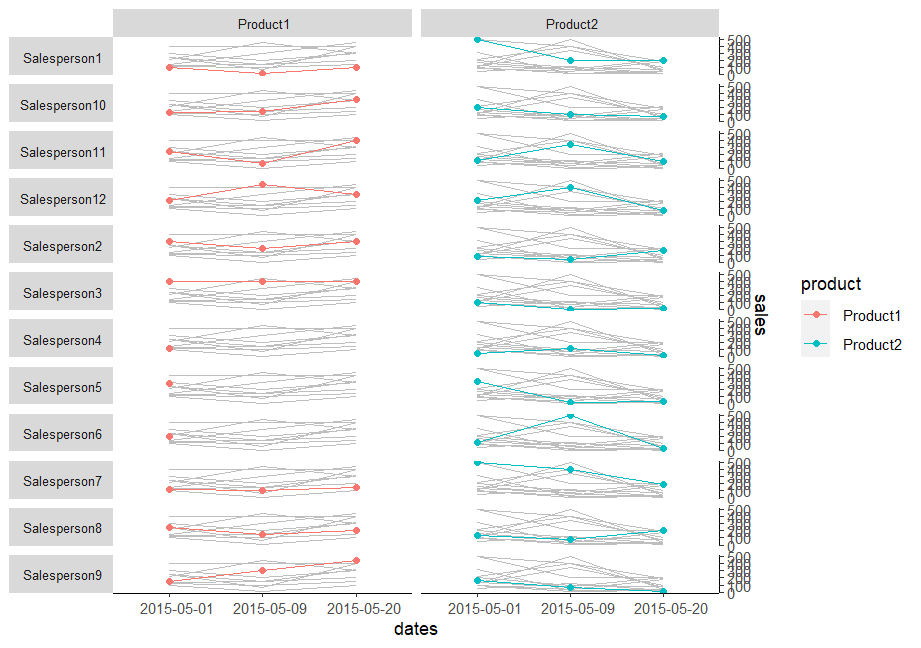
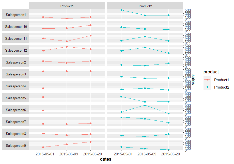
My objective is to show how each salesman's performance was during the recorded days, for each of the product types. I want to facilitate comparison of each salesman's current and old performance, so I have used dates on x-axis to enable easy comparison. I also want to compare the performance intra-products and inter-products, so I have used facets from ggplot2.
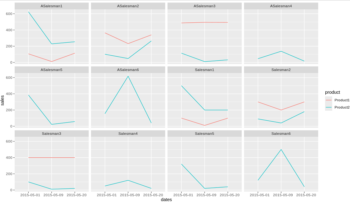
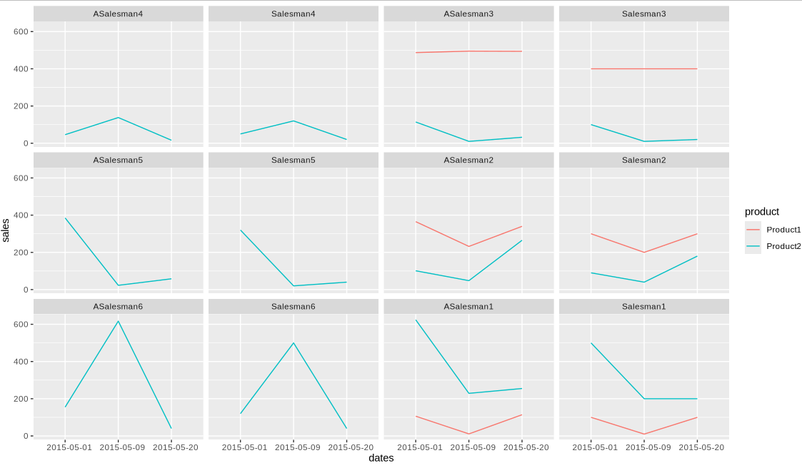
My reservation on using a line/bar chart was that if more salesmen are added to the data set, it will quickly become difficult to compare each salesman to the other. Plus, it will also be difficult to compare performance across the recorded dates.
The audience are business managers who are only moderately literate about Statistics.They are not used to seeing box plots, heatmaps, but are open to them nonetheless. They have primarily seen the humble bar and line charts, using only the basic scales, rather than logarithmic scales.
Questions:
- Would you suggest any alternative visualisation for such data - I understand some people may find it difficult to perceive trends if they are shown using colours, so there must be a better alternative?
- If I stick to the current visualisation, should data labels also be added to show what value for sales is for each salesman? I do think that it clutters the visualisation.
PS. Although I am using ggplot2 in R, and would appreciate any R solutions, I am really after a visualisation, regardless of the software/code used to produce it, and for the latter I will be especially thankful.

[data-visualization]experts / answerers here use software other than R, & you wouldn't want to preclude their insights. $\endgroup$ggplot2,", is on the borderline. $\endgroup$