a picture is added
Source Link
James
  • 63
  • 1
  • 6

I have a set of product online reviews data. The dataset contains review text and 1-5 star ratings.

I've extracted 5 prevalence topics using R stm package. They are price, design, packaging, promotion strategies, and varieties. I also divided reviews into three sentiment groups based on the star ratings: 1- and 2-star ratings were classified as "negative", 3-star ratings were "neutral", and 4- and 5-star ratings were "positive".

Now I would like to graphically present topical prevalence across sentiment groups. That is for example, a graph showing that the topic "price" is largely associated with "negative" sentiment while "design" is positively discussed.

Any suggestions for this task?

Edit: Is it possible to present the data like the graphic below (extracted from the paper: stm: R Package for Structural Topic Models)

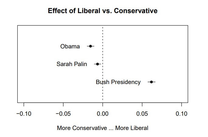
enter image description here

I have a set of product online reviews data. The dataset contains review text and 1-5 star ratings.

I've extracted 5 prevalence topics using R stm package. They are price, design, packaging, promotion strategies, and varieties. I also divided reviews into three sentiment groups based on the star ratings: 1- and 2-star ratings were classified as "negative", 3-star ratings were "neutral", and 4- and 5-star ratings were "positive".

Now I would like to graphically present topical prevalence across sentiment groups. That is for example, a graph showing that the topic "price" is largely associated with "negative" sentiment while "design" is positively discussed.

Any suggestions for this task?

Edit: Is it possible to present the data like the graphic below (extracted from the paper: stm: R Package for Structural Topic Models)

enter image description here

Source Link
James
  • 63
  • 1
  • 6

seeking suggestions for visualizing relationships between extracted topics and ratings in R

I have a set of product online reviews data. The dataset contains review text and 1-5 star ratings.

I've extracted 5 prevalence topics using R stm package. They are price, design, packaging, promotion strategies, and varieties. I also divided reviews into three sentiment groups based on the star ratings: 1- and 2-star ratings were classified as "negative", 3-star ratings were "neutral", and 4- and 5-star ratings were "positive".

Now I would like to graphically present topical prevalence across sentiment groups. That is for example, a graph showing that the topic "price" is largely associated with "negative" sentiment while "design" is positively discussed.

Any suggestions for this task?