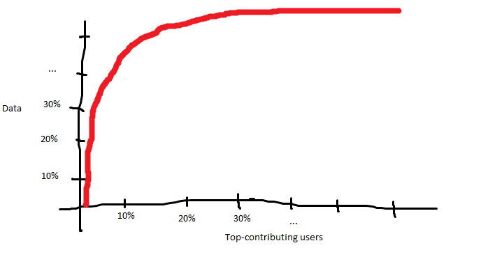
I don't know howwhat such plots are called and thus I just gave this question a stupid title.
Let's say I have an ordered dataset as follows
4253 4262 4270 4383 4394 4476 4635 ...
Each number corresponds to the amount of postings a certain user contributed to a website. I am empirically investigating the "participation inequality" phenomenon as defined here.
In order to make it easy to grasp I would like to produce a plot which allows the reader to quickly deductdeduce statements such as "10% of the users contribute 50% of the data". It should probably look similar to this admittedly pretty lousy paint sketch:

I have no clue how this is called thus I don't know where to look for. Also, if somebody had an implementation in R, that would be awesome.
