I think this isn't that big of a deal. Any statistical procedure, from calculating a mean to fitting a GLMM with crossed random effects, is a function of your data. And your data are, by assumption, a mix of signal and stochastic noise. Thus your output is random as well. In the long run, you hope it will be centered on the true value (unbiased, consistent), and in the short run you hope that the output will be similar / close to the true picture. Nothing about this changes when we move to talking about Gaussian mixture models.
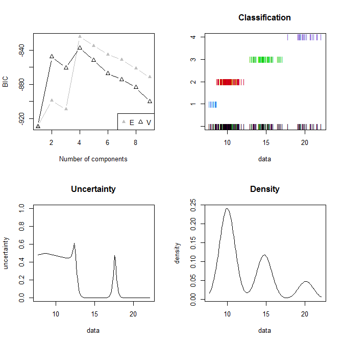
For what it's worth, the model seems decent to me. Here's the standard output that I get for your situation:
summary(mixmdl)
# ----------------------------------------------------
# Gaussian finite mixture model fitted by EM algorithm
# ----------------------------------------------------
#
# Mclust E (univariate, equal variance) model with 4 components:
#
#  log.likelihood   n df       BIC       ICL
#       -391.8016 170  8 -824.6895 -955.0467
#
# Clustering table:
#  1  2  3  4
# 12 89 49 20

The BIC is optimized for your data by a mixture of four components with equal variances. You actually have three components, but look at the density plot in the lower right hand corner—it's not that far from the truth.
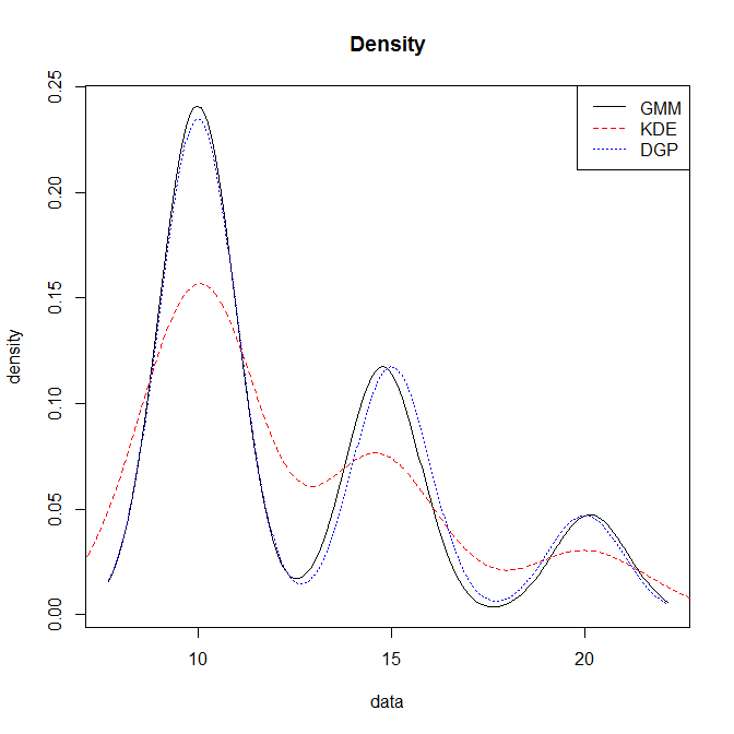
Consider the following plot. The solid black line is the density from the fitted Gaussian mixture model, the dashed red line is a naive kernel density estimate, and the dotted blue line is the underlying data generating process. It looks to me like Mclust did a good job of recovering something very close to the true DGP from your data.

Code:
xs = seq(7, 22, by=.1)
windows()
  plot(mixmdl, what="density")
  lines(density(data), col="red", lty=2)
  lines(x=xs, y=10/17*dnorm(xs, mean=10, sd=1) +
                 5/17*dnorm(xs, mean=15, sd=1) +
                 2/17*dnorm(xs, mean=20, sd=1),
        col="blue", lty=3)
  legend("topright", legend=c("GMM","KDE","DGP"), col=c("black","red","blue"), lty=1:3)
