3
$\begingroup$

In relation to the question below I have uploaded the detrended plot and the differenced plot to the following links (I tried to add the images to the post but I got a 'new user' error msg). If anybody knows a way to make a statistical connection between the two without doing regression analysis (because of the nonstationary red line) I'd be grateful to hear.

http://imageshack.us/photo/my-images/27/differenced.jpg/

http://imageshack.us/photo/my-images/827/detrend.jpg/


I'm trying to work out how to regress one set of time series data against another.

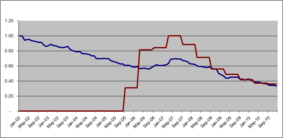
I have attached a graph of two lines:
enter image description here

The blue line (8 yrs of monthly data) has a blip just at the time when the red line (5 yrs of semi-annl data) rapidly increases. As the red line falls the blue line returns to its original trend.

Does anyone know of a standard method to show whether or not the red line 'caused' or 'is associated with' the blue line along the lines of 'Step1: A followed by Step 2: B...etc'?

I have a working knowledge of regression of cross-sectional data but, after 2 weeks of trying to work this out by googling and trial-and-error, I'm not all that much further.

I'm using excel.

In terms of what I have tried...

  1. I found out that both data was autocorrelated and that it had a unit root, using an online Dickey-Fuller test. I also tested the residuals of a regression of each against time using a D-W test and that showed autocorrelation too.
  2. I detrended the blue line by plotting a graph of the residuals from a regression over time. However, the detrended line (the residuals) still visually had a trend which seemed odd. Also it had unit root according to a D-F test.
  3. I detrended the blue line just using data to the start of the red line and it showed no trend
  4. I detrended the blue line just for the period the red line exists and it still showed a trend at the begining of the red line and then returned to the trend when the red line starting falling. Inbetween it leapt up along with the red line but lagged.

I would be grateful to hear any comments.

$\endgroup$
6
  • $\begingroup$ Your added images are pretty good evidence of association between the two trends (especially the detrended image). What else do you want (an actual regression equation?) $\endgroup$
    – Andy W
    Commented Jul 29, 2011 at 17:05
  • $\begingroup$ Hi Andy, yes I'm quite mesmerised by them to be honest :) But I was hoping there might be something more sophisticated that I can do. At the moment I feel like I'm just pointing at them and saying 'look at this'. If I was able to do a regression on them then I could show the p-value etc and have stat backing but I can't do that here because of the nonstationary red line. Do you know of any method to calculate the relationship between the red line and the detrended blue line, for example. Thanks. $\endgroup$
    – paul
    Commented Jul 29, 2011 at 18:09
  • $\begingroup$ there is but you will probably have to migrate away from excel. The wikipedia page IrishStat links to is a good start, but basically you will have to look up resources on ARIMA time series modelling (looking around the time series tags on this site is a good start). The graphs are pretty good evidence though. Do you think both series effect each other, or just the red series influences the blue series and not vice-versa? $\endgroup$
    – Andy W
    Commented Jul 29, 2011 at 18:41
  • $\begingroup$ Just the red affects the blue. The other way round would not be possible. Ok I'll start looking at ARIMA. Thanks. $\endgroup$
    – paul
    Commented Jul 29, 2011 at 19:07
  • $\begingroup$ @PAUL I would suggest uploading the actual data rather than some arbitrary manipulation of it. $\endgroup$
    – IrishStat
    Commented Jul 1, 2012 at 13:35

2 Answers 2

1
$\begingroup$

It does not seem that you will be able to make something stationary out of the red line whatever you apply - it seems that there were different processes at play before and after mid'07, so I am not sure there is any room for statistical inference here. But you may try differencing both series (subtracting a lagged series) and see if the result looks any more compelling. To create a differenced series in a spreadsheet, copy your series and paste it to the adjacent column but one row lower than the original one. Now subtract the cells on the right from the cells of the same row on the left - it will give you a differenced series one period shorter than the original one.

$\endgroup$
3
  • $\begingroup$ Hi Alex, is it possible that you could explain why it is not possible to make something stationary from the red line. Is it because it has few points (11) or simply because of the shape? Also if you have time to explain what you mean by differencing both series I'd be very grateful. Thanks. $\endgroup$
    – paul
    Commented Jul 28, 2011 at 18:39
  • $\begingroup$ I think I might have misled you by having the series of zeros at the beginning of the red line. In fact, the red line doesn't begin until sep05 when it starts at zero and then rockets up. I'm sorry for that. i hadn't worked out how to get the red line to start in the middle of the graph in excel but I worked it out. I also went away and did some reading about differences and along with your explanation I will try it and see what happens. If your advice changes because of my additional info about the start point of the red line I'd be grateful to hear it. $\endgroup$
    – paul
    Commented Jul 28, 2011 at 21:41
  • $\begingroup$ Hi there. I differenced the blue line which then became stationary but differences of the red line remain, as you said, nonstationary. I also detrended the blue line and compared it again with the red line. As a novice I am aware there are lots of things than can catch you out in time series, but these lines move together so closely it looks like there is inference. If you would give me your thoughts on that point I'd be grateful. I don't seem to be able to attach jpg to this comment so I will edit the original question and see if I can attach them there. $\endgroup$
    – paul
    Commented Jul 29, 2011 at 11:13
0
$\begingroup$

Detrending (assumes 1 trend that begins at the beginning and ends at the end ) or using differencing ( can inject structure ) are identification tools/aids that should not be guessed or assumed. Please look at ARMAX model identification http://en.wikipedia.org/wiki/ARMAX#Autoregressive_moving_average_model_with_exogenous_inputs_model_.28ARMAX_model.29 which leads to the detection/finding of appropriate differencing and lag structures. One identifies the model structure by pre-whitening.

$\endgroup$
3
  • $\begingroup$ Hi IrishStat. Thanks for the answer. I'm afraid my current knowledge is too shallow for me to get far with the information in the link although I'm sure it is saying something relevant. I hope to learn more as I try to tackle this problem and the others I want to work on after this one. Thanks. $\endgroup$
    – paul
    Commented Jul 28, 2011 at 18:42
  • $\begingroup$ It appears that there is a need for a supporting series having the form 0,0,0,0,0,0,0,0,0,0,1,1,1,1,1,to the end as the first 11 observations have little or no linkage while observations 12 and on might have some. Intervention Detection is the statistical tool to form unspecified deterministic structure i.e. an omitted variable. $\endgroup$
    – IrishStat
    Commented Jul 28, 2011 at 20:54
  • $\begingroup$ Hi there. As with my comment just now to Alex, I think I might have misled you by having the series of zeros at the beginning of the red line. In fact, the red line doesn't begin until sep05 when it starts at zero and then rockets up. I'm sorry for that. If your advice changes because of my additional info about the start point of the red line I'd be grateful to hear it. $\endgroup$
    – paul
    Commented Jul 28, 2011 at 21:42

Your Answer

By clicking “Post Your Answer”, you agree to our terms of service and acknowledge you have read our privacy policy.

Not the answer you're looking for? Browse other questions tagged or ask your own question.