I am trying hard to do the following and have already spent a few hours in vain:
I wanted to do the scatter plot. But given the high dispersion on those dots, I would like to bin the x-axis and then for each bin of the x-axis, plot the quantiles of the y-values of the data points in each bin:
- Uniform bin size on the x-axis;
- Equal number of observations in each bin;
(These two are separate cases.)
How to do that in R? I guess for the sake of prettyness, I'd better do it in ggplot2?
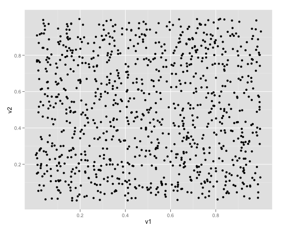
The origin of this problem was that a plain scatter plot with too many points with high dispersion generated too many points flying all over places.
We are trying to smooth the charts a bit...
Any good recommendations?
How about "plot the quantiles of each bin"?
But how are the quantiles plotted? Shall I specify 50% quantile, etc?
[p.s. Update 3/11/2011]: I am trying the following following R-help posts:
DAT <- data.frame(x = runif(1000, 0, 20), y = rnorm(1000))
DAT$xbin <- with(DAT, cut(x, seq(0, 20, 2)))

p <- ggplot(DAT, aes(x = x, y = y)) + geom_point(alpha = 0.2) +
stat_quantile(aes(colour = ..quantile..), quantiles = seq(0.05, 0.95,
by=0.05)) + facet_wrap(~ xbin, scales = "free")
print(p)
My questions are:
1) How do I make it "equal number of points" in each bin along the x-axis? i.e. the original number 2 requirement in my question?
2)
And also, no matter how I changed the quantiles = seq(0.05, 0.95,
by=0.05)) line,
the number of lines in each bin and the number of legends on the right side of the each plot are different...
What's the catch? Am I missing something here?
I thought the number of quantile lines and the number of legends should be exactly the same, no?


