4
$\begingroup$

This has a simple answer but it has been eluding me nonetheless.

I have been trying to build a PCA plot from scratch with the ability to plot predefined groups in different colors. I can plot PCA but I want it to plot with predefined groups (samples) with top 100 expressed genes. I have three groups. Can any body help me keeping in mind that the user is just beginner in R?

Actually I have miRNA data from affymetrix chip. Data is classified into 3 groups. I used limma package for analysis. I did RMA normalization, eBayes etc. But I did not get any miRNA significatly expressed in any group. When I posed questions about it on net somebody suggested me to PCA analysis etc. to remove outliners and go ahead with normal analysis as I did.

Now I will appreciate it some body can guide me from the begining

$\endgroup$
3
  • $\begingroup$ It seems you want to highlight an illustrative (or passive) categorical variable on an individual map. Do you ask us to help you with your code, or guide you about existing packages? In the latter case, that's easy! $\endgroup$
    – chl
    Commented Mar 10, 2012 at 21:54
  • 1
    $\begingroup$ @Shafi Please register your account -- this way you won't lose control of your question again. $\endgroup$
    – user88
    Commented Mar 12, 2012 at 23:59
  • $\begingroup$ Thanks for registering your account! And thanks for updating your post; however, it will be difficult (for me, at least) to provide appropriate response because we don't have access to mydata, hence your working eset. Any chance we can get simulated data or a pointer to an existing R/bioc dataset? $\endgroup$
    – chl
    Commented Mar 13, 2012 at 21:37

1 Answer 1

5
$\begingroup$

Let me continue my comment with an illustration for the case where you're interested in existing R packages. There are several package in the Multivariate Task View that will provide enhanced method for PCA-related methods (as compared to R base prcomp and princomp), e.g. ade4 or FactorMineR. I personally like FactoMineR because of its simple syntax, and you check the associated website for more information on the available methods.

One can use supplementary categorical and/or numerical variables when applying a PCA. Those variables are not used to construct factor axes, but can be showed afterwards on the correlation circle (for numerical variables) or the individual map (for categorical variables). Here is a toy example of use (from the on-line help):

 data(decathlon)
 res.pca <- PCA(decathlon, quanti.sup = 11:12, quali.sup=13)
 plotellipses(res.pca,13)
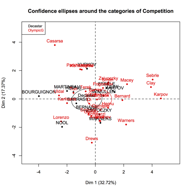
enter image description here

If you have multiple passive variables, you can select the one to display (with or without confidence ellipses) using the keepvar= argument. Here is another picture with two illustrative variables.
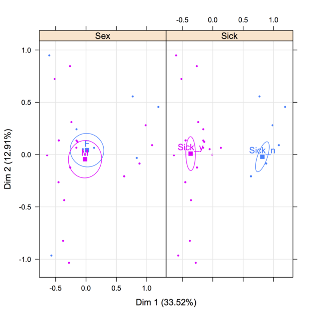
enter image description here

Be careful with arguments that are a little bit non-standard if you are used to default plotting functions in R. The plotellipses() function makes use of the helper function ellipse::ellipse that you can use (or not) in any plot (look for monpanel.ellipse subfunction in plotellipses() to see how confidence lines are computed). That's what I did to build specific individual map (B&W, different plotting symbol, etc.). For example, the following snippet just plot all individuals with two different symbols depending on the type of sporting event (2004 Olympic Game or 2004 Decastar):

labs <- paste(round(res.pca$eig[1:2, 2], 2), "%", sep="")
plot(res.pca$ind$coord[,1:2], pch=as.numeric(decathlon$Competition),
     xlab=paste("Dim. 1 (", labs[1], ")", sep=""), 
     ylab=paste("Dim. 2 (", labs[2], ")", sep=""))
abline(v=0, h=0, lty=2)

Besides, I would like to point you to @vqv's excellent ggbiplot package, available on GitHub, which follows from one of his answer. (It uses R base functions and ggplot2.)

$\endgroup$
4
  • $\begingroup$ thanks I tried to use your recommendation but for error while using plot ellipses function. Error message:Error in if (scale[1] > 0) r <- r/scale[1] : missing value where TRUE/FALSE needed. Remember I have 55 samples classified in 3 groups. what and how should I go about it. Please suggest $\endgroup$
    – Shafi
    Commented Mar 12, 2012 at 15:44
  • $\begingroup$ The error comes from ellipse.default.R in package ellipse or coord.ellipse() in FactoMineR. Try plotting the individual map without confidence ellipse, first; e.g., plot(res.pca, choix="ind"). If you could supply a snapshot of your data and the exact R syntax you used, it would be easy for us to help you sorting that out. $\endgroup$
    – chl
    Commented Mar 12, 2012 at 16:10
  • $\begingroup$ I tried plot(res.pca, choix="ind") but it just plotted x and y axis nothing else. What should I do now. Waiting for your positive reply $\endgroup$
    – Shafi
    Commented Mar 14, 2012 at 10:18
  • $\begingroup$ That's strange. Did you succeed in running PCA on your own dataset? The syntax might look strange at first: PCA(dat[,1:8], quanti.sup=6) means do a PCA on the first 8 columns in dat (they should be numeric, of course) but consider the 6th col as a passive variable. Then, basically, a scatterplot of individual coordinates available can be built from res.pca$ind$coord[,1:2]. If you have an external grouping variable for those individuals, say grp, you can use different symbols (pch=as.numeric(grp)) or colors (col=as.numeric(grp)) to highlight group membership in this scatterplot. $\endgroup$
    – chl
    Commented Mar 14, 2012 at 10:31

Your Answer

By clicking “Post Your Answer”, you agree to our terms of service and acknowledge you have read our privacy policy.

Not the answer you're looking for? Browse other questions tagged or ask your own question.