2
$\begingroup$

I have an interval, say (1 to 100). Then I have many little subintervals:

  • (3,6)
  • (5,15)
  • (4,78)
  • ...

I want to plot and visualise them. I'm interested in how they overlap each other.

Q: What is the most appropriate data visualization tool for doing that?

$\endgroup$
3
  • $\begingroup$ Are you looking for something like this? $\endgroup$ Commented Jul 20, 2017 at 8:19
  • $\begingroup$ This is not really a statistical question. You might get better answers at Programmers.SE or Computer Graphics.SE or CS.SE. $\endgroup$ Commented Jul 20, 2017 at 8:56
  • 1
    $\begingroup$ @StephanKolassa I don't realy thing that the sites are relevant for this question. $\endgroup$
    – Tim
    Commented Jul 20, 2017 at 11:39

1 Answer 1

1
$\begingroup$

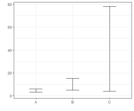
The most common approach is to plot it as lines with whiskers, like on the example below (I'm using here ggplot2 with geom_errorbar as described in here).

enter image description here

$\endgroup$

Your Answer

By clicking “Post Your Answer”, you agree to our terms of service and acknowledge you have read our privacy policy.

Not the answer you're looking for? Browse other questions tagged or ask your own question.