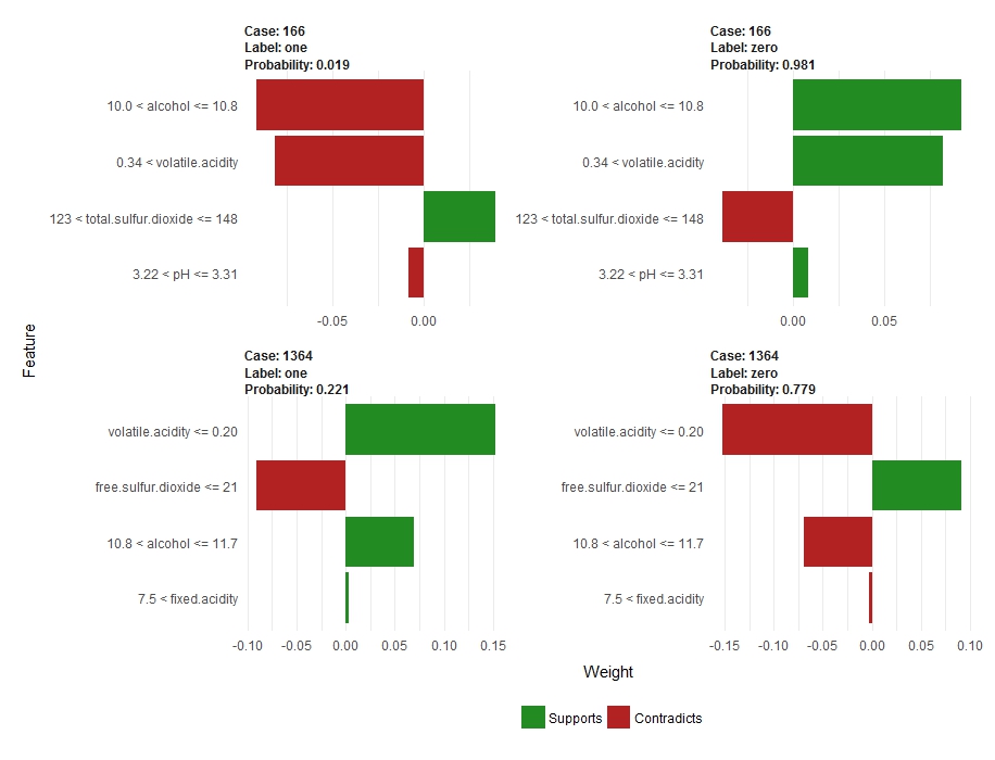
My question is related to this one: LIME explanation confusion. But since it does not have a reproducible example or an answer, I am asking here with an example.
I have a dataset with unbalanced classes. Here I make a reproducible example with the wine data from the breakDown package. My actual data is even more unbalanced than this example. I train a gbm model with the caret package. Below I produce plots with the lime package for two correct predictions and two incorrect predictions.
My question is about the lime explanation plots and how the probabilities of the predictions relate to the weights. Here are the plots for the correct cases:

As you can see, case 1364 has a probability of 0.779 for the zero case, and it is indeed classified correctly as a zero. However, from my understanding of the lime results, the data from this case do not support this class (the red/negative weights). My question is, how can the model predict this high probability for the zero class, and the lime explanation tell us it is not supported? Contrast this to case 166, where it appears there is support for high weight variables for the zero probability class and this case also has a high probability for this class (0.981).
Does it have to do with my dataset having unbalanced classes? I tried lowering the threshold for classification into a one class, and I still see many cases where the lime plots seem to contradict the probabilities.
Example below:
library(lime)
library(breakDown)
library(caTools)
library(caret)
library(tidyverse)
library(SDMTools)

# some code from: https://shiring.github.io/machine_learning/2017/04/23/lime

# make an unbalanced classifier for the wine data quality
new.wine <- transform(wine, sdclass = cut(quality,
                                          breaks=c(-Inf, 6, Inf), labels=c("zero", "one")))
summary(new.wine$sdclass)

# remove the quality column
new.wine <- new.wine[,-12]

# create a training and a testing dataset
set.seed(123)
new.wine$spl=sample.split(new.wine$sdclass, SplitRatio = 0.7)

train <- subset(new.wine, new.wine$spl == TRUE)[,-13]
test <- subset(new.wine, new.wine$spl == FALSE)[,-13]

summary(train$sdclass)
summary(test$sdclass)

# train a gbm model
trainControl <- trainControl(method="cv", number=10)

model <- train(sdclass~., data = train,
               method="gbm",
               bag.fraction=.5,
               distribution="bernoulli",
               metric="Accuracy",
               trControl=trainControl,
               verbose = FALSE)

print(model$bestTune)

# predictions from caret gbm model
caret_pred <- predict.train(model, newdata = test, type="prob")
obs <- ifelse(test$sdclass == "zero" , 0, 1)
SDMTools::accuracy(obs, caret_pred[[2]], threshold = 0.5)
#threshold       AUC omission.rate sensitivity specificity prop.correct     Kappa
#1       0.5 0.6862422     0.5597484   0.4402516   0.9322328    0.8257318 0.4203127

# make a lime model explainer
explainer <- lime(x = train, model = model, bin_continuous = TRUE, n_bins = 5)

# get predictions for the model
pred <- data.frame(sample_id = 1:nrow(test),
                   caret_pred,
                   actual = test$sdclass)
pred$prediction <- colnames(pred)[2:3][apply(pred[, 2:3], 1, which.max)]
pred$correct <- ifelse(pred$actual == pred$prediction, "correct", "wrong")

# filter the correct and wrong predictions
pred_cor <- filter(pred, correct == "correct")

pred_wrong <- filter(pred, correct == "wrong")

# select two test samples with correct predictions
test_data_cor <- test %>%
  mutate(sample_id = 1:nrow(test)) %>%
  filter(sample_id %in% pred_cor$sample_id) %>%
  sample_n(size = 2) %>%
  remove_rownames() %>%
  tibble::column_to_rownames(var = "sample_id") %>%
  select(-sdclass)

# select two samples with wrong predictions
test_data_wrong <- test %>%
  mutate(sample_id = 1:nrow(test)) %>%
  filter(sample_id %in% pred_wrong$sample_id) %>%
  sample_n(size = 2) %>%
  remove_rownames() %>%
  tibble::column_to_rownames(var = "sample_id") %>%
  select(-sdclass)


# explain selected test data
explanation_cor <- lime::explain(x = test_data_cor, explainer, n_features = 4, n_labels = 2)
explanation_wrong <- lime::explain(x = test_data_wrong, explainer, n_features = 4, n_labels = 2)

# plot the explanation
plot_features(explanation_cor, ncol = 2)
plot_features(explanation_wrong, ncol = 2)
