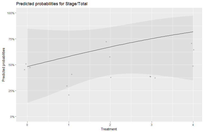
The plot you produced doesn't make sense for your data, since Treatment is supposed to be a categorical variable (not an integer variable as per your plot).
I would re-fit the model by forcing Treatment to be a factor. I think OLRE should be a factor too - usually, the random effect goes hand in hand with a grouping variable (i.e., a factor in R's parlance).
So maybe try something like this:
df$Outcome <- df$Stage/df$Total

df$Treatment <- factor(df$Treatment)

df$OLRE <- factor(df$OLRE)


m1 <- glmer(Outcome ~ Treatment + (1|OLRE), data=df,
            family='binomial',weights=Total)


set.seed(17)

p1 <- sjp.glmer(m1, type = "pred.fe", vars = c("Treatment"),
                show.ci = FALSE, show.scatter=FALSE)
p1

p2 <- sjp.glmer(m1, type = "pred", vars = c("Treatment"),
                show.ci = FALSE, show.scatter=FALSE)
p2
According to the help file for sjp.glmer, which is available at https://www.rdocumentation.org/packages/sjPlot/versions/2.4.0/topics/sjp.glmer, the options type = "pred.fe" and "type = "pred" will help plot the predicted values against the response, with the predicted values being derived only from the fixed effects (for type = "pred.fe") or conditional on random intercept (for "type = "pred").
The beauty with saving the two plots is that you can then inspect the output produced by R when typing the plot names and "steal" that output to create your own customized graph. For example, the output for the plot p1 is as follows:
> p1
$data
x            y ci.low ci.high resp.y grp
1  1 0.4832236     NA      NA   0.45   1
2  1 0.4832236     NA      NA   0.50   1
3  1 0.4832236     NA      NA   0.50   1
4  3 0.5684214     NA      NA   0.58   1
5  3 0.5684214     NA      NA   0.40   1
6  3 0.5684214     NA      NA   0.72   1
7  4 0.3855458     NA      NA   0.31   1
8  4 0.3855458     NA      NA   0.45   1
9  4 0.3855458     NA      NA   0.40   1
10 5 0.5807438     NA      NA   0.63   1
11 5 0.5807438     NA      NA   0.61   1
12 5 0.5807438     NA      NA   0.50   1
13 2 0.2850919     NA      NA   0.23   1
14 2 0.2850919     NA      NA   0.33   1
15 2 0.2850919     NA      NA   0.30   1

$plot

attr(,"class")
[1] "sjPlot"        "sjpglm.ppresp"
Warning message:
In eval(family$initialize) : non-integer #successes in a binomial glm!
So the component p1$data of the plot gives you access to the data used to create the plot.
For example, for your first treatment,0_diatoms, you can compute the predicted probability by hand as follows and compare it against the one produced by sjp.glmer for type = "pred.fe":
intercept <- summary(m1)$coeff["(Intercept)","Estimate"]

exp(intercept)/(1 + exp(intercept))
The probability comes out to be 0.4832236 and this is listed under p1$data (in the column titled y) for each of the three observations corresponding to the first treatment group (i.e., 0_diatoms). The observations themselves are listed under the column titled resp.y of p1$data.
For the second treatment, the predicted probability computed by hand would be:
intercept <- summary(m1)$coeff["(Intercept)","Estimate"]

slope25_diatoms <- summary(m1)$coeff["Treatment25_diatoms","Estimate"]

exp(intercept + slope25_diatoms)/(1 + exp(intercept + slope25_diatoms))
hence 0.5684214. This is listed under the column y in p$data for each of the observations in your 25_diatoms treatment group.
The predicted probabilities for the first two treatment groups that are produced by sjp.glmer with the option type="pred" can be replicated by hand with the commands below:
intercept <- summary(m1)$coeff["(Intercept)","Estimate"]

ranef(m1)$OLRE[1, ]
ranef(m1)$OLRE[2, ]
ranef(m1)$OLRE[3, ]

exp(intercept + ranef(m1)$OLRE[1, ])/
  (1 + exp(intercept + ranef(m1)$OLRE[1, ]))

exp(intercept + ranef(m1)$OLRE[2, ])/
  (1 + exp(intercept + ranef(m1)$OLRE[2, ]))

exp(intercept + ranef(m1)$OLRE[3, ])/
  (1 + exp(intercept + ranef(m1)$OLRE[3, ]))
and
intercept <- summary(m1)$coeff["(Intercept)","Estimate"]

slope25_diatoms <- summary(m1)$coeff["Treatment25_diatoms","Estimate"]

exp(intercept + slope25_diatoms + ranef(m1)$OLRE[4, ])/
 (1 + exp(intercept + slope25_diatoms + ranef(m1)$OLRE[4, ]))

exp(intercept + slope25_diatoms + ranef(m1)$OLRE[5, ])/
 (1 + exp(intercept + slope25_diatoms + ranef(m1)$OLRE[5, ]))

exp(intercept + slope25_diatoms + ranef(m1)$OLRE[6, ])/
 (1 + exp(intercept + slope25_diatoms + ranef(m1)$OLRE[6, ]))
These probabilities come out to be 0.4646612, 0.492606 and 0.492606 for the first treatment (i.e., 0_diatoms) and 0.5748393, 0.4744047 and 0.6512543 for the second treatment (i.e., 25_diatoms). You will recognize then in the first 6 rows of column y contained in the R output corresponding to p2$data:
> p2$data
x            y ci.low ci.high resp.y grp
1  1 0.4646612     NA      NA   0.45   1
2  1 0.4926060     NA      NA   0.50   1
3  1 0.4926060     NA      NA   0.50   1
4  3 0.5748393     NA      NA   0.58   1
5  3 0.4744047     NA      NA   0.40   1
6  3 0.6512543     NA      NA   0.72   1
7  4 0.3447117     NA      NA   0.31   1
8  4 0.4209869     NA      NA   0.45   1
9  4 0.3934527     NA      NA   0.40   1
10 5 0.6078542     NA      NA   0.63   1
11 5 0.5968777     NA      NA   0.61   1
12 5 0.5358618     NA      NA   0.50   1
13 2 0.2574995     NA      NA   0.23   1
14 2 0.3081921     NA      NA   0.33   1
15 2 0.2927040     NA      NA   0.30   1
The above should provide enough insight into what sjp.glmer is actually plotting to enable you to generate your own plots. In particular, you can plot the predicted probabilities on the 0 to 1 scale (rather then converting them to percentage points, as sjp.glmer does). You can also force sjp.glmer to return uncertainty intervals around the predicted probability by using the show.ci = TRUE option.
I am not sure why sjp.glmer jitters the response values in the column resp.y before plotting them when you include the option show.scatter=TRUE. I would have thought that using show.scatter=FALSE would have turned off the random jittering, but it actually removes the response observations altogether from the plot. So either use set.seed(17) (or some other random seed) before creating the plot and then invoke the option show.scatter=TRUE for sjp.glmer, or create your own plot from p1$data or p2$data (whichever you need), but superimpose the values stored in y.resp on your plot, which are the actual response values. If you don't set the random seed, sjp.glmer will come up with a random configuration of jittered response values every time you invoke it for the same model.
Disclaimer: I do not know enough about your study, data and model to determine if your current modeling approach is sensible. Assuming it is, the code I provided here will make sense. Otherwise, it might not make sense.

