The context is survival analysis, where I have an empirical survival function in the form of a step function, which is just one minus the ecdf. Is there a standard way to get an estimate of the pdf (in curves or histograms)?
-
2$\begingroup$ The ecdf is a step function, so the "epdf" is just a finite set of spikes. On the other hand, kernel density methods attempt to "smooth" these spikes into a pdf. $\endgroup$– Sycorax ♦Commented Sep 18, 2018 at 18:41
-
$\begingroup$ you can estimate the pdf via the empirical pdf which can be arrived at as the Radon-Nikodym derivative of the ecdf with respect to the counting measure, but that's just a fancy way of counting the proportion of data points with each unique value and if you want an estimate that's absolutely continuous w.r.t. the Lebesgue measure then you'll need to do something else (such as what Sycorax suggested) $\endgroup$– jldCommented Sep 18, 2018 at 18:57
-
$\begingroup$ @Sycorax Thanks. Are there some standard or common kernel methods for this purpose? $\endgroup$– Lei HuangCommented Sep 18, 2018 at 20:03
1 Answer
This is an outline rather than a complete answer. There are two main issues: (a) finding the data values used to make the ECDF plot, and (b) using a histogram and KDE methods to estimate the PDF.
Data for an example: Here is a simple demo in R for a sample with $n=100$ unique values from $\mathsf{Norm}(\mu=50,\, \sigma = 7):$
set.seed(918);  x = runif(25, 50, 7);  sort(x)
set.seed(1234);  x = rnorm(100, 50, 7);  sort(x)
  [1] 33.58012 34.73972 37.35778 38.59635 39.86257 40.26509 40.39389 40.61305 41.23610 41.55054
 [11] 41.63830 41.82667 41.89534 42.02975 42.05774 42.23777 42.24877 42.51950 42.83441 42.89527
 [21] 43.01129 43.03962 43.22040 43.44836 43.62163 43.76974 44.01245 44.13980 44.56622 44.58653
 [31] 44.93493 45.03392 45.14396 45.31256 45.92547 45.97682 46.04884 46.17358 46.33320 46.42293
 [41] 46.49119 46.52205 46.53092 46.56520 46.65965 46.67085 46.73872 46.81172 46.91616 47.18088
 [51] 47.43433 47.78059 47.93994 48.03564 48.65884 48.75547 48.78349 48.81004 48.86383 48.92621
 [61] 49.22800 49.62789 49.75668 49.89403 49.94677 50.04825 50.45121 50.93862 51.78637 51.80783
 [71] 51.94200 52.35531 52.48885 53.00387 53.21713 53.54239 53.84998 53.94139 54.02329 54.53801
 [81] 54.59612 54.88326 55.95163 56.14743 56.71646 56.81042 57.01059 57.59109 57.71608 59.30695
 [91] 59.57479 60.14647 61.24137 61.53472 61.94175 62.43959 64.49190 64.84782 66.91085 67.84294
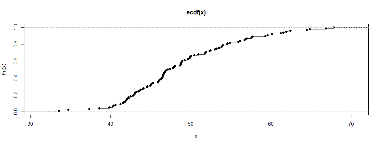
The ECDF plot is shown below:
plot.ecdf(x)
Finding data values. The fundamental idea is to reclaim the individual data values ('knots') at which the ECDF has jumps. If the ECDF was made using R, the knots can be found as follows:
Fn = ecdf(x);  xr = knots(Fn);  xr
  [1] 33.58012 34.73972 37.35778 38.59635 39.86257 40.26509 40.39389 40.61305 41.23610 41.55054
 [11] 41.63830 41.82667 41.89534 42.02975 42.05774 42.23777 42.24877 42.51950 42.83441 42.89527
 [21] 43.01129 43.03962 43.22040 43.44836 43.62163 43.76974 44.01245 44.13980 44.56622 44.58653
..
 [91] 59.57479 60.14647 61.24137 61.53472 61.94175 62.43959 64.49190 64.84782 66.91085 67.84294
If the information for the ECDF is not already in R, presumably you can find or estimate the individual values from the information you do have about the ECDF. If there are ties, a knot may represent multiple observations and the value should be repeated the appropriate number of times. [If you search online with key words such as 'values of empirical distribution function' or 'finding ECDF values', you will find a variety of methods for reclaiming the original data values.]
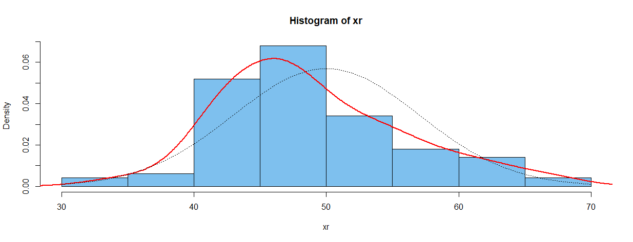
Density estimation: Once the individual values are reclaimed or estimated, you can make a histogram on a density scale (so that the sum of the areas of the bars is unity), and use 'kernel density estimation' (KDE) to 'smooth' the histogram.
hist(xr, prob=T, col="skyblue2")
lines(density(xr), type="l", col="red", lwd=2)  # type is 'ell', not 'one'
curve(dnorm(x, 50, 7), add=T, lty="dotted")
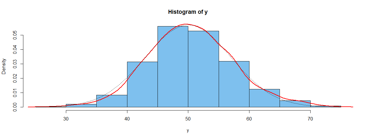
The red curve in plot below shows the default KDE in R (at the default 'window' value). You can look at R documentation and the Wikipedia article for more information on 'kernel density estimation'. [I have found the cited publications of Bernard Silverman to be especially helpful.] The dotted line shows the density of the normal distribution from which the data were sampled. [Generally speaking, for very large samples the two density curves would be in better agreement.]
The figure below was made using a sample of 1000 from a normal distribution.
set.seed(918);  y = rnorm(1000, 50, 7)
hist(y, prob=T, col="skyblue2")
lines(density(y), type="l", col="red", lwd=2)
curve(dnorm(x, 50, 7), add=T, lty="dotted")


