4
$\begingroup$

If several box plots are to be displayed on a graphic where the X-axis represents a unique level, but one which is continuous (like per-year over a very long study) is there a well known way to condense a large number of boxplots aside from the obvious of aggregating up by large subsets of the X?

$\endgroup$
5
  • 4
    $\begingroup$ I'm not sure I follow the situation motivating this question. What's wrong with having a figure with a lot of boxplots in it? I've seen that a number of times. Could you provide an example dataset for people to work with? $\endgroup$ Commented Mar 29, 2019 at 20:47
  • $\begingroup$ I don't see a way around a lot of boxplots, density plots, or similar. You can group things in panels, e.g. a grid of panels. Otherwise you can reduce the data and show e.g. a heatmap of average values, which would throw away any variability. $\endgroup$ Commented Mar 29, 2019 at 20:56
  • 1
    $\begingroup$ If appropriate you could consider shrinking each boxplot to a solid line with a small gap at the median, dashes for the whiskers and dots for the outliers. You can then fit a lot of boxplots onto the same panel $\endgroup$
    – Henry
    Commented Mar 29, 2019 at 21:16
  • $\begingroup$ Is the problem that you do not want a lot of box plots? For example, there is limited room and the high number of box plots would not fit? $\endgroup$
    – Jon
    Commented Mar 30, 2019 at 1:29
  • $\begingroup$ I think even a hundred boxplots looks fine (you can modify the boxplot a bit if needed). x <- sample(101:200,10000,replace=TRUE); y <- 50 + x/9.5 +5*sin(x/45)+ rnorm(10000); a <- boxplot(y~x) However, you could just join the medians, quartiles and whisker-ends (this is rough but conveys the idea - you'd want to make a prettier version than this): matplot(t(a$stats),type="l") $\endgroup$
    – Glen_b
    Commented Mar 30, 2019 at 2:58

1 Answer 1

2
$\begingroup$

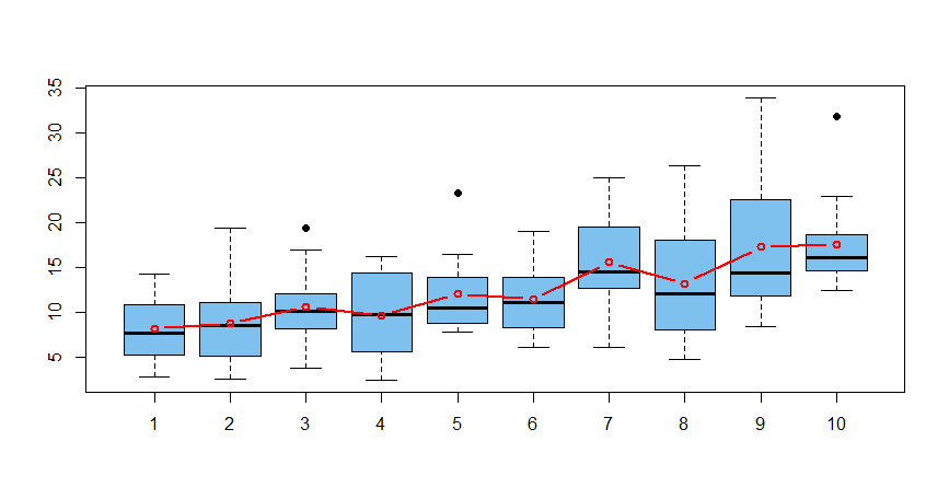
Illustrating @gung's suggestion, here are boxplots (made in R)--one for each of 10 'years'.

Each boxplot shows 12 (simulated) 'monthly' values of a variable x, which is gamma distributed. Gamma shapes increase gradually from 2 to 8 during the 120 months, and rates from about .32 to about .45.

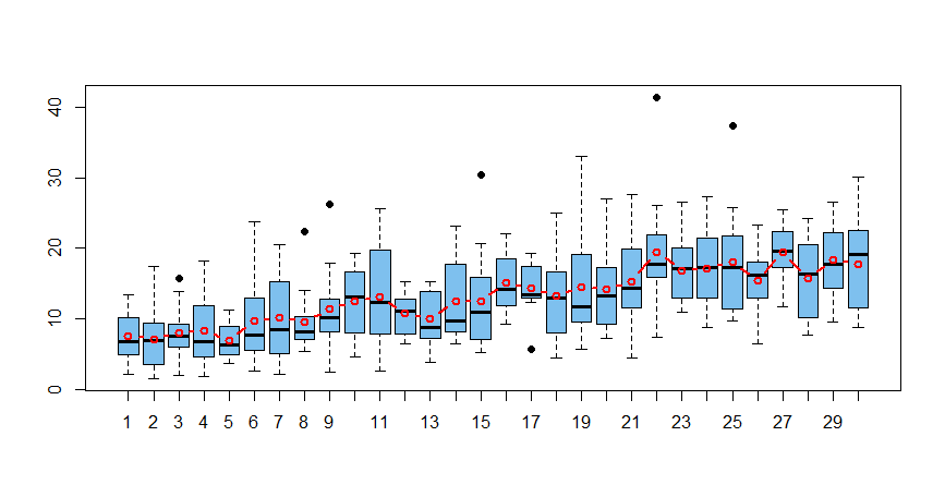
Red line segments connect the averages for the 10 years. Such a graph is still clearly readable with 30 years instead of 10 (second figure).

enter image description here

enter image description here

# R code for first figure
set.seed(329)                      # for reproducibility 
Month = 1:120
shape = seq(2, 8, len=120); rate = seq(.1,.2,len=120)^.5
x = rgamma(120, shape, rate)
Year = rep(1:10, each=12)
MAT = matrix(x, byrow=T, nrow=10)  # a row for each year
a = rowMeans(MAT)                  # 10 averages
boxplot(x ~ Year, col="skyblue2", pch=19)
 lines(1:10, a, type="l", lwd=2, col="red")
$\endgroup$

Your Answer

By clicking “Post Your Answer”, you agree to our terms of service and acknowledge you have read our privacy policy.

Not the answer you're looking for? Browse other questions tagged or ask your own question.