1
$\begingroup$

I have two datasets resembling the toy example below:

* FY        . Cats 
* 2016-2017 . 1
* 2017-2018 . 2 
* 2018-2019 . 3


 Year .   Dogs
* 2016 .   3
* 2017 .   2
* 2018 .   1

I would like to present both of these on a graph, but because the first table's data is in fiscal year, and the other is in calendar year, I am unsure what the best way to visualize this trend would be.

How would you graph these two datasets together, preferably in Excel?

$\endgroup$

1 Answer 1

1
$\begingroup$

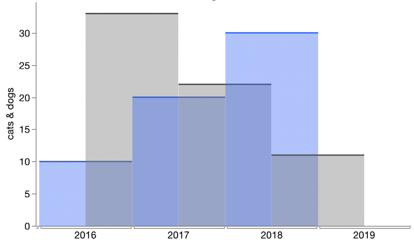
I don't know Excel graphing, but a general approach is to plot horizontal lines from the beginning to end of each year. It can be done with or without fill, depending on aesthetics and how many values you have.

enter image description here

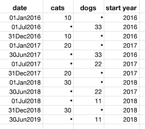
Most of the work if often getting the data in the right form. Here's the data arrangement I used to make a line/area plot in JMP.

enter image description here

$\endgroup$
1
  • $\begingroup$ Thank you for your reply Xan, that makes a lot of sense! $\endgroup$ Commented Jul 14, 2019 at 20:19

Your Answer

By clicking “Post Your Answer”, you agree to our terms of service and acknowledge you have read our privacy policy.

Not the answer you're looking for? Browse other questions tagged or ask your own question.