6
$\begingroup$

I am TAing a course where students are required to turn in their lab reports formatted like a submission to the journal Ecology. Figures and graphs in this journal do not have the horizontal lines that are the default setting in MS Excel, so I am constantly taking off points because students forget to delete them.
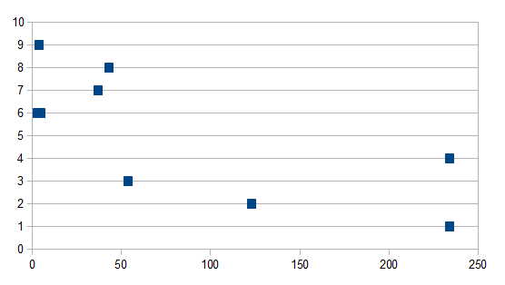
enter image description here

I'd like to provide some justification to students as to why this small part of making a figure is important, besides "because I say so."

Is the use of horizontal lines in figures just the convention of different academic fields and journals, or are there established reasons why its usually best to not include these lines?

$\endgroup$
2

2 Answers 2

7
$\begingroup$

I think about it this way: When I prepare a figure for a paper, I usually want to both show data and make some point about the data. Anything that helps these goals in a simple clear way is a worthwhile addition, anything else should be removed (without distorting the data of course).

In the case of horizontal (or vertical) lines, I would use them only if: (1) It is difficult to tell the exact values for data points and I think that this is important information; (2) I want the viewer to be able to compare the exact y-axis (or x-axis) positions of data points (e.g. to see that two point have exactly the same value, or differ by a specific amount).

Specifically in the figure you show, it seems that the data can only have a limited amount of y values and thus it is easy to tell the value by eye, making the horizontal lines useless in this case.

$\endgroup$
1
  • $\begingroup$ I understand the 1st 2 paragraphs of this answer. On the 3rd paragraph, how would you tell the data points only take limited (whole number?) values if the horizontal lines were not there? It seems to me that this might be a case where the horizontal lines actually help you to work out if the y values are all whole numbers. $\endgroup$
    – RAH
    Commented May 11, 2013 at 5:50
9
$\begingroup$

It's wrong because the default behaviour of Excel is highly prominent gridlines, which are distracting and "chartjunky", and it violates the formatting rules for the journal. Journals often have lowest common denominator formatting rules. They're there so that it's harder to screw things up, not because it's the best way to do things. I remember it was only a few years ago that new APA submission format had to have indented paragraphs for each reference when the prior version was hanging paragraphs because people couldn't figure out their new fangled word processors. The prior version of APA was written for people with typewriters. The rule was in place not because indented paragraphs for each reference was better but because it was more likely all the submissions would look the same.

In short, don't try to derive best principles for graphs from rules for submission to journals. They're a combination of journal consistency, graph quality, and what they can most easily get submitters to consistently do.

$\endgroup$

Your Answer

By clicking “Post Your Answer”, you agree to our terms of service and acknowledge you have read our privacy policy.

Not the answer you're looking for? Browse other questions tagged or ask your own question.