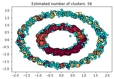
So I am trying to generate a clustered graph using DBScan. I am able to do so but somehow gotten the clustered graph with more than 10+ clusters. It can be seen below.
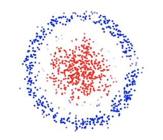
What I was expecting was something more like this with 2 clusters:
Here's my code:
from sklearn.neighbors import NearestNeighbors
from sklearn import datasets

import pandas as pd
import numpy as np
import matplotlib as mpl
import matplotlib.pyplot as plt
import seaborn as sns

from sklearn.cluster import DBSCAN
from sklearn.preprocessing import StandardScaler

%matplotlib inline

n_samples = 1500
X,y= datasets.make_circles(n_samples=n_samples, factor=.5,noise=.05)
X = StandardScaler().fit_transform(X)

neigh = NearestNeighbors(n_neighbors=2)
nbrs = neigh.fit(X)
distances, indices = nbrs.kneighbors(X)

distances = np.sort(distances, axis=0)
distances = distances[:,1]
plt.plot(distances)
plt.grid()
plt.show()

eps = distances[1400]
print("Optimal eps is",eps)
#source on how to find the optimal eps : https://towardsdatascience.com/machine-learning-clustering-dbscan-determine-the-optimal-value-for-epsilon-eps-python-example-3100091cfbc
Some explanation on deriving the optimal epsilon. From the article, what I understand is KNN is used to derive the array of points with shortest distance to its corresponding neighbour. The array is then plotted, and point at which the plotted curve is at its max curvature is the optimal epsilon value.
The model code:
db = DBSCAN(eps=eps,min_samples=5).fit(X)
core_samples_mask = np.zeros_like(db.labels_, dtype=bool) # create array same size as db.labels_ with zeros
core_samples_mask[db.core_sample_indices_] = True
labels = db.labels_
n_clusters_ = len(set(labels)) - (1 if -1 in labels else 0)

print('Estimated number of clusters: %d' % n_clusters_)
plot_dbscan(X, labels, core_samples_mask)
The function to plot the dbscan:
def plot_dbscan (X,labels, core_samples_mask):
    unique_labels = set(labels)
    colors = [plt.cm.Spectral(each)for each in np.linspace(0, 1, len(unique_labels))]
    for k, col in zip(unique_labels, colors):
        if k == -1:
        # White used for noise.
            col = [0, 1,1,1]

        class_member_mask = (labels == k)

        xy = X[class_member_mask & core_samples_mask]
        plt.plot(xy[:, 0], xy[:, 1], 'o', markerfacecolor=tuple(col),
                         markeredgecolor='k', markersize=14)

        xy = X[class_member_mask & ~core_samples_mask]
        plt.plot(xy[:, 0], xy[:, 1], 'o', markerfacecolor=tuple(col),
                         markeredgecolor='k', markersize=6)

    plt.title('Estimated number of clusters: %d' % n_clusters_)
    plt.show()
How do I achieve the expected graph? Thank you for reading.
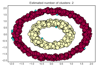
EDIT: I got it the graph to print what I want as seen below.

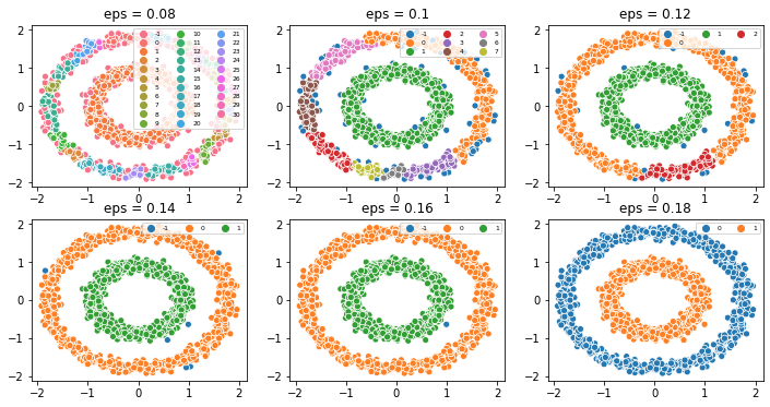
However, it was through, playing around with the $e$ value and not through the described estimation technique found in the article. Why did it not give a rough estimation to near 0.14? Any insight would be greatly appreciated.


