146
$\begingroup$

I'm reading a paper where author discards several variables due to high correlation to other variables before doing PCA. The total number of variables is around 20.

Does this give any benefits? It looks like an overhead to me as PCA should handle this automatically.

$\endgroup$
2
  • 29
    $\begingroup$ Just a hint. Think, in what way the results of PCA will change if add more and more copies (or near copies) of one of the variables. $\endgroup$
    – ttnphns
    Commented Feb 21, 2013 at 19:33
  • 3
    $\begingroup$ @type2 can you please name the paper you were reading? $\endgroup$
    – Amatya
    Commented Jun 21, 2018 at 3:24

6 Answers 6

157
$\begingroup$

This expounds upon the insightful hint provided in a comment by @ttnphns.

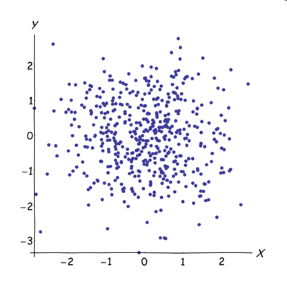
Adjoining nearly correlated variables increases the contribution of their common underlying factor to the PCA. We can see this geometrically. Consider these data in the XY plane, shown as a point cloud:
Scatterplot

There is little correlation, approximately equal covariance, and the data are centered: PCA (no matter how conducted) would report two approximately equal components.

Let us now throw in a third variable $Z$ equal to $Y$ plus a tiny amount of random error. The correlation matrix of $(X,Y,Z)$ shows this with the small off-diagonal coefficients except between the second and third rows and columns ($Y$ and $Z$):

$$\left( \begin{array}{ccc} 1. & -0.0344018 & -0.046076 \\ -0.0344018 & 1. & 0.941829 \\ -0.046076 & 0.941829 & 1. \end{array} \right)$$

Geometrically, we have displaced all the original points nearly vertically, lifting the previous picture right out of the plane of the page. This pseudo 3D point cloud attempts to illustrate the lifting with a side perspective view (based on a different dataset, albeit generated in the same way as before):
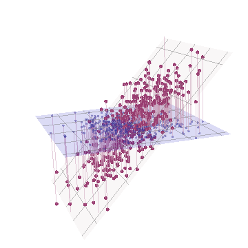
3D plot

The points originally lie in the blue plane and are lifted to the red dots. The original $Y$ axis points to the right. The resulting tilting also stretches the points out along the YZ directions, thereby doubling their contribution to the variance. Consequently, a PCA of these new data would still identify two major principal components, but now one of them will have twice the variance of the other.

This geometric expectation is borne out with some simulations in R. For this I repeated the "lifting" procedure by creating near-collinear copies of the second variable a second, third, fourth, and fifth time, naming them $X_2$ through $X_5$. Here is a scatterplot matrix showing how those last four variables are well correlated:
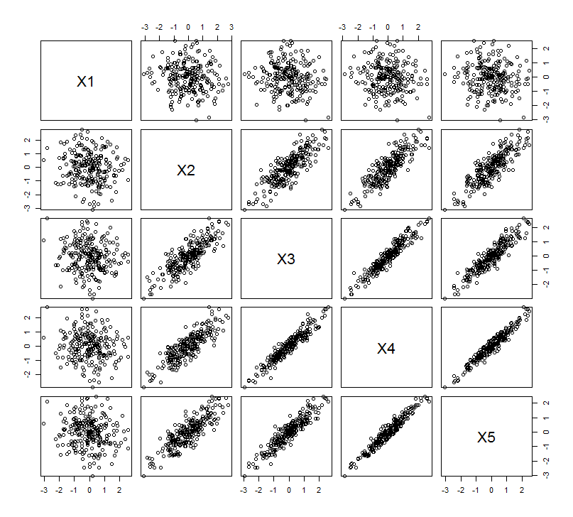
Scatterplot matrix

The PCA is done using correlations (although it doesn't really matter for these data), using the first two variables, then three, ..., and finally five. I show the results using plots of the contributions of the principal components to the total variance.
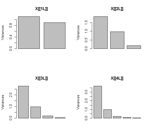
PCA results

Initially, with two almost uncorrelated variables, the contributions are almost equal (upper left corner). After adding one variable correlated with the second--exactly as in the geometric illustration--there are still just two major components, one now twice the size of the other. (A third component reflects the lack of perfect correlation; it measures the "thickness" of the pancake-like cloud in the 3D scatterplot.) After adding another correlated variable ($X_4$), the first component is now about three-fourths of the total; after a fifth is added, the first component is nearly four-fifths of the total. In all four cases components after the second would likely be considered inconsequential by most PCA diagnostic procedures; in the last case it's possible some procedures would conclude there is only one principal component worth considering.

We can see now that there may be merit in discarding variables thought to be measuring the same underlying (but "latent") aspect of a collection of variables, because including the nearly-redundant variables can cause the PCA to overemphasize their contribution. There is nothing mathematically right (or wrong) about such a procedure; it's a judgment call based on the analytical objectives and knowledge of the data. But it should be abundantly clear that setting aside variables known to be strongly correlated with others can have a substantial effect on the PCA results.


Here is the R code.

n.cases <- 240               # Number of points.
n.vars <- 4                  # Number of mutually correlated variables.
set.seed(26)                 # Make these results reproducible.
eps <- rnorm(n.vars, 0, 1/4) # Make "1/4" smaller to *increase* the correlations.
x <- matrix(rnorm(n.cases * (n.vars+2)), nrow=n.cases)
beta <- rbind(c(1,rep(0, n.vars)), c(0,rep(1, n.vars)), 
              cbind(rep(0,n.vars), diag(eps)))
y <- x%*%beta                # The variables.
cor(y)                       # Verify their correlations are as intended.
plot(data.frame(y))          # Show the scatterplot matrix.

# Perform PCA on the first 2, 3, 4, ..., n.vars+1 variables.
p <- lapply(2:dim(beta)[2], function(k) prcomp(y[, 1:k], scale=TRUE))

# Print summaries and display plots.
tmp <- lapply(p, summary)
par(mfrow=c(2,2))
tmp <- lapply(p, plot)
$\endgroup$
23
  • 7
    $\begingroup$ +1, beautiful figures. What did you use for the top 2? The 1st looks like it's hand-drawn. $\endgroup$ Commented Feb 21, 2013 at 23:02
  • 18
    $\begingroup$ @gung I used a variant of the code at mathematica.stackexchange.com/questions/11350/xkcd-style-graphs for the first figure. It has long been known that adding a little random jittering to text or an image can make it look warmer and more accessible. ($\TeX$ itself was originally built on Metafont, which Donald Knuth designed after a deep study of typography; he included such built-in variation.) For some graphics, like the pseudo 3D scatterplot in the second figure, the jittering technique adds little or is distracting, so I did not use it there. $\endgroup$
    – whuber
    Commented Feb 21, 2013 at 23:15
  • 2
    $\begingroup$ That is very enlightening, whuber. I learned something new. $\endgroup$
    – Spacey
    Commented Feb 22, 2013 at 16:18
  • 7
    $\begingroup$ @whuber is like the hippest statistician -- using XKCD plots like a pro. $\endgroup$ Commented Feb 22, 2013 at 20:23
  • 2
    $\begingroup$ @logan In another word, no. Allow me to direct your attention to a sentence late in this post: "There is nothing mathematically right (or wrong) about such a procedure; it's a judgment call based on the analytical objectives and knowledge of the data." $\endgroup$
    – whuber
    Commented May 20, 2014 at 15:23
53
$\begingroup$

I will further illustrate the same process and idea as @whuber did, but with the loading plots, - because loadings are the essense of PCA results.

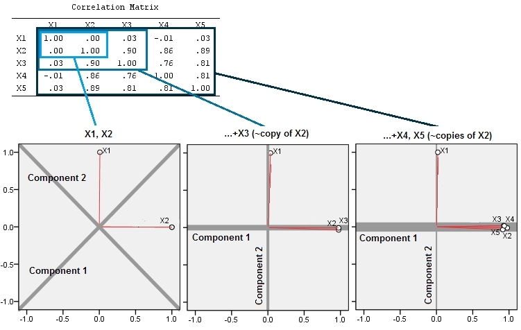
Here is three 3 analyses. In the first, we have two variables, $X_1$ and $X_2$ (in this example, they do not correlate). In the second, we added $X_3$ which is almost a copy of $X_2$ and therefore correlates with it strongly. In the third, we still similarly added 2 more "copies" of it: $X_4$ and $X_5$.

The plots of loadings of the first 2 principal components then go. Red spikes on the plots tell of correlations between the variables, so that the bunch of several spikes is where a cluster of tightly correlated variables is found. The components are the grey lines; the relative "strength" of a component (its relative eigenvalue magnitude) is given by weight of the line.

enter image description here

Two effects of adding the "copies" can be observed:

  1. Component 1 becomes stronger and stronger, and Component 2 weaker and weaker.
  2. Orientation of the components change: at first, Component 1 went in the middle between $X_1$ and $X_2$; as we added $X_3$ to $X_2$ Component 1 immediately re-oriented itself to follow the emergent bunch of variables; and you may be sure that after we further added two more variables to the bunch the attachment of Component 1 to that bunch of closely correlated variables became more undisputable.

I will not resume the moral because @whuber already did it.


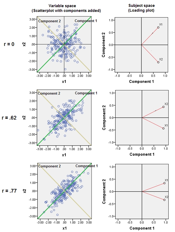
Addition. Below are some pictures in response to @whuber's comments. It is about a distinction between "variable space" and "subject space" and how components orient themselves here and there. Three bivariate PCAs are presented: first row analyzes $r=0$, second row analyzes $r=0.62$, and third row $r=0.77$. The left column is scatterplots (of standardized data) and the right column is loading plots.

On a scatterplot, the correlation between $X_1$ and $X_2$ is rendered as oblongness of the cloud. The angle (its cosine) between a component line and a variable line is the corresponding eigenvector element. Eigenvectors are identical in all three analyses (so the angles on all 3 graphs are the same). [But, it is true, that with $r=0$ exactly, eigenvectors (and hence the angles) are theoretically arbitrary; because the cloud is perfectly "round" any pair of orthogonal lines coming through the origin could serve as the two components, - even $X_1$ and $X_2$ lines themselves could be chosen as the components.] The coordinates of data points (200 subjects) onto a component are component scores, and their sum of squares devided by 200-1 is the component's eigenvalue.

On a loading plot, the points (vectors) are variables; they spread the space which is 2-dimensional (because we have 2 points + origin) but is actually a reduced 200-dimensional (number of subjects) "subject space". Here the angle (cosine) between the red vectors is $r$. The vectors are of equal, unit length, because the data had been standardized. The first component is such a dimension axis in this space which rushes towards the overal accumulation of the points; in case of just 2 variables it is always the bisector between $X_1$ and $X_2$ (but adding a 3rd variable can deflect it anyhow). The angle (cosine) between a variable vector and a component line is the correlation between them, and because the vectors are unit lenght and the components are orthogonal, this is nothing else than the coordinates, the loading. Sum of squared loadings onto the component is its eigenvalue (the component just orients itself in this subject space so as to maximize it)

enter image description here


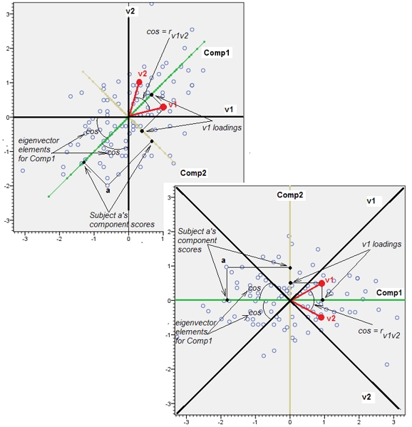
Addition2. In Addition above I was speaking about "variable space" and "subject space" as if they are incompatible together like water and oil. I had to reconsider it and may say that - at least when we speak about PCA - both spaces are isomorphic in the end, and by that virtue we can correctly display all the PCA details - data points, variable axes, component axes, variables as points, - on a single undistorted biplot.

Below are the scatterplot (variable space) and the loading plot (component space, which is subject space by its genetic origin). Everything that could be shown on the one, could also be shown on the other. The pictures are identical, only rotated by 45 degrees (and reflected, in this particular case) relative each other. That was a PCA of variables v1 and v2 (standardized, thus it was r that was analyzed). Black lines on the pictures are the variables as axes; green/yellow lines are the components as axes; blue points are the data cloud (subjects); red points are the variables displayed as points (vectors).

enter image description here

$\endgroup$
8
  • 1
    $\begingroup$ +1 interesting illustration. BTW, your second observation is an artifact of the data: the orientation changed because in the first case the correlation was perfect, giving a two-dimensional eigenspace. (This is extremely rare in real data; it usually means a database mistake was made and one variable is a linear re-expression of another.) The software was free to choose any orthogonal basis for that space, arbitrarily. Just the tiniest amount of correlation would have removed this degeneracy. I think, therefore, that you over-interpret this reorientation phenomenon. $\endgroup$
    – whuber
    Commented Feb 22, 2013 at 15:03
  • $\begingroup$ @whuber, Maybe I don't understand you. What "perfect" correlation? r bw X1 and X2 was .003; and it could'd been any, for example .503. That would be the cos of the angle bw the two red vectors on the plot. Whatever the r, the 1st PC is always the bisector while only 2 variables are in analysis. I guess that your note The software was free to choose any orthogonal basis for that space, arbitrarily applies to round cloud in variable space (i.e. data scatterplot, like the 1st picture in your answer), but loading plot is subject space where variables, not cases, are points (vectors). $\endgroup$
    – ttnphns
    Commented Feb 22, 2013 at 16:08
  • 1
    $\begingroup$ Sorry; I meant perfect lack of correlation. In your analyses, did you use covariance or correlation or otherwise standardize the data rows or columns? (Perhaps I misunderstand, but I do not find your distinction between "subject" and "variable" spaces meaningful in this context: both the original basis vectors and the data are elements of, say, $\mathbb{R}^5$; the "loading plot" is a projection onto the subspace generated by the first two PCs. I believe most people would take the "subject" space to have 240 dimensions in my simulation: I didn't illustrate that with a scatterplot!) $\endgroup$
    – whuber
    Commented Feb 22, 2013 at 16:27
  • $\begingroup$ I used correlations (notice the matrix and the fact that the red vectors are essentially the same length). Yes, subject space is a tupsy-torvey scatterplot with n axes (subjects) and p points (variables). Of course, all n-p dimensions are redundant and any set of p variables can be plotted in p-dimensional subject space, but this doesn't turn it into a variable space! I'll just add a picture to my answer. $\endgroup$
    – ttnphns
    Commented Feb 22, 2013 at 16:41
  • 5
    $\begingroup$ +1, thanks for the additional contribution, @ttnphns. This is turning from what I originally thought was a fairly simple question into a fabulously informative thread. $\endgroup$ Commented Feb 22, 2013 at 17:19
4
$\begingroup$

Without details from your paper, I would conjecture that this discarding of highly-correlated variables was done merely to save off on computational power or workload. I cannot see a reason for why PCA would 'break' for highly correlated variables. Projecting data back onto the bases found by PCA has the effect of whitening the data, (or de-correlating them). That is the whole point behind PCA.

$\endgroup$
3
  • 4
    $\begingroup$ Did you read the hint by @ttnphns? PCA pays attention not just to the eigenvectors (which you discuss) but also to the eigenvalues (which you ignore). This is critical, because the eigenvalues are used to determine which components to retain and which ones to drop. $\endgroup$
    – whuber
    Commented Feb 21, 2013 at 22:02
  • 3
    $\begingroup$ @whuber Yes...yes I think I get it now. So essentially, more correlated variables will over-emphasize particular eigenvectors, (directions), and if there are many correlated variables, then there would be so many more overemphasized 'fake' directions, that drown out an 'original' eigenvector/direction that would have otherwise been easily seen. Am I understanding you right? $\endgroup$
    – Spacey
    Commented Feb 23, 2013 at 5:18
  • 3
    $\begingroup$ That's pretty close, Mohammad. The reality is that a set of correlated variables might "load" onto several principal components (eigenvectors), so including many variables from such a set will differentially weight several eigenvectors--and thereby change the directions of all eigenvectors, too. $\endgroup$
    – whuber
    Commented Feb 23, 2013 at 18:06
1
$\begingroup$

From my understanding correlated variables are ok, because PCA outputs vectors that are orthogonal.

$\endgroup$
1
  • 6
    $\begingroup$ You're right, but would you mind explaining why orthogonality has any bearing on whether or not to discard variables in advance? $\endgroup$
    – whuber
    Commented Feb 21, 2013 at 18:29
-2
$\begingroup$

Well, it depends on your algorithm. Highly correlated variables may mean an ill-conditioned matrix. If you use an algorithm that's sensitive to that it might make sense. But I dare saying that most of the modern algorithms used for cranking out eigenvalues and eigenvectors are robust to this. Try removing the highly correlated variables. Do the eigenvalues and eigenvector change by much? If they do, then ill-conditioning might be the answer. Because highly correlated variables don't add information, the PCA decomposition shouldn't change

$\endgroup$
3
  • 4
    $\begingroup$ Unfortunately, the PCA does change: it's almost guaranteed. $\endgroup$
    – whuber
    Commented Feb 21, 2013 at 22:01
  • 1
    $\begingroup$ @whuber Wow, huge amount of responses, and very informative. Sorry for my comment, it was totally wrong. My bad. Very informative answer BTW $\endgroup$
    – Juancentro
    Commented Feb 22, 2013 at 22:08
  • 4
    $\begingroup$ I learn the most from totally wrong answers, Juancentro--especially my own, which fortunately rarely get out in public :-). I had thoughts similar to yours until @ttnphns left a comment. $\endgroup$
    – whuber
    Commented Feb 22, 2013 at 22:17
-2
$\begingroup$

Depends on what principle component selection method you use doesn't it?

I tend to use any principle component with an eigenvalue > 1. So it wouldn't effect me.

And from the examples above even the scree plot method would usually pick the right one. IF YOU KEEP ALL BEFORE THE ELBOW. However if you simply picked the principle component with the 'dominant' eigenvalue you would be lead astray. But that is not the right way to use a scree plot!

$\endgroup$
1
  • 7
    $\begingroup$ Welcome to the site, Chris. Unfortunately, neither of these ad-hoc procedures are particularly defensible. Notice that in the first case you could not change the shape of your data at all and go from selecting all of them to selecting none of them (just by multiplying everything by a constant). $\endgroup$
    – cardinal
    Commented Mar 12, 2013 at 2:02

Not the answer you're looking for? Browse other questions tagged or ask your own question.