Background: I asked hundreds of participants in my survey how much they are interested in selected areas (by five point Likert scales with 1 indicating "not interested" and 5 indicating "interested").
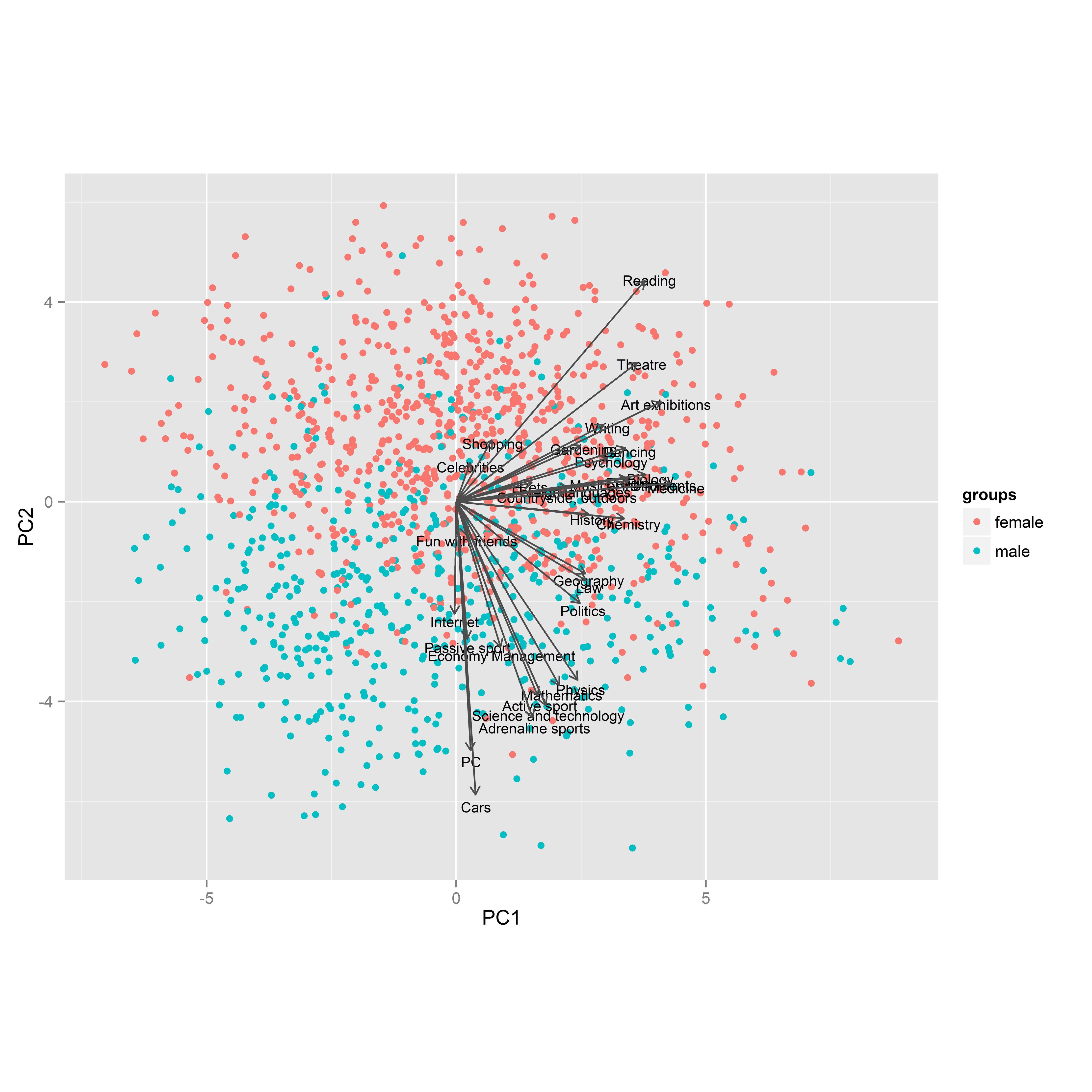
Then I tried PCA. The picture below is a projection into first two principal components. Colors are used for genders and PCA arrows are original variables (i.e. interests).
I noticed that:
- Dots (respondents) are quite well separated by the second component.
- No arrow points left.
- Some arrows are much shorter than others.
- Variables tend to make clusters, but not observations.
- It seems that arrows pointing down (to males) are mainly males' interests and arrows pointing up are mainly females' interests.
- Some arrows point neither down nor up.
Questions: How to correctly interpret relationships between dots (respondents), colors (genders) and arrows (variables)? What other conclusions about respondents and their interests can be mined from this plot?
The data can be found here.

