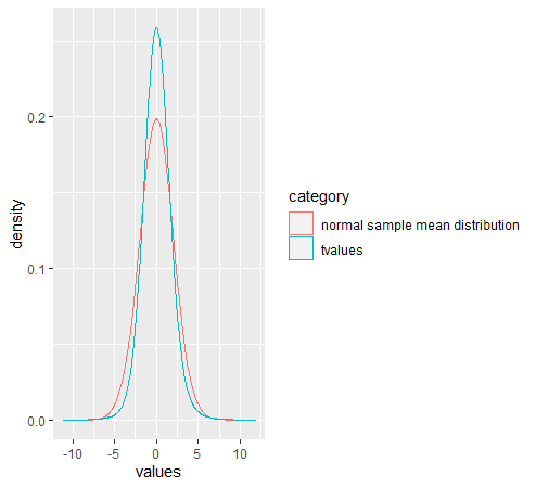
I've been learning about the t-distribution for my stats class and while running some simulations in R to explore the concept, I've run into an issue. I don't know whether it arises from my code, or whether I have seriously misunderstood how t-distributions arise.
Below I've pasted my code and the graph it gives me. The dataset it works on is heights from the dslabs package. It's a dataframe that contains two normally distributed recordings of heights, one for men and one for women. In total there are 1050 observations. I ran a Monte Carlo simulation 1000 times, each time sampling 10 observations randomly from the data, got the sample mean $\bar{x}$ and sample standard deviation $s$. The t-value is then $t=\frac{\bar{x}-\mu}{\frac{s}{\sqrt{n}}}$ and it should have a t-distribution about 0. $\mu$ is the population mean of heights. I made a density plot of these t-values and also 1000 randomly generated normally distributed numbers with $sd= \frac{\sigma}{\sqrt{n}}$. This is the standard deviation of the distribution of sample means of samples of size n. It should be normally distributed.
Here's my code:
n <- 5
tvalues <- replicate(10000,{
    X <- heights[sample(1:1050,size=n),] %>% pull(height)
    Xbar <- mean(X)
    s <- sd(X)
    tvalue <- (Xbar-mu)/(s/sqrt(n))
})
df1 <- data.frame(values=tvalues,category="tvalues")
normal_values <- rnorm(1000,mean=0,sd=sigma/sqrt(n))
df2 <- data.frame(values=normal_values,category="normal sample mean distribution")
df <- rbind(df1,df2)
df$category <- as.factor(df$category)
df %>% ggplot(mapping=aes(values,color=category)) + geom_density(bw=1)
Shouldn't the t-distribution have fatter tails than the normal?

