"Accounting for the variation" usually means "after regressing on the other explanatory variables and extracting the residuals" -- that is, the "left over" variation not "accounted for" by those variables. The residuals have the same structure as the original responses, so just about any graphical method of plotting the responses applies mutatis mutandis to the residuals.
("Just about" acknowledges that sometimes a method relies on a restrictive assumption, such as that all values involved are positive. Such a resumption might not hold for residuals, which are guaranteed--by construction--to have some non-positive values.)
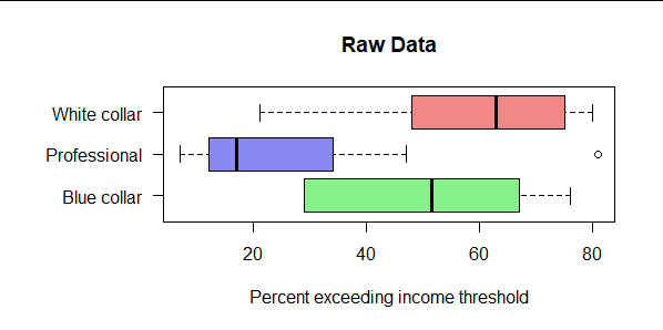
As an example, here is a boxplot relating a quantitative response, income, to a categorical variable (from O.D. Duncan's occupational prestige data supplied in the R package carData; each row summarizes one of 45 occupations).

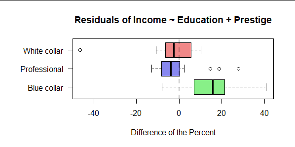
This dataset has two other variables, education and prestige. Here is the same boxplot of the residuals after regressing income on those other two variables, thereby "accounting for the variation" in income associated with measures of educational attainment and prestige of the occupation

Although the large differences apparent in the first figure are reduced and the within-profession variability is considerably narrowed, neither these differences nor this variability are completely eliminated. We would therefore want to explore (theoretically or with other data) whether these residual differences can be attributed to the type of profession.
Disclaimer: This does not constitute an analysis of the data (which I have not explored). Many more considerations, ranging from preliminary transformations to post hoc diagnostics for goodness of fit, would be required before making any use of the results.
The boxplot function in R produced these figures. As in the question, the residuals were computed with lm (ordinary least squares).
library(carData)
# View(Duncan)
X <- Duncan
mai <- par("mai")
par(mai=mai+c(0,0.75,0,0)) # Increase the left margin for long labels
#
# Figure 1
#
X$Profession <- c(prof="Professional",
                  wc="White collar",
                  bc="Blue collar")[X$type] # Give meaningful labels to this variable
col <- hsv(seq(2,6,2)/6, .75, .9, .6)
boxplot(income ~ Profession, X, main="Raw Data", horizontal=TRUE, col=col, las=1,
        xlab="Percent exceeding income threshold")
#
# Figure 2
#
fit <- lm(income ~ education + prestige, X)
X$Residual <- residuals(fit)  # Take out the effects of `education` and `prestige`
boxplot(Residual ~ Profession, X, horizontal=TRUE, col=col, las=1,
        main="Residuals of Income ~ Education + Prestige",
        xlab="Difference of the Percent")
abline(v=0, col="#00000040", lwd=2, lty=2)
par(mai=mai) # Restore the original graphing environment

