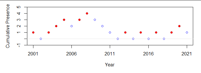
As always, the design of the plot depends on the story you want to tell.
To display the data, a simple table will do:
$$\begin{array}{r|l}
\text{Absent} & \text{Present}
\\
& 2001 \\2002 &\\&2003\\&2004\\&2005\\2006&\\&2007\\&2008\\2009&\\2010&\\2011&\\2012&\\&2013\\2014&\\&2015\\2016&\\&2017\\2018&\\&2019\\&2020\\2021&
\end{array}$$
A graphical representation that works in a similar manner is a rug plot:

(You could render this in the style of low-brow media by, say, replacing each of the red lines with the image of your frog and each of the dashed blue lines with the image of, say, an empty pond -- but only if your purpose is to distract, rather than inform, the viewer.)
But maybe the story you want to tell, or the behavior you want to reveal, is the rate at which presence is noted over time. That is revealed by the difference between the total years present and the total years absent, here colored to indicate presence in each year:

These images are honest in the sense of introducing no graphical distortion (Tufte's Lie Factor is at its smallest value of 1:1) and they all use one of the clearest possible modes of representation: namely, both presence and date are represented by positions along common axes.
All these are straightforward to create in almost any graphics environment. I did the table manually because it's so short. Here is R code for the figures.
X <- data.frame(Year=2001:2021,
                Presence=c(1,0,1,1,1,0,1,1,0,0,0,0,1,0,1,0,1,0,1,1,0))
#
# Rug plots.
#
with(X, plot(Year, rep(0, length(Year)), ylim=0:1, type="n", bty="n", ylab="", yaxt="n",
             xaxp=c(min(Year), max(Year), 4)))
with(subset(X, Presence==1), rug(Year, ticksize=0.5, lwd=2, col="Red", side=3))
with(subset(X, Presence==0), rug(Year, ticksize=0.5, lwd=2, lty=3, col="Blue", side=1))
mtext(c("Absent", "Present"), side=2, line=0, at=c(1/4, 3/4), las=1, adj=1, padj=1/2)
#
# Cumulative plot.
#
with(X, plot(Year, cumsum(2*Presence-1), ylim=c(-1, 5),
             pch=ifelse(Presence==1, 21, 1),
             bg="Red",
             col=ifelse(Presence==1, "Gray", "Blue"),
             cex=ifelse(Presence==1, 1.25, 1),
             ylab="Cumulative Presence",
             xaxp=c(min(Year), max(Year), 4)))
abline(h=0, col=gray(0.90))


