1
$\begingroup$

I was reading An Introduction to Statistical Modeling of Extreme Values by Stuart Coles, and I ran into a problem whilst trying to replicate a basic return level graph in R. For context, I first present the definition of a return level plot (p.49 of the book):

Estimates of extreme quantiles of the annual maximum distribution are then obtained by inverting Eq. (3.2): $$z_p = \begin{cases} \mu - \frac{\sigma}{\xi}\left[1-\{-\log(1-p)\}^{-\xi}\right], & \text{for } \ \xi \neq 0, \\ \mu-\sigma \log\{ -\log(1-p)\}, & \text{for } \ \xi =0,\end{cases} \tag{3.4}$$ where $G(z_p) = 1-p$. In common terminology, $z_p$ is the return level associated with the return period $1/p$, since to a reasonable degree of accuracy, the level $z_p$ is expected to be exceeded by the annual maximum in any particular year with probability $p$.
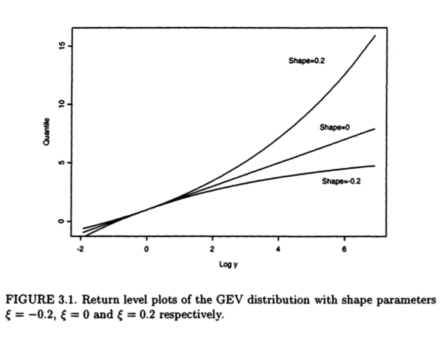
Since quantiles enable probability models to be expressed on the scale of data, the relationship of the GEV model to its parameters is most easily interpreted in terms of the quantile expressions (3.4). In particular, defining $y_p = -\log(1-p),$ so that $$z_p = \begin{cases} \mu - \frac{\sigma}{\xi}\left[1-y_p^{-\xi}\right], & \text{for } \ \xi \neq 0, \\ \mu-\sigma \log (y_p), & \text{for } \ \xi =0,\end{cases} $$ it follows that, if $z_p$ is plotted against $y_p$ on a logarithmic scale - or equivalently, if $z_p$ is plotted against $\log(y_p)$ - the plot is linear in the case $\xi = 0$.If $\xi < 0$ the plot is convex with asymptotic limit as $p \to 0$ at $\mu - \sigma/\xi$; if $\xi> 0$ the plot is concave and has no finite bound. This graph is a return level plot. Because of the simplicity of interpretation, and because the choice of scale compresses the tail of the distribution so that the effect of extrapolation is highlighted, return level plots are particularly convenient for both model presentation and validation. Fig 3.1 shows return level plots for a range of shape parameters.

Fig 3.1

As a reminder, $\mu,\xi \in \mathbb{R}$ and $\sigma > 0$ are the parameters of the GEV distribution. Now, I wanted to replicate Figure 3.1. To do this, I did the following:

mu   <- 0; sigma <- 1
p    <- ppoints(1000)
yp   <- -log(1-p)
zp_1 <- mu - (sigma/0.2)*(1-yp^(-0.2))   #xi =  0.2
zp_2 <- mu - sigma*log(yp)               #xi =   0
zp_3 <- mu - (sigma/-0.2)*(1-yp^(0.2))   #xi = -0.2

plot(log(yp), zp_1, type = "l")
lines(log(yp), zp_2)
lines(log(yp), zp_3)

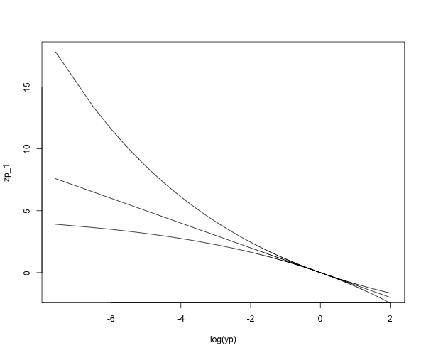
which produced the following plot:

RL1

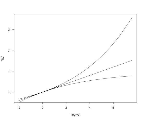
Evidently, this plot is not the same as Figure 3.1. However, if instead of graphing $\{(\log(y_p), z_p), 0 <p<1\}$ we graph $\{(-\log(y_p), z_p), 0 <p<1\}$, we obtain the following:

plot(-log(yp), zp_1, type = "l")
lines(-log(yp), zp_2)
lines(-log(yp), zp_3)

enter image description here

which seems to be exactly Figure 3.1. I know the difference is just a sign, but is there something I am missing, theoretically? Did the author make a mistake? Any help is appreciated.

$\endgroup$

1 Answer 1

2
+50
$\begingroup$

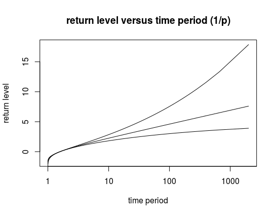
In the rest of the book, several return level plots are made by plotting the time period $T=1/p$ on the x-axis with a logarithmic scale. (like the graph on the bottom of this post)

But for this one graph, instead of plotting $\log(T) = \log(1/p) = - \log(p)$ the author chose to plot with $y_p = -\log(1-p)$.

It is not so clear why it was done because that type of return level plot does not return anywhere else in the book. Possibly it was done to show how to linearize the case of $\xi = 0$. This $y_p$ does occur a few times in the book and is explained as making it easier to evaluate the different models, because of the differences in linearity, concavity and convexity for respectively $\xi = 0$, $\xi > 0$ and $\xi < 0$.

Because the plot with $\log(y_p)$ is less typical, and because $y_p$ has no clear intuitive meaning (it is just a technical aid to linearized the graph), a little mistake with a minus sign might have slipped into to text.

The equation in the text, $z_p = \mu - \sigma \log y_p$, shows clearly that you get a line with negative slope. It may likely have been inverted to make the plot appear more like the other plots with $\log(T)$ on the x-axis.

mu   <- 0; sigma <- 1
p    <- ppoints(1000)
yp   <- -log(1-p)
zp_1 <- mu - (sigma/0.2)*(1-yp^(-0.2))   #xi =  0.2
zp_2 <- mu - sigma*log(yp)               #xi =   0
zp_3 <- mu - (sigma/-0.2)*(1-yp^(0.2))   #xi = -0.2

plot((1/p), zp_1, type = "l", log = "x",
     xlab = "time period", ylab = "return level", xaxt = "n")
axis(1,at = 10^c(0:4))
lines((1/p), zp_2)
lines((1/p), zp_3)
title("return level versus time period (1/p)")

versus time period

Edit:

As mentioned in the discussion in the comments. Several plots in the book are actually also using the $1/y_p$ on the x-axis, even though the axis reads 'return period' (in the limit you do get that $T \sim 1/y_p$).

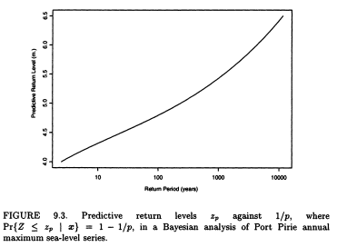
Still, some of the graphs do use the return period $T$. The difference can be seen based on the labels. When the label reads 'return period (years)', with the additional specification of units in years, then the graph relates to $T$ instead of $1/y_p$. See also the original S-PLUS files, which contains different functions for plotting (also seen in the ismev port to R here https://github.com/cran/ismev/blob/master/R/gpd.R).

See for instance Figure 9.3 which has an inflection point.

different plot

$\endgroup$
13
  • $\begingroup$ (+1) Thank you very much for your answer. However I still have some questions: (1) To calculate the $z_i$ you still make use of $y_p = -\log(1-p)$, why would we not use $-\log(p)$ instead? and (2) What would the interpretation be of the $x$-axis on the original plot (the one that appears on the book)? $\endgroup$
    – Bergson
    Commented Sep 19, 2021 at 21:39
  • $\begingroup$ @Bergson the $y_p$ doesn't really have a physical interpretation. The $y_p$ shows up as a variable that is useful in the analysis, but not because it has some special interpretation. (and because of this abstract meaning it is easy to mistakes with minus signs) $\endgroup$ Commented Sep 19, 2021 at 22:02
  • 1
    $\begingroup$ Thank you for your responses, the discussion has been insightful. I agree with you on the negative values aspect. However, looking at the source code for the R package created by the author, I still believe he plots $1/y_p$ (equivalently $-1/\log(p)$) on a logarithmic scale for the $x$-axis. This being said, even though we disagree on the final result, it was your response that lead me to an answer for my question, so I will award you the bounty and accept your answer. $\endgroup$
    – Bergson
    Commented Sep 20, 2021 at 1:00
  • 1
    $\begingroup$ Well, we are talking about two different plots here: (a) one with the $x$-axis being $(1/p)$ and (b) one with the $x$-axis being $1/y_p$, both on a logarithmic scale. Plot (b) yields a straight line when $\xi = 0$, whereas plot(a) does not; there are other minor differences between these graphs. You plotted (a) on your answer, whereas plot (b) looks more like the last graph on my question. Since the author used his own code for the book, I am saying I believe the rest of the plots in the book also correspond to the $x$-axis being $1/y_p$ on a logarithmic scale. $\endgroup$
    – Bergson
    Commented Sep 20, 2021 at 1:25
  • 1
    $\begingroup$ You are right about that package (which is a port by the way, and not the original from the author). The used variable is $-1/\log(f) = -1/\log(1-p) = 1/y_p$. It is wrong however that this axis is called the return period. It is only in the limit that $1/y_p \sim T$. $\endgroup$ Commented Sep 20, 2021 at 2:05

Your Answer

By clicking “Post Your Answer”, you agree to our terms of service and acknowledge you have read our privacy policy.

Not the answer you're looking for? Browse other questions tagged or ask your own question.