5
$\begingroup$

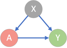
Unlike a standard causal model with A = Treatment, X = Confounder, and Y = Outcome:

enter image description here

a difference-in-differences (DiD) model is concerned with estimating the Average Treatment Effect on the Treated (ATT) $= E(Y_1-Y_0|A=1)$.

Hence we're interested in the causal effects of confounders on the trends in the outcome over time (pre and post periods) between the treatment and control groups. (See see Daw & Hatfield (2018) and Zeldow & Hatfield (2021))

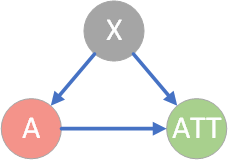
Therefore, for the purposes of drawing a DiD causal diagram is it as simple as replacing Y with ATT:

enter image description here

or perhaps $Y_{post} - Y_{pre}$?

$\endgroup$
3
  • $\begingroup$ Personally, I don't think these graphs are as effective as intended because they stress the variables considered, while a Diff-in-Diff is all about the design/strategy (comparing Treated & Control, Before & After). In particular, these graphs totally lack the time dimension. I do prefer graphs as the one in Figure 5.2.1 in 'Mostly Harmless Econometrics', of the type reported in Wikipedia too under "Difference in differences". $\endgroup$
    – Alessandro
    Commented May 4, 2022 at 16:57
  • 4
    $\begingroup$ @Alessandro After some hunting I found a DiD causal diagram on the Health Policy Data Science Lab website (diff.healthpolicydatascience.org/#confounding) - scroll down a little. They split the outcome variable Y into Y1 and Y2 for the pre and post periods, so that a confounder is causally linked by arrows to both Y1 and Y2. $\endgroup$
    – RobertF
    Commented May 4, 2022 at 18:45
  • $\begingroup$ Very interesting, thanks for sharing!! $\endgroup$
    – Alessandro
    Commented May 4, 2022 at 18:56

1 Answer 1

3
$\begingroup$

enter image description here

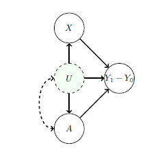
Here, the outcome of interest is the difference between the pre- and post-treatment period, $Y1 - Y0$. This difference is influenced by the treatment, unobserved factors $U$, and observed covariates $X$. The dashed arrow between $U$ and $A$ indicates a statistical dependency between the variables, but where we remain agnostic to the precise causal mechanism. For example, in the minimum wage example, $U$ might be the average income in restaurant’s neighbourhood, which is dependent on the state, and hence also the treatment.

Source:https://github.com/probml/pml2-book/releases/tag/2022-10-16

$\endgroup$
1
  • 1
    $\begingroup$ Thank you - this book looks like a good reference. Now I've read three different sources that describe three different ways to represent the outcome in a diff-in-diff causal diagram: as either (1) $Y_1 - Y_0$, or (2) $Y_1$ and $Y_0$ excluding $Y_1 - Y_0$ (Zeldow & Hatfield), or (3) all three quantities $Y_1 - Y_0$, $Y_1$ and $Y_0$ linked in the same diagram, with $Y_0$ and $Y_1$ having deterministic relationships with $Y_1 - Y_0$ (Pearl). The question is which one is correct? $\endgroup$
    – RobertF
    Commented Oct 28, 2022 at 4:07

Your Answer

By clicking “Post Your Answer”, you agree to our terms of service and acknowledge you have read our privacy policy.

Not the answer you're looking for? Browse other questions tagged or ask your own question.