0
$\begingroup$

I have 3 dataframes with the same structure (each dataframe includes a different type of tweet). Here are the columns of dataframes: id, tweet_time, cascade_lifetime, cascade_size.

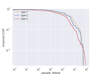
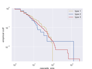
I would like to compare the cascade_lifetime and cascade_size of different types of tweets. To do this, I plotted the empirical CCDF of the cascade_size and cascade_lifetime for different types of tweets:

X1 = df_type1 #type1 tweets
X2 = df_type2 #type2 tweets
X3 = df_type3 #type3 tweets

sns.ecdfplot(data = X1, x= 'cascade_lifetime', complementary=True, label = "type 1", color = 'y')
sns.ecdfplot(data = X2, x= 'cascade_lifetime', complementary=True, label = "type 2", color = 'b')
sns.ecdfplot(data = X3, x= 'cascade_lifetime', complementary=True, label = "type 3", color = 'r')
plt.legend()
plt.xscale('log')
plt.yscale('log')
plt.ylabel('Empirical CCDF')

and here are the plots:

enter image description here enter image description here

My Questions:

  1. Is CCDF the right method to compare data with different sample sizes? my sample sizes are very different, for example, there are 1700 type 2 tweets, and 8600 type 3 tweets, while I only have 100 type 3 tweets. How should I deal with it?

  2. I am not sure how to interpret the plots. Here is my understanding: Most retweet cascades (any type) have lifetime less than ~2.5 hours(1000 s / 3600 = 2.77 h). In general, more number of tweets type 1 (yellow line) have longer lifetime (i.e., lifetime more than a day) compared to other types (100000 s / 3600 = 27.7 h).

Are my interpretations correct? what else we can get from these plots?

NOTES: the distributions of cascade_size and cascade_lifetime in all dataframes are not normal.

$\endgroup$
2
  • 1
    $\begingroup$ Please don't create new threads to edit your original question, Mona. You may simply edit the original. In this instance there's no harm done because the original did not attract any comments or answers, but if it had then its deletion would have unilaterally removed contributions by other users, which isn't fair. $\endgroup$
    – whuber
    Commented May 18, 2023 at 17:37
  • $\begingroup$ @whuber: Sure. Thanks for the tip. $\endgroup$
    – mOna
    Commented May 24, 2023 at 17:47

1 Answer 1

1
$\begingroup$
  1. Question: CCDFs are absolutely fine. Anything that describes the distribution's density instead of the absolute numbers can be used. Other options would be density estimators, in the simplest case scales histograms or for direct group comparison boxplots and their more involved cousin the violin-plot. If you want to also communicate the difference in sample size between your groups you could do so making some kind of double-plot with normal histogram + density, vary the width of the boxplots, or, very involved, with confidence intervals, which would allow the reader to infer the uncertainty about the true distribution of your small groups. It might very well be best to just leave it in the text.

  2. Question: Having a kind of survival function makes perfect sense for lifetime. I would however say the log-scale on both x and especially the y-axis make it almost impossible to read. Also I'm not sure what units you are using. 103 doesn't appear to be anything on the plot.

Anyway here is some R for the alternatives from Question 1:

library(tidyverse)
n <- 1000
df <- data.frame(x = rexp(n), group = sample(c("A", "B", "C"), size = n, replace = T, prob = c(0.1, 0.3, 0.6)))

ggplot(df, aes(x = x, fill = group, color = group)) +
  geom_histogram(aes(y = ..density..), alpha=0.3, position="identity")

ggplot(df, aes(x = x, fill = group, color = group)) +
  geom_histogram(aes(y = ..density..), alpha=0.3, position="identity") +
  scale_x_log10()

ggplot(df, aes(x = x, color = group)) +
  geom_density() +
  scale_x_log10()

ggplot(df, aes(x = x, color = group)) +
  stat_ecdf()

ggplot(df, aes(x = x, color = group)) +
  stat_ecdf() +
  scale_x_log10()

ggplot(df, aes(x = x)) +
  geom_density(aes(color = "combined"), color = "black") +
  geom_density(aes(color = group)) +
  scale_x_log10() 

ggplot(df, aes(y = x, x = group)) +
  geom_violin(draw_quantiles = c(0.25, .5, .75)) +
  scale_y_log10()

ggplot(df, aes(y = x, x = group)) +
  geom_boxplot(varwidth = T) +
  scale_y_log10()
# double plot you might like 
ggplot(df, aes(x = x)) +
  geom_histogram() +
  geom_density(aes(y = after_stat(scaled) * 60, lty = "density estimate\n(scaled for display)")) +
  scale_x_log10() +
  geom_vline(aes(xintercept = quantile(x, 0.25), lty = "quartiles")) +
  geom_vline(aes(xintercept = quantile(x, 0.5), lty = "quartiles")) +
  geom_vline(aes(xintercept = quantile(x, 0.75), lty = "quartiles")) +
  facet_wrap(~ group, ncol = 1, labeller = "label_both")

$\endgroup$

Your Answer

By clicking “Post Your Answer”, you agree to our terms of service and acknowledge you have read our privacy policy.