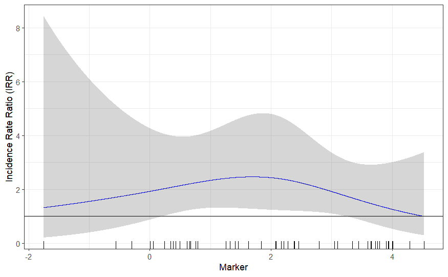
I am trying to visualize the relationship between a continuous variable ("marker") and a count variable ("count") using a negative binomial regression with a restricted cubic spline term.
Now I wanted to visualize the relationship and used the following code:
fit <- MASS::glm.nb(count ~ rcs(marker, 3), data = df.splines)

x_seq <- seq(min(df.splines$marker, na.rm = TRUE),
             max(df.splines$marker, na.rm = TRUE), length.out = 800)

# Create a new dataframe for prediction
new_data <- data.frame(
  marker= x_seq
)
log_preds <- predict(fit, newdata = new_data, type = "link",
                     se.fit = TRUE)

new_data$IRR <- exp(log_preds$fit)
new_data$IRR_lower <- exp(log_preds$fit - 1.96 * log_preds$se.fit)
new_data$IRR_upper <- exp(log_preds$fit + 1.96 * log_preds$se.fit)

ggplot(new_data, aes(x = marker)) +
  geom_line(aes(y = IRR), color = "blue") +
  geom_rug(aes(x = marker), data = df.splines) +
  geom_ribbon(aes(ymin = IRR_lower, ymax = IRR_upper), alpha = 0.2) +
  labs(x = "marker", y = "Incidence Rate Ratio (IRR)") +
  theme_bw()
summary(fit)
It seems as if the range is between 1-2 for the marker variable is associated with a significantly higher incidence ratio of "Count". However, when looking at the summary none of the term show statistical significance, even remotely.
Call:
glm.nb(formula = count ~ rcs(marker,
    3), data = df.splines, init.theta = 0.5572638248, link = log)

Coefficients:
                                                      Estimate Std. Error z value Pr(>|z|)
(Intercept)                                             0.6568     0.4058   1.619    0.106
rcs(marker, 3)marker                                    0.2144     0.3538   0.606    0.545
rcs(marker, 3)marker'                                  -0.4016     0.4272  -0.940    0.347

(Dispersion parameter for Negative Binomial(0.5573) family taken to be 1)

    Null deviance: 49.048  on 47  degrees of freedom
Residual deviance: 48.002  on 45  degrees of freedom
AIC: 183.82

Number of Fisher Scoring iterations: 1

              Theta:  0.557
          Std. Err.:  0.193

 2 x log-likelihood:  -175.824
Is my statistical approach in creating the plot correct? What does the discordance between the plot and the summary regarding statistical significance mean?

