0
$\begingroup$

I am trying to plot a graph which has two y-axes and one x-axis.

Consider three variables A,B,C. My first data set G1, has values of A and B. While getting this dataset in the script I kept C constant. In second dataset G2, I have B and C and was generated for some fixed value of A.

Now I am plotting this with matplotlib.pyplot.

My question is if I keep Y1=A, X=B, Y2=C and plot this data. It comes out to be weird looking which I think is because for G1, C has only one value and for G2 A has only one value. I get two different lines in the final graph and I do not understand what this graph is showing?

To me it feels that if I plot graph between A,B,C variables then it should show me the relationship between them rather than plotting two independent different lines.
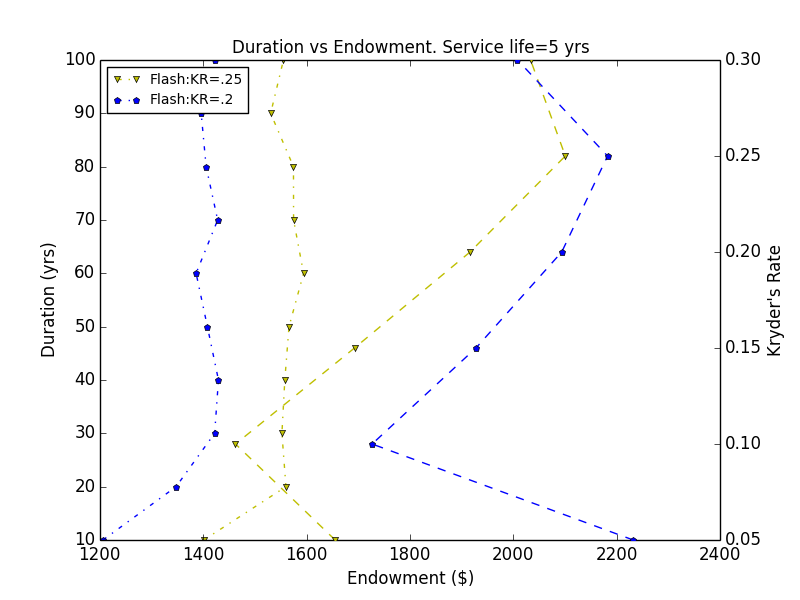
http://imgur.com/OahwFir

$\endgroup$
1
  • $\begingroup$ Thanks for adding the figure. I'm still not sure what's going on. Are these data time-series? Each point is connected by lines to a preceding point & a subsequent point, are those connections meaningful in your data? Eg, for some specific 3 points, maybe the preceding point was Mondays value, the middle point was Tuesday's value, & the subsequent point was Wednesday's value, is there something like that? Also, there may be some issue w/ the code used to generate the plot, can you paste the code you used into your question? $\endgroup$ Commented Feb 9, 2014 at 6:06

1 Answer 1

2
$\begingroup$

A dual-axis graph is just an overlay of two graphs: y1 vs. x, and y2 vs. x. Because each of them contributes a line, the dual-axis graph would have only two lines. If you'd like to see the relationship between y1 and x, y2 and x, as well as y1 and y2, it's easier to just plot three scatterplot or line plot that using dual-axis.

$\endgroup$

Your Answer

By clicking “Post Your Answer”, you agree to our terms of service and acknowledge you have read our privacy policy.

Not the answer you're looking for? Browse other questions tagged or ask your own question.