1
$\begingroup$

I am working with a data set that has information of users and their contributions. Each user has expert level and contribute to multiple section of the project. Here is a sample data set:

   user_id contrib_count total_min_length  group_space     expert_level
1   1641254        30           591213              0             l-4
2   1641254         3             9028              1             l-4
3   1641254        23            19347              2             l-4
4   1641254         1               32              3             l-4
5   1641254         1              401              4             l-4
6  21784963       136          1651150              0             l-6
9    105176         6            23816              3             l-5
11   105176         4             6646              4             l-5
12   105176         2           130838              5             l-5
13 18729750        13           636623              0             l-3
14 18729750         5            20304              2             l-3
15 18729750         2             3135             10             l-3

What I really want to find out is how expert levels differ respect to group_space that they are contributing based on the contrib_count.

ggplot(df, aes(x=group_namespace, y=log(contrib_count))) + xlab("group") + ylab("contrib_count") + geom_point()

To start with I ran a simple scatter plot using log of contrib_count, but I don't think it tells a good story of the data.
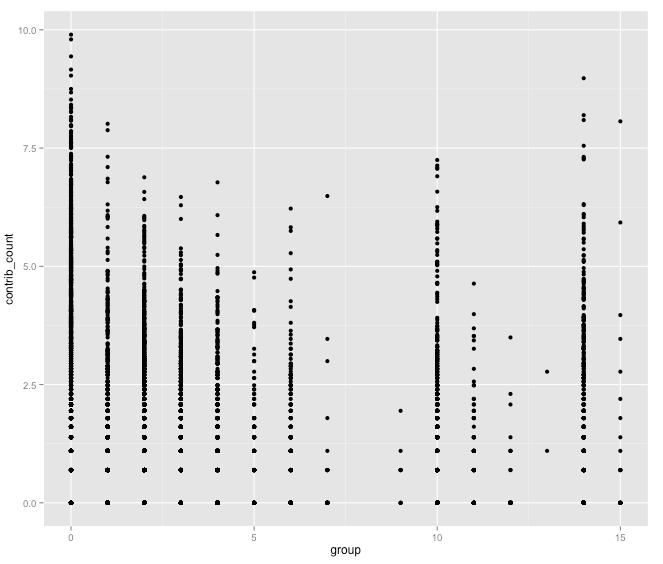
Plot of contribution respect to groups

expert level is a factor and I am not sure if a regression would be more meaningful to explain expert_level and group_space they contribute respect to contrib_count?

$\endgroup$
1
  • $\begingroup$ Since "group" is discrete you might want to jitter the points a little in the x-direction so you can more easily see differences in center; you might also want to mark centers. What is the 'group' variable? Is it nominal? ordered-categories? a count variable? $\endgroup$
    – Glen_b
    Commented Jan 7, 2015 at 0:12

2 Answers 2

2
$\begingroup$

Visualizing is a start. If I understand correctly, what you can do perhaps is create a plot like above, but for each expert level. You can utilize the facet_wrap option in ggplot2:

Instead of your code:

ggplot(df, aes(x=group_namespace, y=log(contrib_count))) + xlab("group") + ylab("contrib_count") + geom_point()

you could try the following:

ggplot(df, aes(x=group_namespace, y=log(contrib_count))) + xlab("group") + ylab("contrib_count") + geom_point() + facet_wrap(~ expert_level)

See documentation here: http://docs.ggplot2.org/current/facet_wrap.html

$\endgroup$
1
$\begingroup$

Density or scatter plot is a way to visualize, whereas regression is a way to test for the significance of the relationship. If your question is how to "find out how levels differ", an appropriate test is needed. It could be simple linear regression, multiple regression or analysis of covariance, depending on the question and data distribution. But back to the visualization question: density plot is best when there are so many points on the scatter plot that they overlap and you cannot tell what's going on (eg middle sections of groups 0 and 10); that said, I am not sure what is being shown on that figure you give as an example.

$\endgroup$

Your Answer

By clicking “Post Your Answer”, you agree to our terms of service and acknowledge you have read our privacy policy.

Not the answer you're looking for? Browse other questions tagged or ask your own question.