5
$\begingroup$

I have fitted multionomial regression models to two different datasets, but from the same country, corresponding to the same event.

Dataset A is an aggregated dataset (at country level), relating a 6 level response scale to a explanatory variable V. The sample size is 41, each individual point in the sample representing the counts of instances of each response level for a given value of V.

Dataset B is a disaggregated dataset, at city level (1 city), relating the same 6 level response scale to the same V as dataset A. Each indidvidual point in the sample is a pair of (V, response level). The sample size is 265.

I expected that, given the information loss through aggregation for dataset A, the fit of the model would be worse than when performing the fitting of the model to B. However, I observe the opposite: the use of A yields obviously better observed vs. expected probabilities than the use of B.

Why can this be?

Is the use of a small sample of aggregated data still inferior to using a large sample of disaggregated data but in a way that is not detectable just through examination of the observed and expected probabilities?

$\endgroup$
1
  • 2
    $\begingroup$ This sounds like an ecological fallacy. A closely related post on our site is stats.stackexchange.com/questions/23779/…. For intuition, consider what happens in ordinary regression when you group all your data into just two classes: you fit a line through two points. It's a perfect fit! In some sense, what is lost through that aggregation is information about variation and about lack of fit. Those losses make the model look better, rather than worse. Maybe your situation is similar. $\endgroup$
    – whuber
    Commented Oct 16, 2014 at 17:08

1 Answer 1

6
$\begingroup$

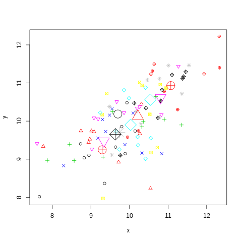
It is common for the correlation or other relationship between aggregated data to show a stronger relationship than the individual or unaggregated data. Basically, if there is a linear relationship between $x$ and $y$ and you also have a grouping variable that is related to $x$ and/or $y$ then looking at only the averages (or other aggregation) of the groups will remove much of the variation within the groups while maintaining the relationship, making the relationship look stronger in the aggregate.

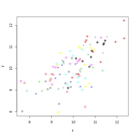
Here is some R code to simulate some data and compare the raw to the aggregated data, look at the graph to see the lower variation and higher correlation:

library(MASS)

tmp.s <- matrix(0.7, nrow=3, ncol=3)
diag(tmp.s) <- 1

set.seed(0)
tmp <- mvrnorm(100, mu=rep(10, 3), tmp.s)

x <- tmp[, 1]
y <- tmp[, 2]
g <- as.numeric(cut(tmp[, 3], quantile(tmp[, 3], (0:10) / 10), 
    include.lowest=TRUE))

plot(x, y, col=g, pch=g)

x2 <- tapply(x, factor(g), FUN=mean)
y2 <- tapply(y, factor(g), FUN=mean)
points(x2, y2, col=g, pch=g, cex=3)

chart 1

chart 2

cor(x, y)
# [1] 0.6511773
cor(x2, y2)
[1] 0.9498334

A related concept is the Ecological Fallacy. The extreme case is Simpson's paradox, where the aggregated data can show an opposite relationship to the data at the individual level.

$\endgroup$
0

Your Answer

By clicking “Post Your Answer”, you agree to our terms of service and acknowledge you have read our privacy policy.

Not the answer you're looking for? Browse other questions tagged or ask your own question.