8
$\begingroup$

I'm interested in a continuous variable, namely blood pressure.

The higher the blood pressure, the greater the risk of heart attack and stroke. However, studies frequently report that also low blood pressure is associated adverse outcomes.

The question is: what is the optimal blood pressure? At what value of blood pressure does risk start to increase?

In other words, how can I model, and visualize graphically, what hazard ratio various levels of blood pressure is associated with. I suspect that some will suggest restricted cubic splines. Do you have any suggestions on suitable R packages that will help me visualize the effect of blood pressure on hazard. I'm fairly familiar with Cox regression and plan using the RMS package. Time-dependent variables are included.

Sample data (no time-dependent variables):

event <- c(1,0,1,0,0,0,0,1,0,0,0,1,1,0,1,0,0,1,0,1,1,1,1,0,1,1,1,0,0,1)
survival <- c(4,29,24,29,29,29,29,19,29,29,29,3,9,29,15,29,29,11,29,5,13,20,22,29,16,21,9,29,29,15)
statin <- c(0,0,0,0,1,1,1,0,0,0,0,0,0,0,0,0,0,1,0,0,1,0,0,0,0,0,0,0,0,0)
bloodpressure <- c(160,120,150,140,135,110,139,140,153,129,149,163,179,129,144,119,100,115,145,150,130,120,122,129,116,171,129,126,159,150)
data <- data.frame(event, survival, statin, bloodpressure)
View(data)

require(rms)
fit <- coxph(Surv(survival, event) ~ statin + rcs(bloodpressure, 3), data=data)

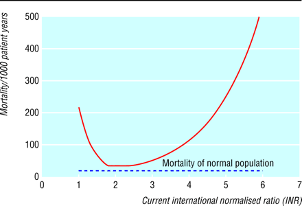
I had something like this in mind: http://www.bmj.com/content/325/7372/1073/F1 Via Poisson regression
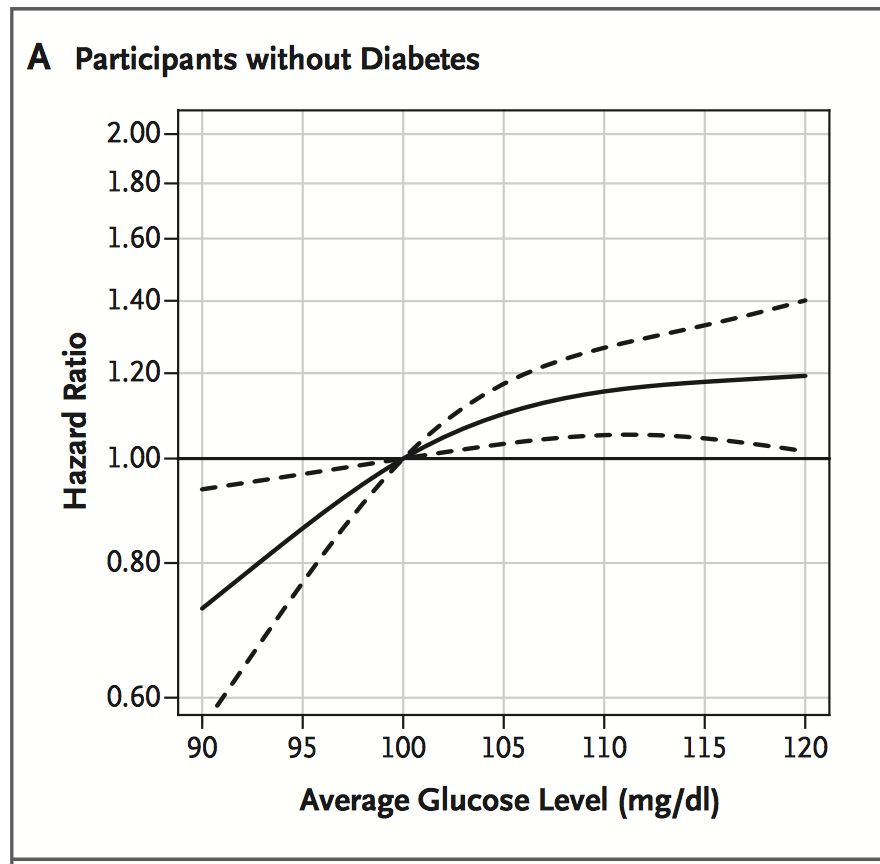
http://www.nejm.org/doi/full/10.1056/NEJMoa1215740 Via Cox regression
Thanks

$\endgroup$

5 Answers 5

3
$\begingroup$

Don't accept this answer, it's only for variety:

In oncology, there is a different approach more closely to proportional hazards. It would work as follows: One splits the blood pressure scale in small intervals and estimates the hazard ratios "locally". You'll get a plot of blood pressure vs. hazard ratio. It is called STEPP by Bonetti and Gelber (2004). There is also a R package. But you have to keep in mind the downsides of this apporach: It needs rather large sample sizes and the results depend on the (arbitrary) length of the intervals. After all, it is more useful for explanatory than confirmatoric analysis. Also, you will not get the optimal blood pressure but only an interval. The only pro is that you don't have to specify the shape of the hazard function.

(Which is also a downside because it's tempting you to think less in advance of your analysis)

$\endgroup$
1
  • $\begingroup$ Thanks Horst! Always nice with inputs from other fields. I've actually thought about splitting blood pressure into quantiles (e.g deciles) and obtain hazard ratios for these groups. The problem is that I then have to use one of these groups as a reference, which might not be a huge drawback but I think that it would be a bit better to model the variable as continuous. Have a look at: nejm.org/doi/full/10.1056/NEJMoa1215740 $\endgroup$ Commented Oct 30, 2014 at 10:57
3
+50
$\begingroup$

I think you are on the right track with rcs of the rms package. In fact, rms comes with its own version of Coxph, it is called cph.

You might wish to try the following

fit <- cph (Surv(survival, event) ~ statin + rcs(bloodpressure, 3), x=TRUE, y=TRUE, data=data)
# x, y for predict, validate and calibrate;
plot(Predict(fit), data=data)

You may read more about this in the lecture note of Professor Harrell (author of RMS package and a book of the same name) http://biostat.mc.vanderbilt.edu/wiki/pub/Main/RmS/rms.pdf Scroll to Section 18.4

Here is however another side to consider - have you included all the relevant variables in your model? It is not necessary to have only one variable in the model to visualize its effect. An under-specified model produces biased estimates because it does not control for all the potential confounding variables. (See for example: http://en.wikipedia.org/wiki/Omitted-variable_bias)

EDITED: For the plot.Predict method to work correctly, you would need the following two lines before the cph line. (I have to confess I don't know the exact meaning of this, but I see this in 18.1 of Harrell's notes, and it helps resolve the error message for me) Hope this helps~

dd <- datadist(data)
options(datadist = 'dd')
$\endgroup$
6
  • $\begingroup$ Thanks @Clark! I've tried that actually; plot ( Predict ( fit ) , data=dataset ) and plot(fit). This is covered in the book RMS (p. 517), but I'm getting the errors: "variable age_inclusion does not have limits defined by datadist" and "'x' and 'y' lengths differ", respectively, when using those commands. $\endgroup$ Commented Nov 4, 2014 at 22:21
  • $\begingroup$ I edited my post to add in the datadist command which resolves the "does not have limits defined by datadist" error. However, I am not sure where does the variable age_inclusion come from. I suspect the above suggestion would resolve the 2nd error as well, but if it does not, you may wish to check out this post: stackoverflow.com/questions/18110691/… $\endgroup$ Commented Nov 5, 2014 at 5:33
  • $\begingroup$ Thanks again Clark. I had the datadist in order, but found out that the problem was my choice of Cox model; I use the extended Cox model, that did not work. When I switched to the "usual" (without start and stop intervals for observations) it worked. Unfortunately I really want to use the extended Cox model, as the other one discards 90% of data... $\endgroup$ Commented Nov 5, 2014 at 21:15
  • $\begingroup$ You are welcome! I am a bit confused - from the sample you gave above, there is no time dependent variables, why would you need start and stop intervals for observations? Is the variable age_inclusion somehow related to this start-stop thing you are referring to? $\endgroup$ Commented Nov 6, 2014 at 2:05
  • $\begingroup$ Sorry for the confusion. I wrote in parentheses that i used time-dependent variables, many observations on the same individual (counting process format on data). So it worked out fine as long as I only use 1 observation per individual. If I find out how to fix it, I'll get back here! The age_inclusion was patient age at study entry (real data set, not included in sample data above). $\endgroup$ Commented Nov 6, 2014 at 12:34
2
$\begingroup$

I would try the cox.ph family in the mgcv package, which is available for the generalized additive models implemented by the gam function. Generalized additive models (GAMs) are sort of the multiple linear regression analogue for spline models. If you have a large dataset, worry not, because mgcv is also quite fast. After fitting the flexible, semi-parametric GAM, you can eyeball the curve, and then start thinking about a parametric generalized non-linear model that captures its shape well.

$\endgroup$
1
  • $\begingroup$ Thanks @Brash, I'll definitely have a look at the mgcv package and GAMs, although I'm not familiar at all with these methods. My only skepticism is that I haven't seen GAM models being used for these tasks before. I'm enthusiastic about new methods anyways! $\endgroup$ Commented Nov 4, 2014 at 22:01
1
$\begingroup$

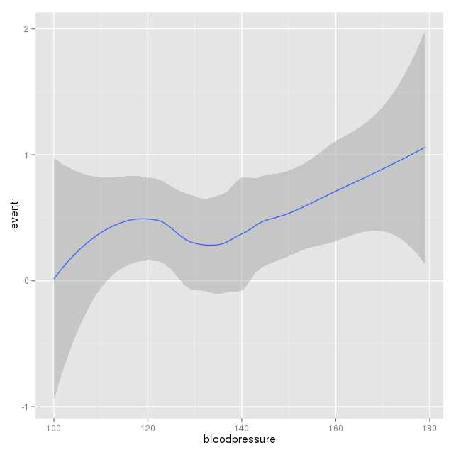
For a graphic display of relation between BP and events, you could following using ggplot2 and R. Here is an example using your own sample data:

library(ggplot2)
ggplot(data, aes(x=bloodpressure, y=event))+stat_smooth()

enter image description here

The shaded zones indicate 95% confidence intervals.

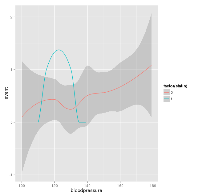
Two curves can be obtained based on statin use:

ggplot(data, aes(x=bloodpressure, y=event, group=factor(statin), color=factor(statin)))+stat_smooth()

enter image description here

Here the patients taking statins are very few, hence the curve is not complete.

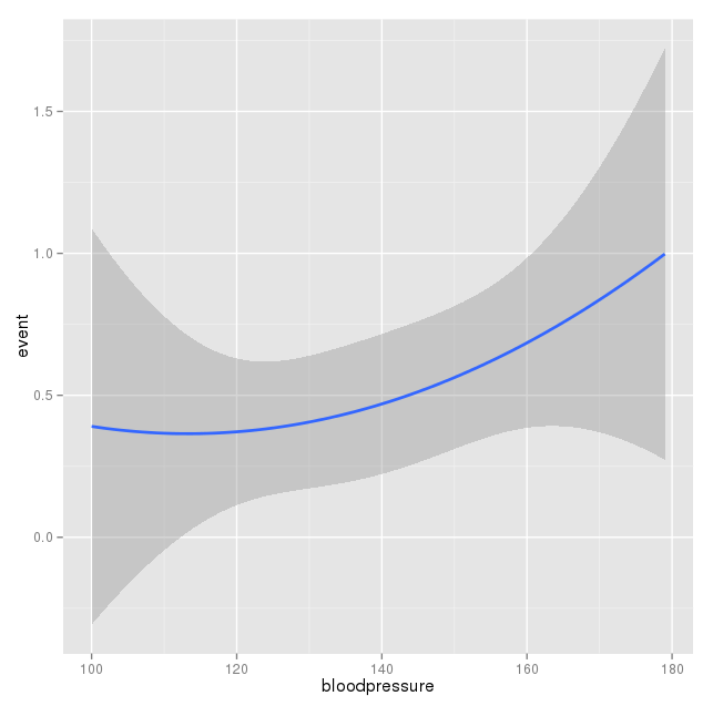
Above code uses 'loess' as the method. Since you are expecting it to be a curve, the code can be changed as follows:

ggplot(data, aes(x=bloodpressure, y=event))+stat_smooth(method = "lm", formula = y ~ poly(x, 2), size = 1)

enter image description here

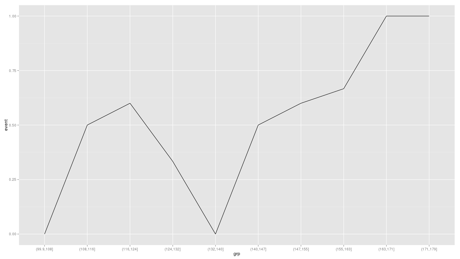
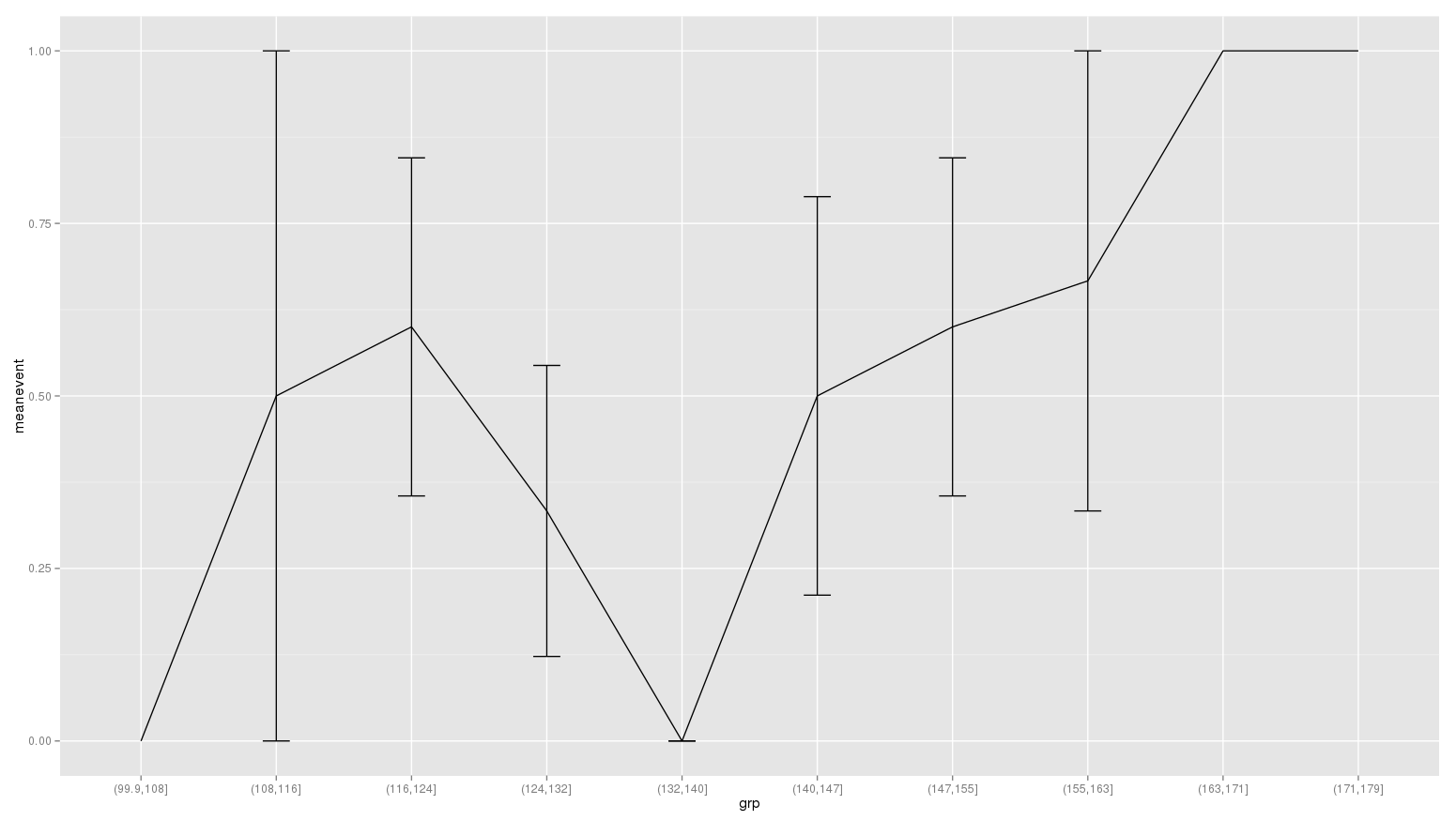
You can also show actual event rate in groups of bloodpressure. Say you divide all into 10 bloodpressure groups. For large sample size, the number of groups can be increased to get more accurate curve. The y axis in following curves give proportion of patients in that group who had events.

data$grp = cut(data$bloodpressure, 10)
aa = aggregate(event~grp, data=data, mean)
ggplot(aa, aes(x=grp, y=event))+geom_line(aes(group=1))

enter image description here

Errorbars can be added:

ddt = data.table(data)
aaa = ddt[,list(meanevent=mean(event), se_event=se(event)),by=grp]
ggplot(aaa, aes(x=grp, y=meanevent))+geom_line(aes(group=1)) + geom_errorbar(aes(ymin = meanevent-se_event, ymax = meanevent+se_event), width = 0.2) 

enter image description here

$\endgroup$
3
  • $\begingroup$ Thanks @rnso, much appreciate Your answer. I believe, but I'm not sure, that these graphs/methods will present the univariate association between my predictor of main interest and the outcome. However, I need to present the effect of blood pressure after adjustments (most likely via Cox regression) for a list of covariates. Your graphs, however, will definitely come at handy sooner or later. $\endgroup$ Commented Nov 4, 2014 at 21:57
  • $\begingroup$ These graphs do show univariate association, which is also important. Multiple curves can be drawn based on other factors and I have added in answer above a graph comparing curves in patients on statins versus not on statins. $\endgroup$
    – rnso
    Commented Nov 5, 2014 at 0:43
  • $\begingroup$ This completely ignored the follow up time and hence is definitly not a valid strategy to analyse this right-censored data $\endgroup$
    – Denzo
    Commented Jan 23 at 8:34
0
$\begingroup$

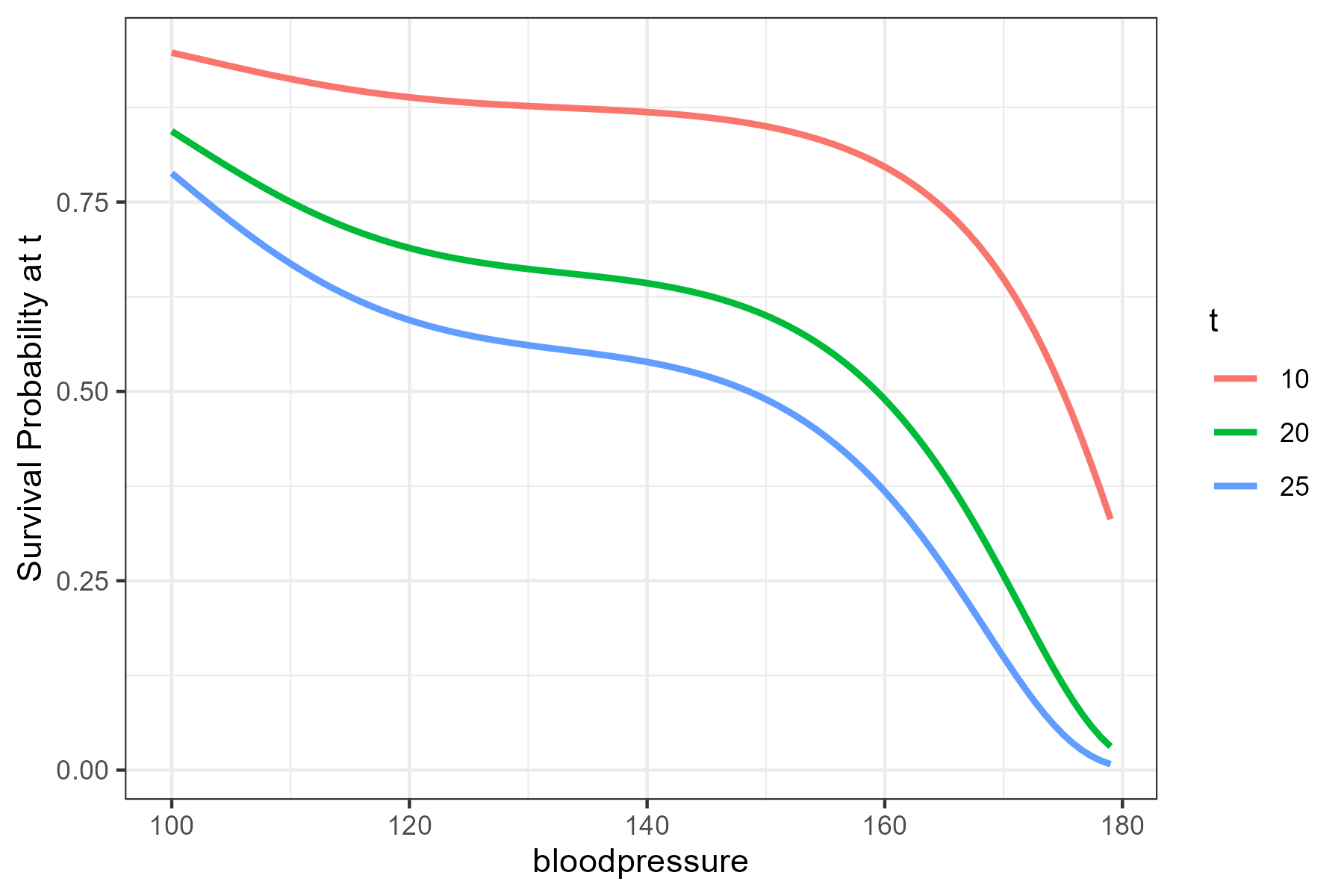
If you want to visualize the effect of a continuous predictor on a time-to-event outcome such as yours, you could use the contsurvplot package. For example you could pick a certain point in time and plot the survival probability at this point in time as a function of the covariate using the following code:

library(splines)
library(survival)
library(contsurvplot)

# your data
event <- c(1,0,1,0,0,0,0,1,0,0,0,1,1,0,1,0,0,1,0,1,1,1,1,0,1,1,1,0,0,1)
survival <- c(4,29,24,29,29,29,29,19,29,29,29,3,9,29,15,29,29,11,29,5,13,20,22,29,16,21,9,29,29,15)
statin <- c(0,0,0,0,1,1,1,0,0,0,0,0,0,0,0,0,0,1,0,0,1,0,0,0,0,0,0,0,0,0)
bloodpressure <- c(160,120,150,140,135,110,139,140,153,129,149,163,179,129,144,119,100,115,145,150,130,120,122,129,116,171,129,126,159,150)
data <- data.frame(event, survival, statin, bloodpressure)

# fit a cox model
fit <- coxph(Surv(survival, event) ~ statin + bs(bloodpressure, 3), data=data,
             x=TRUE)

# plot at t
plot_surv_at_t(time="survival",
               status="event",
               variable="bloodpressure",
               data=data,
               model=fit,
               t=c(10, 20, 25))

at_t

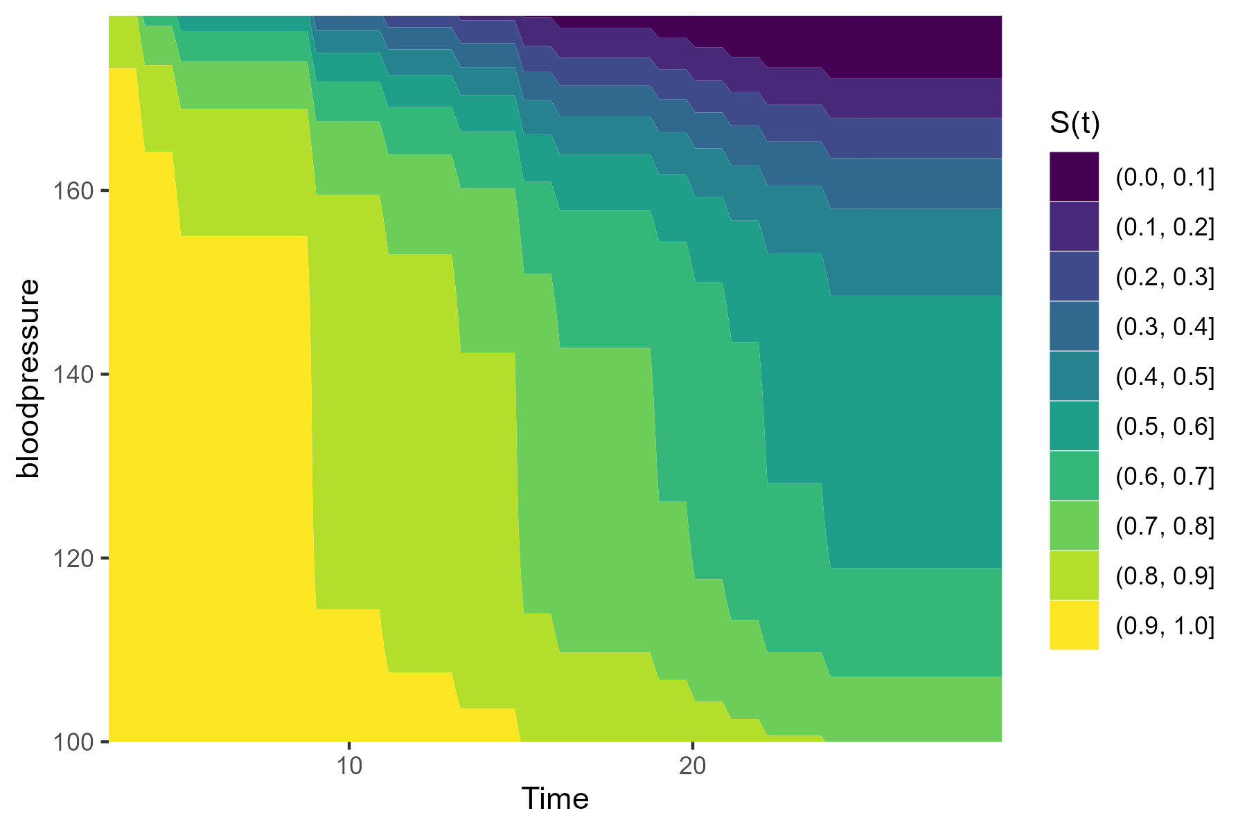
Instead of picking a few points in time directly, you can also visualize the association using a survival contour plot:

plot_surv_contour(time="survival",
                  status="event",
                  variable="bloodpressure",
                  data=data,
                  model=fit)

contour

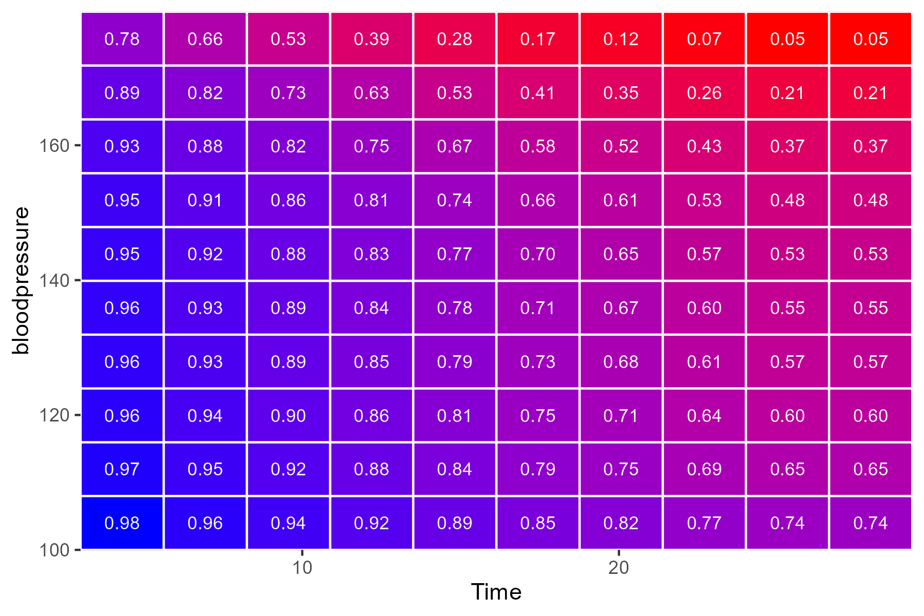
Or a survival heatmap:

plot_surv_matrix(time="survival",
                 status="event",
                 variable="bloodpressure",
                 data=data,
                 model=fit)

heatmap

All of these plots, how the required estimates are calculated and more is described in detail in the associated publication: https://www.doi.org/10.1097/EDE.0000000000001630

$\endgroup$

Your Answer

By clicking “Post Your Answer”, you agree to our terms of service and acknowledge you have read our privacy policy.

Not the answer you're looking for? Browse other questions tagged or ask your own question.