3
$\begingroup$

According to a least squares fit I have performed to my data, my slope is $-0.1038±0.033$, and my offset $0.1065±0.032$. My first idea was to visualise this by drawing three lines: $0.1065-0.1038x$, $(0.1065+0.032) - (0.1038-0.33)x$, and $(0.1065-0.032) + (0.1038+0.33)x$. Those correspond to the 95% confidence interval. However, the joint probability that both slope and offset are at the edge of the 95% intervals is certainly not 5%. If the two were independent it would be closer to 0.25%, whereas in reality the joint probability is probably somewhere in-between.

I could calculate the confidence interval at $\sqrt{0.05}$ for offset and slope and then visualise the extrema as described above, to get an effective 5% probability range. But I'm almost certainly reinventing the wheel here. What is a suitable way of visualising the uncertainty in a regression line — slope and offset?

For reference, Pythons statsmodels.api.OLS summaries my regression fit as below. In my real world example, I use a weighted least squares, because I have errors on my y-values (and I am considering orthogonal distance regression as I have errors on my x-values too, but I am neglecting those for now).

                            OLS Regression Results                            
==============================================================================
Dep. Variable:                      y   R-squared:                       0.026
Model:                            OLS   Adj. R-squared:                  0.023
Method:                 Least Squares   F-statistic:                     9.673
Date:                Mon, 06 Apr 2015   Prob (F-statistic):            0.00202
Time:                        18:14:55   Log-Likelihood:                 1223.1
No. Observations:                 370   AIC:                            -2442.
Df Residuals:                     368   BIC:                            -2434.
Df Model:                           1                                         
Covariance Type:            nonrobust                                         
==============================================================================
                 coef    std err          t      P>|t|      [95.0% Conf. Int.]
------------------------------------------------------------------------------
const          0.1065      0.032      3.343      0.001         0.044     0.169
x1            -0.1038      0.033     -3.110      0.002        -0.169    -0.038
==============================================================================
Omnibus:                       23.030   Durbin-Watson:                   1.484
Prob(Omnibus):                  0.000   Jarque-Bera (JB):               45.433
Skew:                          -0.350   Prob(JB):                     1.36e-10
Kurtosis:                       4.567   Cond. No.                         138.
==============================================================================
$\endgroup$
8
  • 1
    $\begingroup$ Have you thought about using an elliptical confidence region? $\endgroup$
    – dimitriy
    Commented Apr 6, 2015 at 23:00
  • $\begingroup$ @DimitriyV.Masterov I can see how I would visualise an elliptical confidence region around a simple data point — but such a confidence region around a regression line would be an 3-dimensional ellipsoid. Of course, I could add a separate figure visualising the slope and uncertainty of my regression line with an ellipse... $\endgroup$
    – gerrit
    Commented Apr 6, 2015 at 23:09
  • $\begingroup$ I see only 2 parameters in your output. Am I missing something? The ellipse is the CI for the slope and the intercept, not the data. $\endgroup$
    – dimitriy
    Commented Apr 6, 2015 at 23:12
  • $\begingroup$ @DimitriyV.Masterov Yes, the ellipse is on the slope and the intercept. But I want to show the model (the linear regression) in the same graph as the data. $\endgroup$
    – gerrit
    Commented Apr 6, 2015 at 23:21
  • $\begingroup$ Are you just asking how to get a 95% confidence or prediction interval for E[Y|X] = a + b*x1, where a is the constant and b is the slope? $\endgroup$
    – dimitriy
    Commented Apr 6, 2015 at 23:30

3 Answers 3

7
$\begingroup$

You may be looking for what Wikipedia calls "Confidence Bands". The band edges are curves instead of lines because the joint probability.

enter image description here

$\endgroup$
1
  • $\begingroup$ Thanks, that is a good starting point for further reading! I just need to figure out how to draw those given my parameters and the covariance between them. Seems this SO answer gets me close. $\endgroup$
    – gerrit
    Commented Apr 7, 2015 at 15:49
4
$\begingroup$

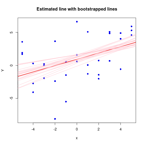
A sometimes useful alternative to the confidence band is to show the estimated line together with bootstrapped lines. Here is a simple, simulated example:

Estimeted LS line with bootstrapped lines

EDIT

Bootstrapping regression can be done in different ways, for instance:

  1. Resampling (with replacement) from the rows of the design matrix. This is what I have done here. A robust option, is valid even when assumptions like constant variance do not hold. But a philosophical problem, it does not really condition on the covariables, see What is the difference between conditioning on regressors vs. treating them as fixed?.

  2. Resmpling residuals. More dependent on assumptions like constant variance, but true to conditioning on predictors.

  3. Parametric bootstrap, more of a bayesian flavour.

It could be interesting to try all tree and see how much of a difference it makes.

R code for the simulation:

set.seed(7*11*13) # My public seed

a <- 1.0; b <- 0.8

x <- rep( seq(-5, 5, length.out=11), 3)
Y <- a + b*x + rnorm(x, sd=3)
df <- data.frame(x, Y)
n <- NROW(df)
mod.0 <- lm(Y ~ x, data=df)

plot(x, Y, col="blue2",  pch=16)
abline(mod.0, col="red2", lwd=2)

for (i in 1:20) {
    ind <- sample(1:n, n, replace=TRUE)
    abline( lm(Y ~ x, data=df[ind, ]), col="pink")
}

title("Estimated line with bootstrapped lines")
$\endgroup$
2
  • 1
    $\begingroup$ Can you add something on how those bootstrapped lines are defined? Just random draws from the probability distribution, what I seem to infer from your R code? $\endgroup$
    – gerrit
    Commented Oct 23, 2019 at 16:12
  • $\begingroup$ @gerrit: Have a look at the edits. $\endgroup$ Commented Oct 24, 2019 at 15:29
3
$\begingroup$

Python might give you this output, but it's pretty easy from first principles.

You want the 95% confidence interval for $a+bx$, where $a$ and $b$ are estimated with the data with some error, which introduces the uncertainty.

The 95% confidence interval for the expected value of y given a particular value of $x$ is the prediction from the model for that $x$ $\pm$ 1.96*prediction error. That is also why $0.1065 + 1.96 \cdot 0.032=.169,$ the upper bound of the 95%CI for the constant.

So we need to get the standard error of the prediction. You may remember that $$Var(a+bx)=Var(a) + Var(b)\cdot x^2+2\cdot x \cdot Cov(a,b).$$ This formula can be found on Wikipedia. The standard error is just the square root of the variance. This yields: $$(0.1065 -0.1038 \cdot x) \pm 1.96 \cdot (0.032^2 + (x \cdot 0.033)^2 + 2\cdot x \cdot Cov(a,b))^{1/2}.$$

You did not show the covariance between the slope and the intercept, so I could not plug it in.

$\endgroup$

Your Answer

By clicking “Post Your Answer”, you agree to our terms of service and acknowledge you have read our privacy policy.

Not the answer you're looking for? Browse other questions tagged or ask your own question.