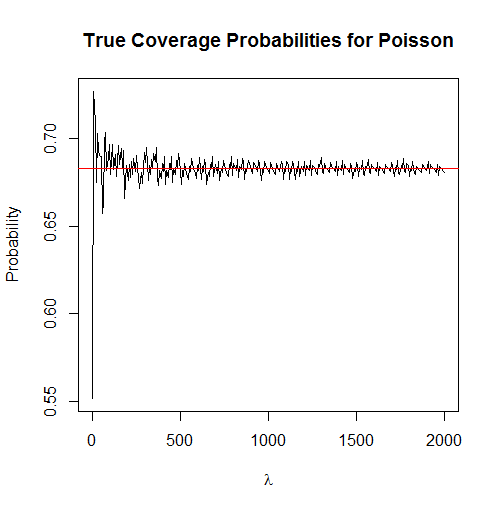
Update: As @whuber has pointed out with his comments, a better way to look at this is by computing the true coverage probabilities for the Poisson. The simulation, while also with its uses, does not reveal the interesting pattern seen in the plot below.

This was based on @whuber's code (see his first comment on this answer):
f <- function(mu) ppois(mu + sqrt(mu), mu) - ppois(mu - sqrt(mu), mu) ## computing coverage probabilities as a function of the true mean
curve(f, from = 1, to = 2000, n = 300, main = "True Coverage Probabilities for Poisson", xlab = expression(lambda), ylab = "Probability")
abline(h = 0.6827, col = "red") ## coverage prob. for a Normal RV
What this does:
If $X \sim \textrm{Pois}(\lambda)$ then $E(X) = \lambda$ and $V(X) = \lambda$. This means that the interval in question is $I := (\lambda - \sqrt \lambda, \lambda + \sqrt \lambda)$. The function f computes
$$
\mathbb P_\lambda(X \in I) = F_X(\lambda + \sqrt \lambda; \lambda) - F_X(\lambda - \sqrt \lambda; \lambda)
$$
where in R $F_X(t; \lambda)$ is obtained via the ppois function.
Original answer:
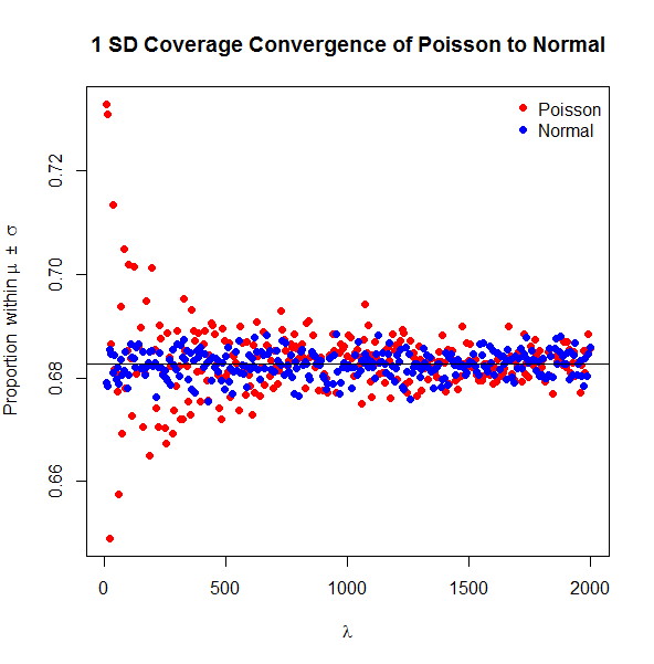
This is in no way a categorical answer but I thought you might like to see a simulation. Note that I'm using samples of size $n = 20000$ because you didn't mention that you cared about the sample size, so I wanted each sample to reflect asymptotic properties.

The simulation shows that the Poisson random variables (RVs) do not behave indistinguishably from the Normal RVs until around $\lambda \approx 1000$ with respect to the coverage rate and this choice of $n$. We can also see the variation in the coverage of random samples of Normal RVs even though they all exactly have the property that we are investigating at the population level. Note that in this simulation I compared a random sample to its sample mean and sample standard deviation rather than the population mean and population standard deviation. I chose to do so because I felt this to be more interesting for a discussion about the distribution of a statistic calculated from a sample.
Here's the code to make the plot.
set.seed(1)
lambda.seq <- round(seq(10, 2000, length = 300)) ## lambdas to try
res.norm <- res.pois <- numeric(length(lambda.seq)) ## these get the results
nsim <- 20000 ## number of observations at each iteration

for(i in 1:length(lambda.seq))
{
  sims <- rpois(nsim, lambda.seq[i]) ## simulating Poissons
  res.pois[i] <- mean(sims > mean(sims) - sd(sims) & sims < mean(sims) + sd(sims)) ## computing proportion of Poisson RVs within 1 SE of the mean

  sims <- rnorm(nsim, lambda.seq[i], lambda.seq[i]) ## simulating normals
  res.norm[i] <- mean(sims > mean(sims) - sd(sims) & sims < mean(sims) + sd(sims))
}

plot(res.pois ~ lambda.seq, pch = 19, col = "red", main = "1 SD Coverage Convergence of Poisson to Normal", xlab = expression(lambda), ylab = expression(paste("Proportion  within  ", mu, "  \u00b1  ", sigma, sep = "")))
points(res.norm ~ lambda.seq, pch = 19, col = "blue")
abline(h = .6827) ## this is the true coverage for a normal distribution
legend("topright", c("Poisson", "Normal"), pch = 19, col = c("red", "blue"), bty = "n")


