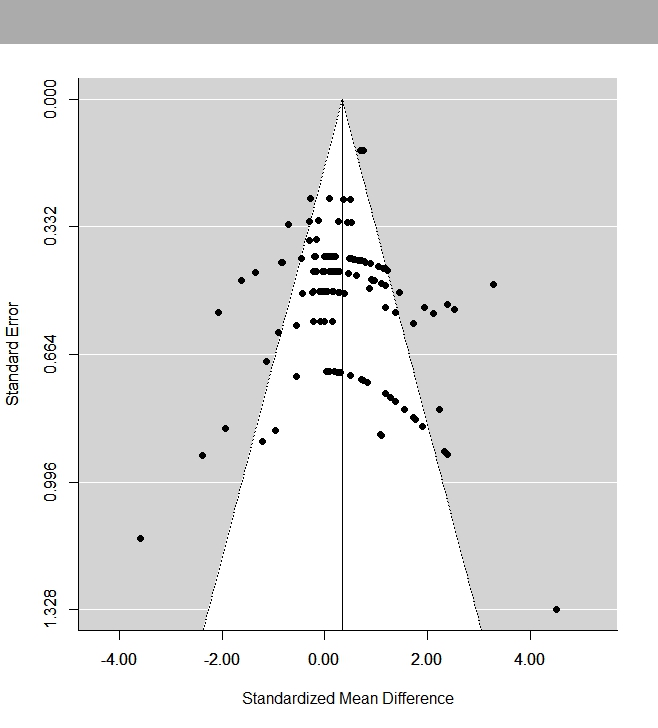
I have a set of 130 measurements from about 30 different studies. I have made a random effects meta-analysis of SMD (standardised mean difference) and ROM (ratio of means). I used the DL (DerSimonian-Laird) method. I also made funnel plots to check for publication bias. The SMD funnel plot shows strange stripe like shapes, that I’m guessing are appearing, because multiple measurements from the same author/paper were used. Also I have not seen any instances, where ROM funnel plots were used to test publication bias, are ROM plots an appropriate way to test publication bias?
1 Answer
Yes, this is due to including multiple SMDs that are computed based on the same sample. Note that the plot shows the SMD values on the x-axis against their standard errors on the y-axis. The standard error of the SMD is computed (or better: can be estimated) with: $$SE = \sqrt{\frac{1}{n_1} + \frac{1}{n_2} + \frac{SMD^2}{2(n_1+n_2)}}.$$ Now imagine what will happen if you have multiple SMDs computed based on the same sample (so $n_1$ and $n_2$ stay fixed), but the observed SMD values differ. The larger the observed SMD, the larger the standard error (with the SE being smallest when the SMD is 0). So, you get these curves in the funnel plot that are in essence artificial. This reduces the usefulness of funnel plots (for detecting patterns that may be induced by possible publication bias).
The concept of a funnel plot is generic and not tied to any specific outcome measure. So, yes, you can also create funnel plots with ratios of means (ROMs) as your outcome measure.