I understand the reasoning behind column normalization, as it causes features to be weighted equally, even if they are not measured on the same scale - however, often in the nearest neighbour literature, both columns and rows are normalized. What is the row normalization for/why normalize rows? Specifically, how does the result of the row normalization affect the similarity/distance between row vectors?
-
1$\begingroup$ can you please cite the literature that normalizes the rows? I realize that this is a relatively old discussion but I recently came across a similar issue and am trying to find out the differences. I will post my take on it as an answer. $\endgroup$– KrrrCommented Aug 30, 2017 at 10:54
-
$\begingroup$ A mention of row normalisation can be found on p504 of Hastie, Tibshirani, Friedman in the context of clustering: if rows $\boldsymbol{x}$ and $\boldsymbol{x}'$ are centred and normalised, $\ell^2$-dissimilarity produces the same closeness ordering of datapoints as cosine-similarity (=row-wise correlation). Indeed, $\|\boldsymbol{x}\|=\|\boldsymbol{x}'\|=1$ implies $\|\boldsymbol{x}-\boldsymbol{x}'\|^{2}=\|\boldsymbol{x}\|^{2}+\|\boldsymbol{x}'\|^{2}-2\langle\boldsymbol{x},\boldsymbol{x}'\rangle=2-2\cos\angle\boldsymbol{x}\boldsymbol{x}'$. $\endgroup$– paperskilltreesCommented Sep 6, 2022 at 3:18
4 Answers
This is a relatively old thread but I recently encountered this issue in my work and stumbled upon this discussion. The question has been answered but I feel that the danger of normalizing the rows when it is not the unit of analysis (see @DJohnson's answer above) has not been addressed.
The main point is that normalizing rows can be detrimental to any subsequent analysis, such as nearest-neighbor or k-means. For simplicity, I will keep the answer specific to mean-centering the rows.
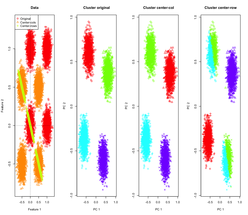
To illustrate it, I will use simulated Gaussian data at the corners of a hypercube. Luckily in R there is a convenient function for that (the code is at end of the answer). In the 2D case it is straightforward that the row-mean-centered data will fall on a line passing through the origin at 135 degrees. The simulated data is then clustered using k-means with correct number of clusters. The data and the clustering results (visualized in 2D using PCA on the original data) look like this (the axes for the leftmost plot are different). The different shapes of the points in the clustering plots refer to the ground-truth cluster assignment and the colors are result of the k-means clustering.
The top-left and bottom-right clusters get cut in half when the data is row-mean-centered. So the distances after row-mean-centering get distorted and are not very meaningful (at-least based on the knowledge of the data).
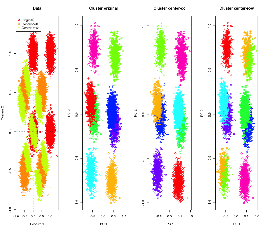
Not so surprising in 2D, what if we use more dimensions? Here is what happens with 3D data. The clustering solution after row-mean-centering is "bad".
And similar with 4D data (now shown for brevity).
Why is this happening? The row-mean-centering pushes the data into some space where some features come closer than otherwise they are. This should be reflected in the correlation between the features. Let's look at that (first on the original data and then on the row-mean-centered data for 2D and 3D cases).
[,1]   [,2]
[1,]  1.000 -0.001
[2,] -0.001  1.000
     [,1] [,2]
[1,]    1   -1
[2,]   -1    1
       [,1]   [,2]  [,3]
[1,]  1.000 -0.001 0.002
[2,] -0.001  1.000 0.003
[3,]  0.002  0.003 1.000
       [,1]   [,2]   [,3]
[1,]  1.000 -0.504 -0.501
[2,] -0.504  1.000 -0.495
[3,] -0.501 -0.495  1.000
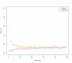
So it looks like row-mean-centering is introducing correlations between the features. How is this affected by number of features? We can do a simple simulation to figure that out. The result of the simulation are shown below (again the code at the end).
So as the number of features increase the effect of row-mean-centering seems to diminish, at-least in terms of the introduced correlations. But we just used uniformly distributed random data for this simulation (as is common when studying the curse-of-dimensionality).
So what happens when we use real data? As many times the intrinsic dimensionality of the data is lower the curse might not apply. In such a case I would guess that row-mean-centering might be a "bad" choice as shown above. Of course, more rigorous analysis is needed to make any definitive claims.
Code for clustering simulation
palette(rainbow(10))
set.seed(1024)
require(mlbench)
N <- 5000
for(D in 2:4) {
X <- mlbench.hypercube(N, d=D)
sh <- as.numeric(X$classes)
K <- length(unique(sh))
X <- X$x

Xc <- sweep(X,2,apply(X,2,mean),"-")
Xr <- sweep(X,1,apply(X,1,mean),"-")

show(round(cor(X),3))
show(round(cor(Xr),3))

par(mfrow=c(1,1))

k <- kmeans(X,K,iter.max = 1000, nstart = 10)
kc <- kmeans(Xc,K,iter.max = 1000, nstart = 10)
kr <- kmeans(Xr,K,iter.max = 1000, nstart = 10)
pc <- prcomp(X)
par(mfrow=c(1,4))

lim <- c(min(min(X),min(Xr),min(Xc)), max(max(X),max(Xr),max(Xc)))
plot(X[,1], X[,2], xlim=lim, ylim=lim, xlab="Feature 1", ylab="Feature 2",main="Data",col=1,pch=1)
points(Xc[,1], Xc[,2], col=2,pch=2)
points(Xr[,1], Xr[,2], col=3,pch=3)
legend("topleft",legend=c("Original","Center-cols","Center-rows"),col=c(1,2,3),pch=c(1,2,3))
abline(h=0,v=0,lty=3)

plot(pc$x[,1], pc$x[,2], col=rainbow(K)[k$cluster], xlab="PC 1", ylab="PC 2", main="Cluster original", pch=sh)
plot(pc$x[,1], pc$x[,2], col=rainbow(K)[kc$cluster], xlab="PC 1", ylab="PC 2", main="Cluster center-col", pch=sh)
plot(pc$x[,1], pc$x[,2], col=rainbow(K)[kr$cluster], xlab="PC 1", ylab="PC 2", main="Cluster center-row", pch=sh)
}
Code for increasing features simulation
set.seed(2048)
N <- 1000
Cmax <- c()
Crmax <- c()
for(D in 2:100) {
X <- matrix(runif(N*D), nrow=N)
C <- abs(cor(X))
diag(C) <- NA
Cmax <- c(Cmax, max(C, na.rm=TRUE))

Xr <- sweep(X,1,apply(X,1,mean),"-")
Cr <- abs(cor(Xr))
diag(Cr) <- NA
Crmax <- c(Crmax, max(Cr, na.rm=TRUE))
}
par(mfrow=c(1,1))
plot(Cmax, ylim=c(0,1), ylab="Max. cor.", xlab="#Features",col=1,pch=1)
points(Crmax, ylim=c(0,1), col=2, pch=2)
legend("topright", legend=c("Original","Center-row"),pch=1:2,col=1:2)
EDIT
After some googling ended up on this page where the simulations show similar behavior and proposes that the correlation introduced by row-mean-centering to be $-1/(p-1)$.
There are some field-specific reasons to perform row normalization. In text analysis, it is quite common to represent a text with the histogram of the words it contains. Starting from the count of words for each line, raw standardization turns it into an histogram.
And the computational reason. If you are working with a sparse matrix, you cannot center and scale the data column by column easily. If you embed it in a dense matrix, the data can become too large to fit in memory. However, the scaling row by row does not affect the total amount of memory needed.
-
$\begingroup$ For the computational reason, are you saying that we just take the transpose and row normalize that because of the way the sparse matrices are represented? I'm asking moreso how row normalization affects nearest neighbour results in practice. $\endgroup$ Commented Oct 5, 2015 at 16:53
-
$\begingroup$ The "computational reasons" do not seem to be reasons at all. If A is easier to do than B, this does not mean that A is a suitable substitute for B. They must at least have similar effects. $\endgroup$ Commented Oct 24, 2021 at 19:48
-
$\begingroup$ Besides, there are obvious ways to overcome the computational challenge. For example, if there are too many rows, one can just sample them to estimate the mean and std, or, in an online setting, one could use an online estimate of the required quantities. $\endgroup$ Commented Oct 24, 2021 at 19:54
There are various forms of row normalization and the OP is not stating which one s/he has in mind.
A specific form of row normalization (Eucledian norm normalization) where each row is normed (divided by its Eucledian norm) is quiet popular.
Reasons for using this form of row normalization are well summarized in section $3.2$ of this paper [0]:
Denote $\pmb x$ a column centered row $p$-vector and
$$r(\pmb x)=||\pmb x||^{-1}_2\pmb x\label{a}\tag{0}$$
the row normalized vector. Consider what this transformation is doing to your data geometrically. Geometrically, if your original data has $p>1$ variables and is centered, by applying the euclidean row normalization, you project your data on the surface of the $p$ dimensional unit circle.
For example, if your original data is centered (like the black dots in this image) and you apply row normalization to it, you obtain the red stars.
library(car)
p = 2
n = 1000
m = 10
C = matrix(.9, p, p)
diag(C) = 1
set.seed(123)
x = matrix(runif(n * p, -1, 1), n, p) %*% chol(C)
z = sweep(x, 1, sqrt(rowSums(x * x)), FUN = '/')
plot(rbind(x, z), pch = 16, type = 'n', ann = FALSE, xaxt = 'n', yaxt = 'n')
points(x, pch = 16)
points(z, pch = 8, col = 'red')
The green dots represent a small number of outliers in the original data. If you apply the row normalization transformation to them, you obtain the blue stars.
x_1 = sweep(matrix(runif(m * p, -1, 1), m, p), 2, c(2, -2))
z_1 = sweep(x_1, 1, sqrt(rowSums(x_1 * x_1)), FUN = '/')
plot(rbind(x, x_1, z, z_1), pch = 16, type = 'n', ann = FALSE, xaxt = 'n', yaxt = 'n')
points(x, pch = 16)
points(x_1, pch = 16, col = 'green')
points(z, pch = 8, col = 'red')
points(z_1, pch = 8, col = 'blue')
Now the advantage of this transformation are clear. The projection on the unit circle dampens the effect of far out outliers. If you original data $x$ is drawn from a centered model $\mathcal{F}$ except for a few far out outliers (such as the green dots) then any estimate of the shape of your data based on $x$ will be spoiled by the outliers.
If you base your estimates on the normalized data $z$ (the stars, red and blue), the outliers (now mapped to the blue stars) have less leverage to spoil your estimates.
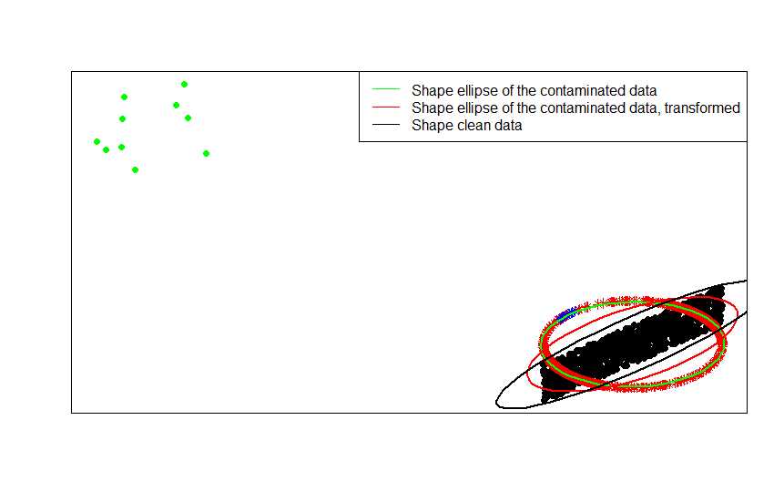
You can see this most clearly by comparing the shape matrices (or contour ellipses) fitted in turn to the data, their contaminated version and the row normalized transformation thereof:
ellipse(crossprod(rbind(x, x_1)) / (n + m - 1) / det(crossprod(rbind(x, x_1)) / (n + m - 1))^(1 / p), center = rep(0, p), col = 'green', radius = 1)
ellipse(crossprod(rbind(z, z_1)) / (n + m - 1) / det(crossprod(rbind(z, z_1)) / (n + m - 1))^(1 / p), center = rep(0, p), col = 'red', radius = 1)
ellipse(crossprod(rbind(x)) / (n - 1) / det(crossprod(rbind(x)) / (n - 1))^(1 / p), center = rep(0, p), col = 'black', radius = 1)
As you can see, the shape ellipses fitted to the transformed contaminated data (red ellipse) is a better estimated of the shape matrix of the uncontaminated data (black ellipse) than that obtained from the contaminated data (green ellipse). This is because the green stars have a smaller pull on the red ellipse (constructed from the transformed data $z$) than on the green one (constructed from the original data $x$).
- [0] S. Visuri, V. Koivunen, H. Oja (2000). Sign and rank covariance matrices, Journal of Statistical Planning and Inference Volume 91, Issue 2, 557–575.
Row normalization has a name -- ipsative scaling -- which typically involves rescaling a set of features by either dividing by the maximum value for the set or subtracting the mean of the features. There are many motivations for choosing this approach to transforming data but chief among them is that it conditions the features relative to the unique characteristics of the individual (the row or unit of analysis).


