2
$\begingroup$

I have a series of 300 measurement. these were done from a car traveling arund the city. Now I would want to plot a line along the path of the car and have it's color represent the magnitude of the measurements. Now to the problems The measurements are of ozone concentration and have alot of noise so a line would not have a smooth color transition. What is a good method to remove the noise?

What would be a good way to plot the line. I'm going to use it with latex so I'm thinking pfgplots but does anyone have a better alternative?

$\endgroup$

1 Answer 1

2
$\begingroup$

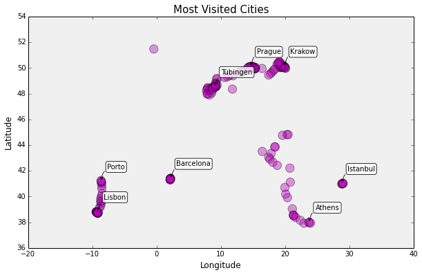
In your case, given that you do not intend to interpolate between your data points, it would be best to plot your data points, each point centered at the measurement location. This can be easily done by plotting a scatter plot and superimposing it to a shapefile-generated or picture of the area in question. Magnitude can be conveyed via different colors (like a heatmap) or by changing the size of the data point.

Below is an example, where different shades of pink are used to convey magnitude:

enter image description here

$\endgroup$
2
  • $\begingroup$ One problem is that I did not think about the need for a map before doing the measurements. So I do not have coordinates for each point. But I think that the speed of the car was constant enough to allow me to say that the messurments were taken a fixed distance from each other. So to get coordinates my idea was to find the coordinates of the path and get som function that gives a value after some time to give the value at each point. The other way I see is the extract 300 coordinates from the list of the path and plot those but it seems more wrong. $\endgroup$
    – Carl N
    Commented Oct 20, 2015 at 15:29
  • $\begingroup$ Unfortunately if you did not record you precise location for each data measurement you are missing some critical information. However, if you think you can approximate the position that each measurement was taken you might have a way out. You can extract the coordinates of your car ride using a high sampling density (total >> 1000 coordinates) and then uniformly sample 300 points. $\endgroup$
    – ikonikon
    Commented Oct 20, 2015 at 15:44

Your Answer

By clicking “Post Your Answer”, you agree to our terms of service and acknowledge you have read our privacy policy.

Not the answer you're looking for? Browse other questions tagged or ask your own question.