4
$\begingroup$

I have 4 dimensional data in a matrix, group1, that looks like the following:

    cost quality safety time
[1,]   13       6      3    4
[2,]   10       4      5   10
[3,]    8       9      3    9
[4,]    7       8      9    9
[5,]    4       4      4    2

I have another matrix, group2, that has a single row and four columns representing the same four variables:

  cost quality safety time
[1,]    2       2      7   11

To identify the distance between group1 and group2 I have calculated the Mahalanobis distance using the mahalanobis function:

mat1 <- matrix(group1, ncol=ncol(group1), dimnames=NULL)
mat2 <- matrix(group2, ncol=ncol(group2), dimnames=NULL)
mahalanobis(mat2, colMeans(mat1), cov(mat1))

The function calculates the distance from group1 to group2 as 13.74883.

  1. How Can I show 4 dimensions of group 1 and group 2 in a graph?

  2. How can I draw the distance of group2 from group1 using Mahalanobis distance?

I also looked at drawMahal function from the chemometrics package ,but this function doesn't support more than 2 dimensions.

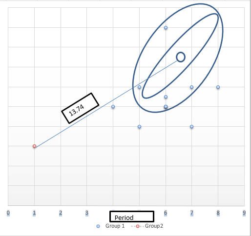
The graph is something like the following: multi dimensional point

$\endgroup$
4
  • 1
    $\begingroup$ Did you mean to include an image there? $\endgroup$
    – Glen_b
    Commented Jan 13, 2016 at 10:44
  • $\begingroup$ Yes I mean to show in a graph 4 dimensional point of group2 from 4 points of 4 dimensional point in group1 $\endgroup$
    – user
    Commented Jan 13, 2016 at 10:55
  • $\begingroup$ When you edit your question, you should be able to click a button at the top of the edit window that looks like a little picture to upload your image file. If that doesn't work for you, include a URL for the file in your post and someone will try to sort it out for you. $\endgroup$
    – Glen_b
    Commented Jan 13, 2016 at 11:00
  • 1
    $\begingroup$ I have updated my question by adding the image $\endgroup$
    – user
    Commented Jan 13, 2016 at 11:07

1 Answer 1

2
$\begingroup$

Take a look at the ggobi web site, and the R code for model-based clustering shows how to compute points on an ellipse, corresponding to the variance-covariance matrix of the data. This is basically the ellipse in your diagram above.

This R code should also work:

f.var.ellipse <- function(x,n=100) {
xm <- apply(x,2,mean)
p <- dim(x)[2]
xn <- dim(x)[1]
xv <- var(x) 
ev <- eigen(xv)
sph <- matrix(rnorm(n*p),ncol=p)
cntr <- t(apply(sph,1,f.norm.vec))
cntr <- cntr%*%diag(sqrt(ev$values))%*%t(ev$vectors)
cntr <- cntr+matrix(rep(xm,n),nrow=n,byrow=T)
return(cntr)
}

You will want to set up a data set, or data frame in R, with the 4 columns of your data, append the points generated by the above function, and add an indicator column which specifies that the row of numbers is "data" or "ellipse".

You can use the tourr package in R to view it dynamically, or you could use the ggplot2 package to plot it pairwise.

Take a look at the video LDA video showing high-d variance-covariance ellipses and confidence intervals which shows the ideas for 3D Mahalanobis distance, between hypothesized mean and sample mean. These were done with ggobi, but installing ggobi can be difficult. The tourr package in R gets you pretty close to the ggobi tools.

$\endgroup$
1
  • $\begingroup$ Hi Dianne, Thanks for your reply. But when I use the function of f.var.ellipse(benchmark,n=20), I got the following error message, Error in t(apply(sph, 1, f.norm.vec)) : error in evaluating the argument 'x' in selecting a method for function 't': Error in match.fun(FUN) : object 'f.norm.vec' not found. Is it possible for you to run the function with a sample data frame. $\endgroup$
    – user
    Commented Jan 14, 2016 at 23:01

Your Answer

By clicking “Post Your Answer”, you agree to our terms of service and acknowledge you have read our privacy policy.

Not the answer you're looking for? Browse other questions tagged or ask your own question.