22
$\begingroup$

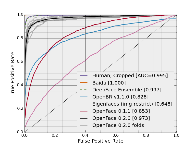
The image below shows a continuous curve of false positive rates vs. true positive rates:

enter image description here

However, what I don't immediately get is how these rates are being calculated. If a method is applied to a dataset, it has a certain FP rate and a certain FN rate. Doesn't that mean that each method should have a single point rather than a curve? Of course there's multiple ways to configure a method, producing multiple different points, but it's not clear to me how there is this continuum of rates or how it's generated.

$\endgroup$
6
  • 2
    $\begingroup$ I'd be interested as to where this came from. It appears to be claiming that Baidu is 100% perfect (and better than people) at identifying/recognising faces. Either that or it's using Baidu's results as ground truth rather than human categorisation, which is also really weird. $\endgroup$
    – OrangeDog
    Commented Jan 19, 2016 at 16:48
  • $\begingroup$ @OrangeDog bamos.github.io/2016/01/19/openface-0.2.0 $\endgroup$
    – Axoren
    Commented Jan 19, 2016 at 17:29
  • $\begingroup$ OK, they mixed results of different experiments, and rounded their source data incorrectly. Baidu should be 0.9977 ± 0.0006 $\endgroup$
    – OrangeDog
    Commented Jan 20, 2016 at 14:04
  • 2
    $\begingroup$ Incidentally, you missed that your source had the answer: "See Wikipedia for more details about reading the ROC curve." $\endgroup$
    – OrangeDog
    Commented Jan 20, 2016 at 14:04
  • 2
    $\begingroup$ @OrangeDog 0.9977 ± 0.0006 is Baidu's accuracy from the LFW results page, not AUC. This is confusing because the LFW results page doesn't have a heading for the column this is from. However, their v4 arxiv paper presents this number as the accuracy. I have computed the AUC on their curve in this function. Even though the AUC of 1.000 is confusing, I believe my technique is valid. $\endgroup$ Commented Jan 21, 2016 at 18:22

4 Answers 4

28
$\begingroup$

The plot is ROC curve and the (False Positive Rate, True Positive Rate) points are calculated for different thresholds. Assuming you have an uniform utility function, the optimal threshold value is the one for the point closest to (0, 1).

$\endgroup$
3
  • $\begingroup$ So this type of curve requires that the method have a relaxable threshold parameter? $\endgroup$
    – Axoren
    Commented Jan 19, 2016 at 14:56
  • 2
    $\begingroup$ Yes, but the threshold could be many things e.g. the log likelihood for a trained model given the test data or the distance to the separating hyperplane for a SVM. $\endgroup$
    – Morten
    Commented Jan 19, 2016 at 15:09
  • 1
    $\begingroup$ For example, the diagonal line is a random guess algorithm; the parameter will be "with what probability shall we guess TRUE?" $\endgroup$
    – OrangeDog
    Commented Jan 19, 2016 at 16:44
21
$\begingroup$

To generate ROC curves (= Receiver Operating Characteristic curves):

Assume we have a probabilistic, binary classifier such as logistic regression. Before presenting the ROC curve, the concept of confusion matrix must be understood. When we make a binary prediction, there can be 4 types of errors:

  • We predict 0 while we should have the class is actually 0: this is called a True Negative, i.e. we correctly predict that the class is negative (0). For example, an antivirus did not detect a harmless file as a virus .
  • We predict 0 while we should have the class is actually 1: this is called a False Negative, i.e. we incorrectly predict that the class is negative (0). For example, an antivirus failed to detect a virus.
  • We predict 1 while we should have the class is actually 0: this is called a False Positive, i.e. we incorrectly predict that the class is positive (1). For example, an antivirus considered a harmless file to be a virus.
  • We predict 1 while we should have the class is actually 1: this is called a True Positive, i.e. we correctly predict that the class is positive (1). For example, an antivirus rightfully detected a virus.

To get the confusion matrix, we go over all the predictions made by the model, and count how many times each of those 4 types of errors occur:

enter image description here

In this example of a confusion matrix, among the 50 data points that are classified, 45 are correctly classified and the 5 are misclassified.

Since to compare two different models it is often more convenient to have a single metric rather than several ones, we compute two metrics from the confusion matrix, which we will later combine into one:

  • True positive rate (TPR), aka. sensitivity, hit rate, and recall, which is defined as $ \frac{TP}{TP+FN}$. Intuitively this metric corresponds to the proportion of positive data points that are correctly considered as positive, with respect to all positive data points. In other words, the higher TPR, the fewer positive data points we will miss.
  • False positive rate (FPR), aka. fall-out, which is defined as $ \frac{FP}{FP+TN}$. Intuitively this metric corresponds to the proportion of negative data points that are mistakenly considered as positive, with respect to all negative data points. In other words, the higher FPR, the more negative data points we will missclassified.

To combine the FPR and the TPR into one single metric, we first compute the two former metrics with many different threshold (for example $0.00; 0.01, 0.02, \dots, 1.00$) for the logistic regression, then plot them on a single graph, with the FPR values on the abscissa and the TPR values on the ordinate. The resulting curve is called ROC curve:

enter image description here

In this figure, the blue area corresponds to the Area Under the curve of the Receiver Operating Characteristic (AUROC). The dashed line in the diagonal we present the ROC curve of a random predictor: it has an AUROC of 0.5. The random predictor is commonly used as a baseline to see whether the model is useful.

If you want to get some first-hand experience:

$\endgroup$
9
$\begingroup$

Morten's answer correctly addresses the question in the title -- the figure is, indeed, a ROC curve. It's produced by plotting a sequence of false positive rates (FPR) against their corresponding true positive rates.

However, I'd like to reply to the question that you ask in the body of your post.

If a method is applied to a dataset, it has a certain FP rate and a certain FN rate. Doesn't that mean that each method should have a single point rather than a curve? Of course there's multiple ways to configure a method, producing multiple different points, but it's not clear to me how there is this continuum of rates or how it's generated.

Many machine learning methods have adjustable parameters. For example, the output of a logistic regression is a predicted probability of class membership. A decision rule to classify all points with predicted probabilities above some threshold to one class, and the rest to another, can create a flexible range of classifiers, each with different TPR and FPR statistics. The same can be done in the case of random forest, where one is considering the trees' votes, or SVM, where you are considering the signed distance from the hyperplane.

In the case where you are doing cross-validation to estimate out-of-sample performance, typical practice is to use the prediction values (votes, probabilities, signed distances) to generate a sequence of TPR and FPR. This usually looks like a step function, because typically there is just one point moving from TP to FN or FP to FN, at each predicted value (i.e. all the out-of-sample predicted values are unique). In this case, while there is a continuum of options for computing TPR and FPR, the TPR and FPR functions will not be continuous because there are only finitely many out-of-sample points, so the resulting curves will have a step-like appearance.

$\endgroup$
1
$\begingroup$

From Wikipedia:

The ROC curve was first developed by electrical engineers and radar engineers during World War II for detecting enemy objects in battlefields and was soon introduced to psychology to account for perceptual detection of stimuli. ROC analysis since then has been used in medicine, radiology, biometrics, and other areas for many decades and is increasingly used in machine learning and data mining research.

The ROC is also known as a relative operating characteristic curve, because it is a comparison of two operating characteristics (TPR and FPR) as the criterion changes.

You can think of the two axes as costs that must be incurred in order for the binary classifier to operate. Ideally you want to incur as low a false positive rate as possible for as high a true positive rate as possible. That is you want the binary classifier to call as few false positives for as many true positives as possible.

To make it concrete imagine a classifier that can detect whether a certain disease is present by measuring the amount of some biomarker. Imagine that the biomarker had a value in the range 0 (absent) to 1 (saturated). What level maximises detection of the disease? It might be the case that above some level the biomarker will classify some people as having the disease yet they don't have the disease. These are false positives. Then of course there are those who will be classified as having the disease when they do indeed have the disease. These are the true positives.

The ROC assesses the proportion of true positives of all positives against the proportion of false positives by taking into account all possible threshold values.

$\endgroup$

Your Answer

By clicking “Post Your Answer”, you agree to our terms of service and acknowledge you have read our privacy policy.

Not the answer you're looking for? Browse other questions tagged or ask your own question.