2
$\begingroup$

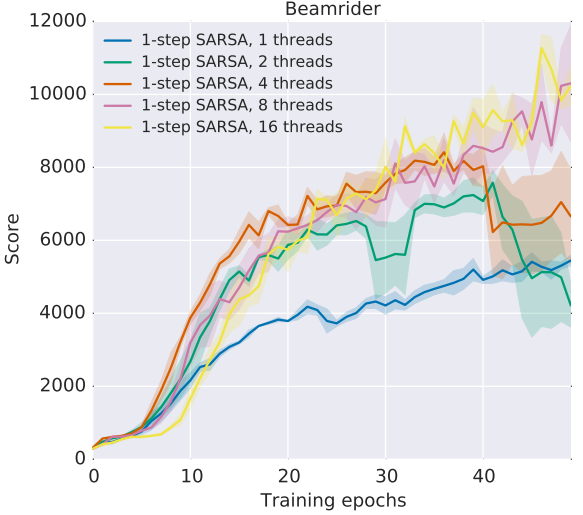
I've often seen a less informative but simpler alternative to boxplots where the error is assumed to be Gaussian and the plot shows the mean as a line with the surface of one standard deviation above and below it filled semi-transparently, as shown below.

Now, the surfaces in this kind of chart can cover impossible values. For example, when the minimum value is zero, the area might cover negative values.

Intuitively, I would just compute the standard deviation of all values above and all below the mean individually, and plot the area between those values. However, is there is a common distribution family for this error assumption?

standard deviation area plot

(Mnih, Volodymyr, et al. Asynchronous methods for deep reinforcement learning. arXiv preprint arXiv:1602.01783. 2016.)

Update: I found this very similar question that also has a good answer.

$\endgroup$

1 Answer 1

2
$\begingroup$

Unless there is some statistical explanation given, the regions only serve to suggest relative variability, not any particular distribution or confidence level. There is more measured variability in the thick regions than the thin regions. Variability could seem higher if there are fewer samples, but the original paper does explain that each point is the average of an equal number of samples (3).

In the article, I can't readily find any description of what the regions are, but +/- a standard deviation seems likely since the regions look symmetric about the lines. Quartiles or min/max are sometimes used to allow for asymmetric distributions.

Compare the Xbar and S chart for where standard deviation gets a more statistical treatment.

$\endgroup$
3
  • 1
    $\begingroup$ Thanks, I'll take a look at the suggested charts. Would it be a reasonable idea to compute the upper and lower variance and plot them individually, as I suggested in my question? $\endgroup$
    – danijar
    Commented Aug 7, 2016 at 18:00
  • 1
    $\begingroup$ I've never seen separate upper and lower standard deviations, but it could be an interesting way to show asymmetry. $\endgroup$
    – xan
    Commented Aug 7, 2016 at 18:28
  • 1
    $\begingroup$ Okay. I think I'll go with percentiles instead. Standard deviation might just not be a very useful measure for non-symmetrical (error) distributions. $\endgroup$
    – danijar
    Commented Aug 9, 2016 at 17:47

Your Answer

By clicking “Post Your Answer”, you agree to our terms of service and acknowledge you have read our privacy policy.

Not the answer you're looking for? Browse other questions tagged or ask your own question.